Reduced Discoverability in Windows 8
I just finished reading Jakob Nielsen’s article Windows 8 - Disappointing Usability for Both Novice and Power Users where the summary reads…
_Hidden features, reduced discoverability, cognitive overhead from dual environment, and reduced power from a single-window UI and low information density. Too bad. _
First of all, I think Jakob’s article is pretty well written and rather honest as well. I don’t think he’s trolling or begging for clicks. I do want to offer some extended thoughts on the matter, however.
Jakob’s second point is Windows 8’s reduced discoverability. I couldn’t agree more, but we can no longer work from an assumption that discoverability is king. We used to worship it and we ended up with a thousand commands on our design surface all conveniently a single click away. We had bloated navigation bars with submenus inside of submenus that all activated on hover (a gesture shackled to the mouse). In short, we had huge swathes of real estate dedicated to things the user might do and places they might go. No more. Now the user enjoys his content and brings up the charms bar when he wants to.
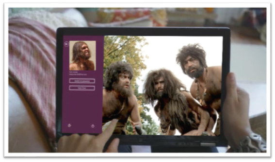
That simplicity comes at a cost though. As Jakob said, Windows 8 amounts to a reduction in discoverability. You may have seen the internet video of someone’s poor old dad left to discover Windows 8 on his own. He found his way to the desktop but couldn’t find his way back. All he had to do was move his mouse to any corner of the screen or hit the Windows key on his keyboard, but he didn’t know that. I think it’s safe to say he hadn’t discovered all the features yet. If you put a caveman in front of Windows 8, how long would it take him to figure out that he can swipe from an edge of the screen (unless he cheated and watched the introductory animation while setting up his profile).
If you can surmount that hurdle (and a few more) then you’ll be well on your way to enjoying your UI and I hope you’ll appreciate that it’s not trying to put everything front and center. Just for fun, I’d like to make a list of things the caveman (or any of us actually) would not know without being told.
- Swipe in from the left to browse other Store apps
- Swipe in from the right to access charms
- Swipe from the top or bottom to access app bars
- Your preferences are in the Settings charm
- If you want to search your app, you need to go to the Search charm
- To print, you go to the Devices charm
- To select something you swipe down on it (or swipe right if you’re in a vertical scroll)
- You can just start typing on the start screen to find things
- Cut, Copy, and Paste are hiding behind a hold gesture
- (and there are likely more)
You know what’s way longer than that list? The growing list of things a computer can do, and they can’t all fit on the screen at once nor should they. I say leave the interactions for when the user is interested in interacting and requests them, otherwise just show him his content.
As for the remaining points in Jakob’s article.
There’s no question there are hidden features. When you open a photo and there’s nothing on your screen except your photo, you can bet there are hidden features. When your primary user interactions (e.g. app bars, charms bar) are off screen, you can be sure there are hidden features. Once again I want my features to be hidden. Until I want my features. If I have to learn where they are, so be it, but that happens once and doesn’t mean I want to look at them on the first page of my app for the rest of my life. I can’t agree with cognitive overhead from dual environment because I’ve never felt any brain pain over the fact that there’s a desktop back there. I love it in fact that I have access to all of the legacy features and functions. Reduced power from a single-window UI? Actually, it’s not a single-window UI. The desktop is still there and you can use your windows and resize them and everything still. And low information density? Yep, and I really appreciate it too!