Data Presentation
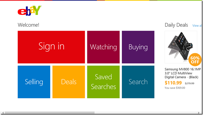
Sometimes it’s hard to know what control to use when you’re thinking about bringing your data feed into your Windows 8 app. You know you want to bring them in as tiles of some form or another. Maybe you want to do classic square tiles like eBay.
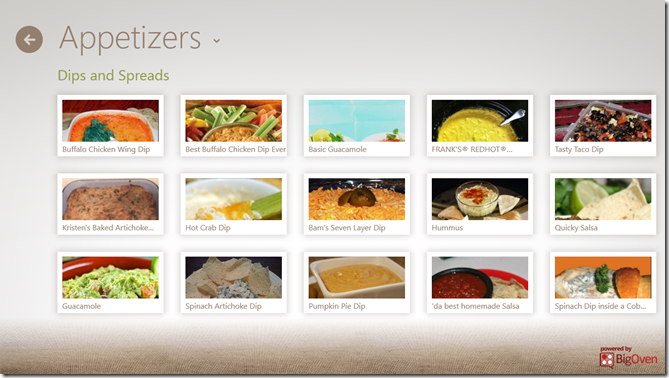
Hopefully, though, you want to add a little bit of flare and personality to yours. You could do something like the Cookbook app. Their primary data point is obviously a recipe and it looks to me like the designers of this app have put them in little Polaroids with shadows and everything.
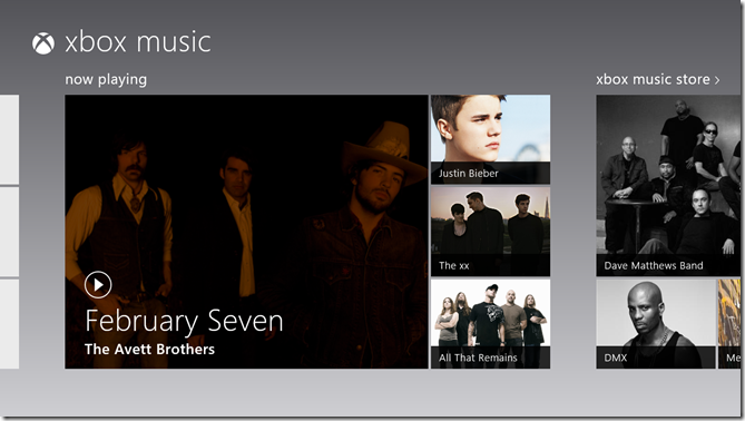
You could copy the music app that utilizes hero images – larger than average images that communicate a sense of feature or significance.
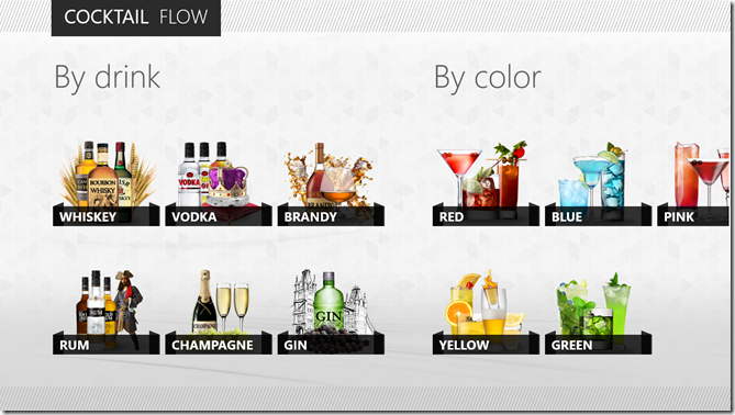
You could even get trés chic and model Cocktail Flow with their novel, beautiful tiles. They hardly look like tiles, but they still convey that essential Windows 8 design.
Inevitably, you’re going to have to make a choice about what control underlies this presentation of data, and eventually you’re going to have to implement it.
In this post, I’d like to do a little bit of a study into what control to choose when and why. As usual, I’ll be coming from an HTML/JS perspective, so if you’re wondering what your options are in XAML, Bing is your friend.
The first thing I want to point out is that not all lists of data are created equal. If you’re working on a section of your hub, you’re working with a very finite set of data. On the other hand, if your user has chosen to see something like your list of all recipes, then the list could have 10’s or 100’s of items in it. The two scenarios are candidates for vastly different solutions.
For the former, the hub section, I would employ a grid like what you see in the Music app screenshot above. You know that you have exactly four cells for images (for albums in this case) and you can determine which four albums you want to show and of them which deserves the ginormous featured cell on the left. The advantage to using a grid is that you have ultimate control over its layout. You don’t have to stick to symmetric lists of square. You can get funky with the layout and you can change it up too. You can create one layout for features a single item and another for featuring three. It’s all up to you (with the permission of your designer friend of course). The downside to using a grid is that you don’t get to bind it to an enumerable list of data. That’s not much of a problem, however, because again you’re only working with a handful or so of items. Also, grids don’t have any of the UX yum built in. They don’t automatically handle selection for instance, so if you want to allow the user to swipe select multiple entities in your grid, you’re going to have to figure out how to do that.
For the latter, the recipe list like you see in the Cookbook app screenshot above, I would employ a ListView. A ListView does have the UX yum built in. It automatically handles invocation, selection, and a lot more. It flows, it pans, it groups, and it wraps. It’s really great at what it’s made for.
In other scenarios, if you’re okay with giving up the yum that a ListView provides, you might want to opt for a FlexBox. Flexboxes give you better control than a ListView over how it’s members are laid out, and nothing complicated gets rendered out for each member of the flexbox. If you just inject a bunch of divs into your flexbox then that’s all it will contain.
To avoid a merely conceptual post on a developers’ blog, allow me to create a quick, custom grid and then populate it with some content.
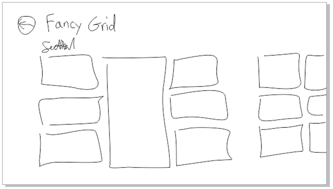
First, the design. Let me whip out my digitizer pen and draw up a quick grid layout using CorelDRAW (woot!)…
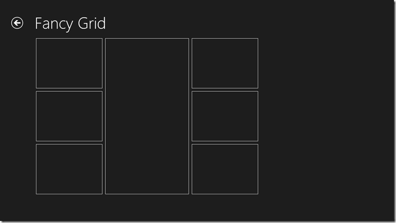
That’s the concept. Now for the implementation. I’m only going to layout the seven items in the first section.
First the HTML…
<!DOCTYPE html>
<html>
<head>
    <meta charset="utf-8" />
    <title>fancygrid</title>

    <!-- WinJS references -->
    <link href="//Microsoft.WinJS.1.0/css/ui-dark.css" rel="stylesheet" />
    <script src="//Microsoft.WinJS.1.0/js/base.js"></script>
    <script src="//Microsoft.WinJS.1.0/js/ui.js"></script>

    <link href="fancygrid.css" rel="stylesheet" />
    <script src="fancygrid.js"></script>
</head>
<body>
    <div class="fancygrid fragment">
        <header aria-label="Header content" role="banner">
            <button class="win-backbutton" aria-label="Back" disabled type="button"></button>
            <h1 class="titlearea win-type-ellipsis">
                <span class="pagetitle">Fancy Grid</span>
            </h1>
        </header>
        <section aria-label="Main content" role="main">
            <div id="grid">
                <div></div>
                <div></div>
                <div></div>
                <div></div>
                <div></div>
                <div></div>
                <div></div>
            </div>
        </section>
    </div>
</body>
</html>
The only thing in that HTML that isn’t boilerplate is the div called grid and the seven div’s inside. There’s one for each of the tiles in our layout. And now on to the CSS which is not a terribly lot longer…
.fancygrid section[role=main] > * {
    margin-left: 120px;
}

.fancygrid #grid {
    height:540px;
    display: -ms-grid;
    -ms-grid-columns: 240px 300px 240px;
    -ms-grid-rows: 184px 184px 184px;
}

    .fancygrid #grid > div {
        border: 1px solid white;
        margin: 5px;
    }

        .fancygrid #grid > div:nth-of-type(1) {
            -ms-grid-row: 1;
            -ms-grid-column: 1;
        }
        .fancygrid #grid > div:nth-of-type(2) {
            -ms-grid-row: 2;
            -ms-grid-column: 1;
        }
        .fancygrid #grid > div:nth-of-type(3) {
            -ms-grid-row: 3;
            -ms-grid-column: 1;
        }
        .fancygrid #grid > div:nth-of-type(4) {
            -ms-grid-row: 1;
            -ms-grid-column: 2;
            -ms-grid-row-span: 3;
        }
        .fancygrid #grid > div:nth-of-type(5) {
            -ms-grid-row: 1;
            -ms-grid-column: 3;
        }
        .fancygrid #grid > div:nth-of-type(6) {
            -ms-grid-row: 2;
            -ms-grid-column: 3;
        }
        .fancygrid #grid > div:nth-of-type(7) {
            -ms-grid-row: 3;
            -ms-grid-column: 3;
        }
Great. No JavaScript. As it should be. This is just a matter of layout, so it’s a collaborative effort between HTML (our structure) and CSS (our layout and style). The HTML in this case is dead simple. It’s just a div with seven div’s inside. Our CSS is like that kid in your chemistry lab in high school that did all the work for your whole lab group while you played Nintendo. Slacker.
So let me explain. The first style rule that refers to the main section is just something I do make sure everything in that main section takes on the 120px left margin that characterizes Windows 8 apps. The next rule applies to the grid. You may know by now, but the .fancygrid that preceeds #grid is just there to namespace this rule to this page. The next rule applies to all seven of the child div’s of the #grid div. The child combinator (the >) in this case is likely important. If you end up putting content inside of these cells and that content contains any div elements at all, this rule would apply to them if you used a space (the descendent combinator) instead of that greater than sign. So for all seven cells we want to draw a white border and give 5px of space. Why 5px? Because the Windows 8 design principles call for 10px between items and so that would be 5px around each item. Then I’m using the :nth-of-type() pseudo-class to refer to each div according to its position and add the correct -ms-grid properties to put it where it belongs. Notice how the 4th div has a span of 3.
And here’s the result…
Now, if you’re like me, you see this done once and it looks fine and dandy, but your mind races to imagine the value of something like this in a library primed for reuse. It would be super easy to dynamically add div’s and a couple of CSS properties each according to the template selection chosen by the developer. I believe I’ll get started on that now. Or perhaps soon. By all means, please beat me to it.
Hope this has been helpful. Now get to work!