Design
Canva.com Colors
I host a page at /media that is a resource of stock assets - images, illustrations, video, fonts, etc.
I originally made this resource for myself because I was always forgetting what my favorite stock asset sites were. Over the years, though I’ve gotten a lot of traffic on this page proving that I’m not the only developer that dabbles in graphics and isn’t foolish enough to try to create everything from scratch. I don’t have the time, talent, or inspiration to consider that.
On that page, I ask readers to recommend more resources and recently somebody did.
The folks at Canva.com let me know about their free online color tool - canva.com/colors, and I was so impressed that I decided to blog about it as well.
When I start a new website, create a new brand, or even start putting together a photo album for my family, I want to pick a color pallet that has some chance of looking good. In the past, I’ve used sites like Adobe Color CC (formerly Kuler), but I’ve always found them to be overkill. Canva Colors instantly struct me as a simple and clean alternative. I was also impressed right off the bat at their inclusion of some design learning. That’s just what most of us developers need - to get a bit more design savvy.
I moved on from their /colors tool to check out the rest of their site and as a web developer, I’m impressed. For example, just take a look at their About page. That’s snazzy.
By the way, Canva asked me if I’d like to include a link to their tool on my /media page, but they didn’t ask me or pay me to blather on about how cool their stuff is. I’m just impressed.
So head over to canva.com and check it out for yourself.
CorelDRAW App Tile Template
In case you haven’t heard, Microsoft has an incentive [link removed] going on right now where any app you create, you can get $100 for. That’s not bad considering how easy it is to make an app. Well, not all apps are easy. Some apps take quite a substantial bit of time, but if you’re just trying to get a good app into the Windows Store quickly (like say for $100!) there are some tricks you should know. There’s a template at w8templates.codeplex.com, for instance, that you can customize with a few search terms and RSS feeds and in a matter of minutes, you’ve got a data and media rich app all about the topic of your choice.
I just made an app using this template. It’s called The Sailing App. One of the tasks you’ll have to complete if you go down this road is to create your own graphics for the app tiles, splash screen, etc. Well, I don’t know about you, but I’m a big fan of CorelDRAW, so I made a template and I’m posting it here for you. By the way, if you’d like your very own free copy of CorelDRAW X6 Essentials, just join a ZERO260 event [link removed]. We’re giving them away.
Here’s that template. Have fun!
App Art
One of my favorite steps in the app development lifecycle is the creation of the artwork. I’m not stellar at creating original artwork, but I definitely recognize when things look just right, and sometimes I stumble upon it. I must also have a little bit of marketing in me, because it’s my constant effort to brand things.
The artwork and branding is important, because an app developer must live in a constant state of capturing the user amid so much noise. An app needs to say “here’s precisely what I do and how it adds value to your life”. It takes a lot of design thought and effort to cut through the noise and reach your audience.
Good messages to communicate are: clean, simple, creative, elegant, and fluid.
I’d like to walk you through my process of creating artwork for an app called Everyview. Everyview is webcam viewer that attempts to implement well the design principles of Windows 8. It’s intended to feel like a breath of fresh air. There are plenty of apps for viewing web cams and it’s nothing that can’t be done in the browser too, but it’s seldom a consolidated and elegant experience. As of this writing, Everyview is not yet published to the Windows Store, but by the time you read it, it may be. Try searching for Everyview.
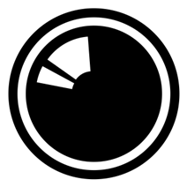
My artwork for Everyview started with the creation of a symbol. The symbol had to represent every image that could possibly come through the eye of a camera and so I simply chose to represent the eye of a camera. I didn’t want to make the app subject to aging by choosing a specific camera though, and I didn’t want to specify a still camera or a video camera. So I created a camera lens. The icon doesn’t determine absolutely that you’re looking down the barrel of a DSLR, an amateur video camera, a high-end video camera, or any other specific model. It’s an agnostic character of a camera.
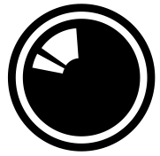
Looking into the eye of a camera invokes a bit of a “live” feeling, as if you’re on the air. I chose not to embellish the icon with a lot of gradients and or other attempts to make it look more realistic. As long as it says “camera” to the user, that’s enough. I did, however, ad a lens glare that identifies it without doubt as a camera lens.
Let me show you how I created this image.
I used CorelDRAW because… well, because I always use CorelDRAW. Use your graphics package of choice, but don’t restrict yourself to a bitmap editor. Creating images in a vector-based graphics package has serious benefits and will make exporting to the various required app graphic sizes a breeze. Creating images in a bitmap package will inevitable find you needing a size larger than what you designed for. I recorded a primer on using CorelDRAW and you can access it at http://aka.ms/coreldrawprimer.
Before I show you how I created that image, let me show you how I set up CorelDRAW for creating images for Windows 8. Choosing File | New in CorelDRAW by default will start you out with a document the size of a piece of paper. CorelDRAW is very good at creating artwork for print, but we’re concerned here more with pixels than we are with inches, so let’s change the defaults and save it for future use.
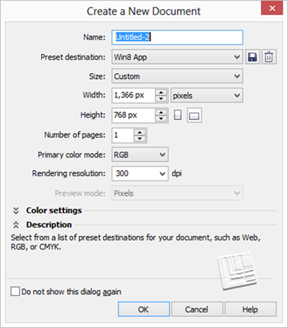
I created a preset called Win8 App that uses the base Windows resolution of 1366 x 768 pixels. I also chose a color mode of RGB since the results are to be rendered to a screen rather than a printer. When you’re working with documents of a designated pixel width/height, the resolution I mostly irrelevant.
If you’d like a nice place to start, try downloading the template I created at /w8tiletemplate.
Now, with a new document, we can go about creating our camera lens graphic.
Creating the lens graphic
Create a series of concentric circles like so. You do this by creating the largest and then resizing it with the CTRL key held to resize about the object’s center and hitting the right mouse button when you have your next circle to create a copy.
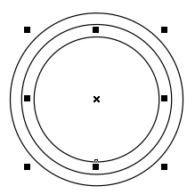
Use the second largest to trim the largest by clicking first the second largest and then holding shift and clicking the largest. Then hit the trim button  on the toolbar. Then delete the second largest circle. Setting the fill color of all objects to black and removing the outline color should leave you with something like this…
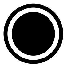
That’s nice and simple and we have only to create the lens glare, which is only slightly harder than what we’ve done so far.
Make another couple of circles inside the smallest. I like to give them a red outline (right click on red from the color palette) while I’m working so they’re easily discerned.
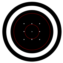
When you draw an ellipse (in this case a circular ellipse) in CorelDRAW, you have an ellipse, which is different from a custom curve. Ellipses have the property that you can grab their little vertex using the shape tool and drag to reduce the ellipse to an arc. Use the shape tool (F10) to do just that and work your way to something like this…
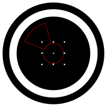
And then use some trimming and intersecting to end up with this…
Designing the tiles
Now it’s time to design yourself some tiles. At a minimum, you’ll need a standard app tile (150 x 150), a small logo (30 x 30), a store logo (50 x 50), and a splash screen (620 x 300). Additionally, you can design a wide logo (310 x 150) and some additional promotional images in case the Store finds your app worthy of being featured. It’s recommended that the wide logo only be used if you’re going to implement a live tile.
Let’s start with the main app tile. Here’s what I came up with for that…

Obviously, the tile incorporates the symbol we just created, but I also add a stylized app title below that. I chose a fairly bold font, condensed it, used different colors for the words and even shoved them together and created a little notch. Little design choices like this are somewhat arbitrary, but will end up becoming your brand and how people recognize your app. Finally, I added a soft gradient behind the entire title. You have to be careful with gradients in modern apps, but a shallow, gray gradient here seems to add a sort of dreamy, modern, cloud feel to the app.
Next, I’ll elaborate a bit on the standard logo design when creating the wide logo and the splash screen which I tend to make rather similar. Here’s what I came up with.

Now with more horizontal space than vertical, we stretch the brand elements out left to right and I like to add a little subtitle that describes without a doubt what the purpose of the app is - it’s a webcam viewer. Like the notched v in view, I notch the E with the camera lens and keep all of the graphics tight and bold.
The last step is the creation of the store and small logos.
The Store logo
The store logo is used for your apps dedicated detail page in the Windows Store. It’s common practice to just shrink the app tile down from 150 pixels to 50 and call it good, but that’s unfortunate because it’s rare that the app’s main tile will look so good at this size. Take a look at the Bing app’s Store logo captured from its page in the Store…
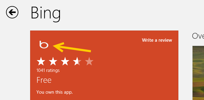
You want this image to be even simpler than the main app tile, to use most of the 50 x 50 pixel space, and to have a transparent background.
For my Everyview app, I stuck to the basic, original symbol. In CorelDRAW if you want to render something out a certain size even if the elements inside don’t quite fill up that size, you just create a bounding rectangle the size you want and then give it no fill and no outline. I have rendered this bounding box orange below for visibility only. To export this image, you simple set the bounding box’s outline color to none (invisible), select the entire group (bounding box and symbol together), and then export (CTRL + E) it.

Here’s how that would be rendered, however.
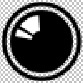
Notice a few things about this:
- The image has been rendered to pixels custom made for the export size chosen (it could be rendered absolutely huge and would still look great)
- The bounding box is not visible, yet it is responsible for the overall size and shape of the exported image
- The background is transparent (designated by the checkerboard pattern) but the lens glare is always white
- The transparency is 24-bit which means it has various levels of transparency around the edges to make it blend perfectly with the background
- There is a little bit of space around each edge of the symbol
- The symbol is large enough to capture all the quality we can in this restricted space
The small logo
The small logo is used to represent your app when the user semantically zooms out of their start screen. Try it and see.
You can use the exact same techniques to create the small logo as you did for the Store logo. The small logo (30 x 30 pixels) is even smaller than the store logo (50 x 50 pixels) so it becomes that much more important to be intentional about simplifying your image.
That’s as far as I’ll take this for now. Of course, you would continue your design effort into the app itself so that the entire effort is unified and consistent.
I’d like to point out one of the advantages to Microsoft design principles that ends up being highlighted by the content of this article. No part of the splash screen or the tiles or even the app itself are contributed to by Windows. The entire space falls under the responsibility of whoever wears the design hat in your organization (even if you are your organization and you wear all the hats!). The app tiles as well as the app’s main design surface because a truly empty canvas and 100% of the pixels are there to deliver your brand, deliver your functionality, and delight your user.
Have fun with this. It’s fun stuff for sure.
The Escalator Ride
You want your app to be successful and to be successful, you must think about the user.
Windows 8 thinks about the user through and through. It puts the user in control of what shows up on their start screen, when the app bar and charms bar appear over their content, and what apps have the capability of doing on their machine.
When you’re working on your app, consider that the user is not always just launching your app and then closing it when they’re done. They may be using your app as one in a series of apps involved in a single usage scenario.
Consider this usage scenario…
Your app helps users make restaurant dinner reservations.
Your user may use your app on its own, but more likely your user…
- steps onto an escalator at the airport
- checks their trip management app to find their hotel’s location
- checks for restaurants in the hotel’s vicinity
- picks a restaurant based on user reviews
- makes a reservation at the restaurant (with your app!)
- sends the reservation confirmation to a colleague
- and then steps off the escalator
That user is a delighted user. He has not just used an app. He has accomplished something significant in very little time. All during the escalator ride, the complimentary and informative animations were important, all of the thought that went into the UX of each app was very important, and the app-to-app sharing was crucial.
Keep that in mind as you formulate your app idea, as you design your app, and as you implement the Windows 8 contracts.
Gen Appathon Design Slides
If you attended the Gen Appathon in Redmond last week and attended the Windows 8 Design 101 breakout session lead by Valentina and Christina, you know that they promised slides, and here they are: http://www.slideshare.net/valeaseattle/windows-8-design-101
A big thanks to both Valentina and Christina for delivering excellent design content at a time when good design is more important than ever.
Data Presentation
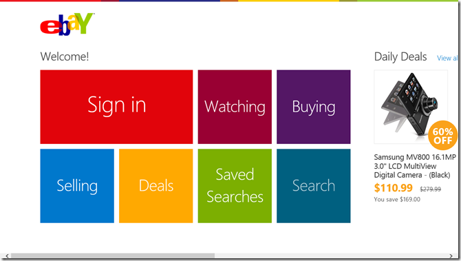
Sometimes it’s hard to know what control to use when you’re thinking about bringing your data feed into your Windows 8 app. You know you want to bring them in as tiles of some form or another. Maybe you want to do classic square tiles like eBay.
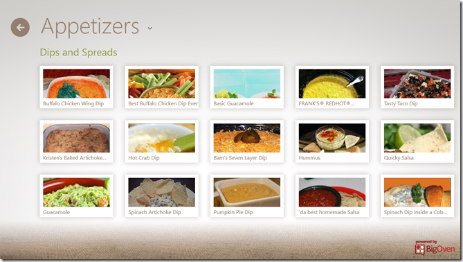
Hopefully, though, you want to add a little bit of flare and personality to yours. You could do something like the Cookbook app. Their primary data point is obviously a recipe and it looks to me like the designers of this app have put them in little Polaroids with shadows and everything.
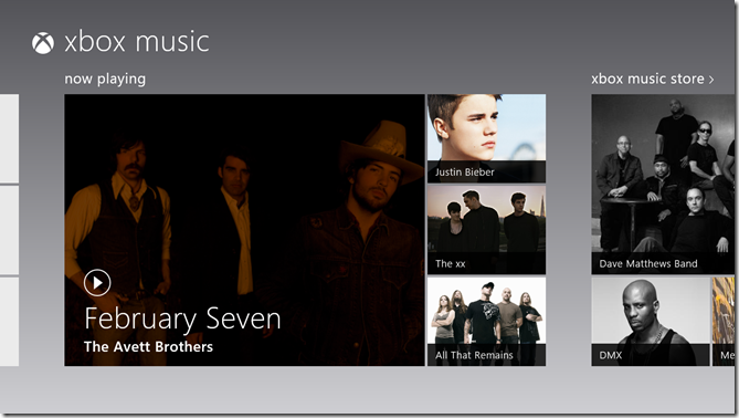
You could copy the music app that utilizes hero images – larger than average images that communicate a sense of feature or significance.
You could even get trés chic and model Cocktail Flow with their novel, beautiful tiles. They hardly look like tiles, but they still convey that essential Windows 8 design.
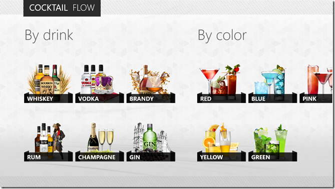
Inevitably, you’re going to have to make a choice about what control underlies this presentation of data, and eventually you’re going to have to implement it.
In this post, I’d like to do a little bit of a study into what control to choose when and why. As usual, I’ll be coming from an HTML/JS perspective, so if you’re wondering what your options are in XAML, Bing is your friend.
The first thing I want to point out is that not all lists of data are created equal. If you’re working on a section of your hub, you’re working with a very finite set of data. On the other hand, if your user has chosen to see something like your list of all recipes, then the list could have 10’s or 100’s of items in it. The two scenarios are candidates for vastly different solutions.
For the former, the hub section, I would employ a grid like what you see in the Music app screenshot above. You know that you have exactly four cells for images (for albums in this case) and you can determine which four albums you want to show and of them which deserves the ginormous featured cell on the left. The advantage to using a grid is that you have ultimate control over its layout. You don’t have to stick to symmetric lists of square. You can get funky with the layout and you can change it up too. You can create one layout for features a single item and another for featuring three. It’s all up to you (with the permission of your designer friend of course). The downside to using a grid is that you don’t get to bind it to an enumerable list of data. That’s not much of a problem, however, because again you’re only working with a handful or so of items. Also, grids don’t have any of the UX yum built in. They don’t automatically handle selection for instance, so if you want to allow the user to swipe select multiple entities in your grid, you’re going to have to figure out how to do that.
For the latter, the recipe list like you see in the Cookbook app screenshot above, I would employ a ListView. A ListView does have the UX yum built in. It automatically handles invocation, selection, and a lot more. It flows, it pans, it groups, and it wraps. It’s really great at what it’s made for.
In other scenarios, if you’re okay with giving up the yum that a ListView provides, you might want to opt for a FlexBox. Flexboxes give you better control than a ListView over how it’s members are laid out, and nothing complicated gets rendered out for each member of the flexbox. If you just inject a bunch of divs into your flexbox then that’s all it will contain.
To avoid a merely conceptual post on a developers’ blog, allow me to create a quick, custom grid and then populate it with some content.
First, the design. Let me whip out my digitizer pen and draw up a quick grid layout using CorelDRAW (woot!)…
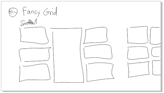
That’s the concept. Now for the implementation. I’m only going to layout the seven items in the first section.
First the HTML…
|
The only thing in that HTML that isn’t boilerplate is the div called grid and the seven div’s inside. There’s one for each of the tiles in our layout. And now on to the CSS which is not a terribly lot longer…
.fancygrid section[role=main] > * { |
Great. No JavaScript. As it should be. This is just a matter of layout, so it’s a collaborative effort between HTML (our structure) and CSS (our layout and style). The HTML in this case is dead simple. It’s just a div with seven div’s inside. Our CSS is like that kid in your chemistry lab in high school that did all the work for your whole lab group while you played Nintendo. Slacker.
So let me explain. The first style rule that refers to the main section is just something I do make sure everything in that main section takes on the 120px left margin that characterizes Windows 8 apps. The next rule applies to the grid. You may know by now, but the .fancygrid that preceeds #grid is just there to namespace this rule to this page. The next rule applies to all seven of the child div’s of the #grid div. The child combinator (the >) in this case is likely important. If you end up putting content inside of these cells and that content contains any div elements at all, this rule would apply to them if you used a space (the descendent combinator) instead of that greater than sign. So for all seven cells we want to draw a white border and give 5px of space. Why 5px? Because the Windows 8 design principles call for 10px between items and so that would be 5px around each item. Then I’m using the :nth-of-type() pseudo-class to refer to each div according to its position and add the correct -ms-grid properties to put it where it belongs. Notice how the 4th div has a span of 3.
And here’s the result…
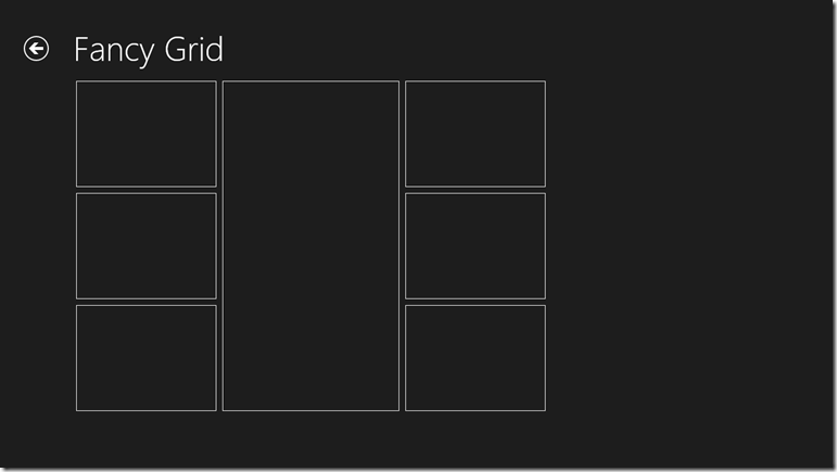
Now, if you’re like me, you see this done once and it looks fine and dandy, but your mind races to imagine the value of something like this in a library primed for reuse. It would be super easy to dynamically add div’s and a couple of CSS properties each according to the template selection chosen by the developer. I believe I’ll get started on that now. Or perhaps soon. By all means, please beat me to it.
Hope this has been helpful. Now get to work!
Windows 8 App Bar Icons (from Segoe UI)
UPDATE: since writing this I’ve found this MSDN article that I think has more information than my post. Hope that’s helpful.
This is a reference post. Come back when you, like me, forget which icons are available to use on your application bar in your Windows 8 app.
If you define your app bar imperatively (in JavaScript), then you would simply pass the name of the icon from this graphic in as the icon option like so…
new WinJS.UI.AppBarCommand({..., icon:'bookmarks', ...}) |
Here’s the chart for those with young eyes :)
![]()
Windows 8 App Design Sheet
Attached is a worksheet that might help you when you’re brainstorming the design of your Windows 8 app.
It encourages the 3-tier navigation structure that’s common with these apps. The grid units are 1 unit (20 pixels). There are rules for the top and left margins (5 units and 6 units respectively) as well as for an app bar (88 pixels). The Windows 8 version includes a guide for snapped view (320 pixels), whereas the Windows 8.1 version has minimum width guides at 320 and 500 pixels.
If I modify it, I will replace the attachment here so that you can always come back to this post to download more sheets. It helps to have a few of these printed out and stashed in your computer bag.
Hope it helps.
Windows 8: Windows 8 App Design Sheet.pdf
Windows 8.1: Windows 8.1 App Design Sheet.pdf
Metro Design by Blink Interactive
Last Friday my user group (“The Ocho”) met and heard a special presentation on Metro Design thanks to Blink Interactive.
Valentina and Christina are UW students and interns at Blink and gave us a ton of information about user centric design and then the history and concepts behind Metro design.
I promised that I’d post their slide deck for those that want to take a look, so here it is.
If you were there with us, thanks for joining. If you weren’t, then look up our next meeting at http://www.meetup.com/theocho. Maybe we’ll see you there.
Art Matters
I’m in a Microsoft building today that I’ve not been in before. There are a lot of them since I’m a relatively new employee. This one houses a lot of the work that goes into the Windows Phone 7 operating system, and that’s pretty cool.
I arrived early for my conference and decided to spend some time meandering. A 3rd floor native told me I should visit the Windows Phone design studio on the 2nd. The design studio looks like a bunch of art supplies, flowers, and rainbows blew up. It’s very cool actually.
I’m a propeller head for sure, so it’s important to me that a system functions correctly, but I want never to forget that art matters. It matters because it’s human like your users. When I picked out my SCUBA gear, for instance, its ability to sustain my existence while I’m under water was certainly high on my priority list, but it was also an assumption for the most part. SCUBA gear wouldn’t likely make it to the consumer shelf if it wasn’t well tested. So I essentially set that aside and look for gear that I enjoy looking at - gear that makes me feel like a Navy Seal Ninja.
Know that your users are making the same assumptions that your application is going to function as it’s intended, and they are going to choose it, keep it, and pay for it based on its art. Is it beautiful? Is it smooth like butter? Is it inspirational.