
Design
The Counter Principles of Metro Style Design
Likely you’ve read the Metro style design principles, but you haven’t seen the counter principles yet (because I made them up). Here we go…
1. Show Shame in Mediocrity
To really show shame in mediocrity, just look at about 80% of the apps in any major app marketplace. These apps may get a users attention with a catchy title or a promise to solve some problem, but then they fail to add any value to anyones life. Even if they are not devoid of functional value they fail to provide any user joy.
- Ignore the little things
- Do something different in every little user interaction so you can keep them on their toes
- Embrace chaos
- Deviate slightly from the grid so the user knows something is wrong even though that can’t see it
2. Flow Like Peanut Butter
To be clear, peanut butter doesn’t flow. Even creamy peanut butter doesn’t flow. To meet this counter principle, perform actions synchronously, use while loops that peg the processor, and only use the UI thread.
- Add some offset between the user’s finger and the registered touch point
- No transitions or animations… all straight cuts
- Add boring graphics and boring interactions.
- Embrace lag and jitters
3. Be Faux Analog
It’s 2012, but give the user a solid 1994 experience by rendering an actual real-life scene and hope they’ll figure out which drawer their word processor is in. Even though there’s no actual need for a spiral binding, let’s add one. It’s nostalgic.
- Show a desk or a lobby or some other loose analogy to your navigation model
- Firmly draw your limits at real life paradigms and scenarios
- Expand on the success of Microsoft Bob©
4. Do Less With More
Pack that screen. You have millions of pixels at your disposal. You can use some for navigation, some for commanding, and if there’s room left over you can even include your user’s content.
- Assure that users can orient themselves to your views within 7.5 minutes
- Adhere to a strict 45 button limit per view
- Give users a sense of adventure as they discover your application
5. Die Alone
- Assume the user is only concerned with doing whatever it is that your app does.
- Assume they don’t have friends to share your content with.
- Assume they don’t need to find anything of your content
- Assume the user what’s to do one thing at a time… always… ever… only
Good Design for App Bar Button Placement
I’ve watched a few developers port their existing apps over to Windows 8.
The first thing they do is drop all of their UI into their new app and run it to see it work. It’s nice to see things work, but Windows 8 is more than just a new API for accessing modern computer hardware. It’s a completely new design for user experience as well. So after you drop all of your buttons into your new app and see it work, you should migrate most of those buttons to the app bar.
The app bar, for the uninitiated, is the bar that slides up from the bottom of the screen whenever the user swipes up from off screen (and sometimes it appears all on its own). That app bar is nice. It avoids bothering the user by appearing only when the user requests it.
Here are some questions that developers raise when they’re learning to design and develop for Windows 8…
- Why can’t I put my buttons on the screen like I always have?
- Okay, fine, but which buttons should I put in the app bar and which should remain on the canvas?
- Do I put the buttons on the left, the right, or what?
- What if they don’t all fit?
- How do I control when buttons appear?
I’ll take these one at a time…
Why can’t I put my buttons on the screen like I always have?
It’s because it’s 2012 now! The modern trend has been to cram as much information into a user’s screen as possible, but we’ve had enough! When I see so may things I cease to see anything. It’s time to take a step back, take a deep breath, and think about what the user is actually doing right now and dedicate every pixel on the screen to it, immersing the user.
Look at the website versus the Metro versions of the Times of India…
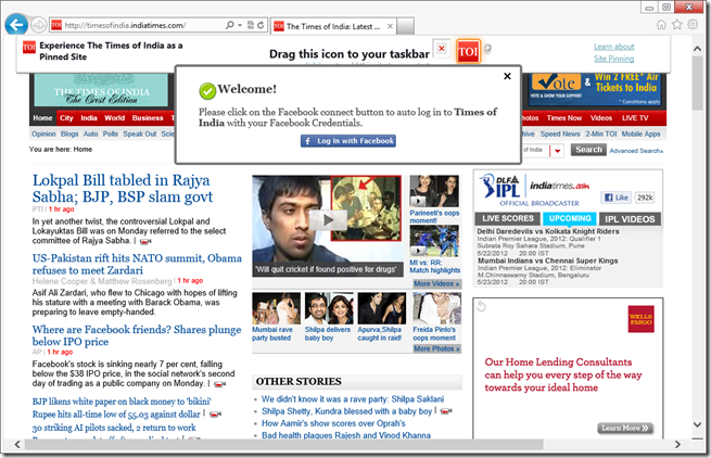
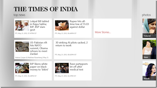
Most of the space in the website version is taken up with navigation commands (hyperlinks), which is a good example of an app telling you about “where you might go” instead of telling you where you are and letting the user navigate with the content.
Okay, fine, but which buttons should I put in the app bar and which should remain on the canvas?
First off, most of the buttons should be in the app bar. It won’t take long for a user to learn that that’s where the interactions are and start to swipe that bar up automatically. Since the app bar is hidden at first (usually), many wonder if their command won’t be apparent enough to the user. Keep in mind, however, that when a user draws up the app bar, they are specifically searching for a command. It takes away the need for discoverability and arguably makes your command more apparent - not less.
Some buttons should be on the canvas though. You would decide to put a button on the canvas when it’s part of the workflow a user is traversing. A case could be made that the workflow itself is the content at that point. If I’m adding products to my cart and checking out, I’m not here to browse content anymore. I’m engaged in the purchasing workflow. If you’re a retailer making a Windows 8 app, I would recommend that you diligently immerse the user in your products and their supporting media to make them love the browsing experience. Then when they decide to checkout, transition them to a slightly more utilitarian mode with canvas buttons and progress feedback.
Do I put the buttons on the left, the right, or what?
In general, the right side is for global commands, and the left side is for contextual commands. There are exceptions, however.
**Global commands **are those that apply to the entity represented by the current page. If you’re on the friend page, then add to favorites is a global command because it applies to the friend.
**Contextual commands **are those that apply to the entity or entities the user has selected. If you’re on the my friends page, then add to favorite is going to require that you swipe select one or more friends and would then be a contextual command.
One exception to this is when you don’t have any (and aren’t going to have any) contextual commands because you have nothing for the user to select. In this case, the entire app bar can be dedicated to global commands and the left and right sides should be used to separate the most disparate functions. You could, for instance, put your filtering commands on the left and your sort commands on the right.
What if they don’t all fit?
If you have more commands then you have app bar, then go vertical by combining commands into menus. For instance, if this is what you have on your app bar…
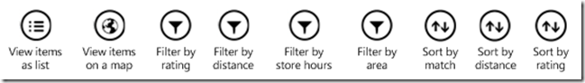
…then combine all of your filters into one menu and your sorts into another. That would bring 9 buttons down to only 4!
How do I control when buttons appear?
If you’re using HTML/JavaScript for your app, the recommended way to add app bar buttons and control when they appear is to declare them all on the default.html file and then in the .js file for each page just control their visibility. This avoids having to manipulate the DOM each time a page is loaded. There are easy functions for doing this such as…
appbar.showOnlyCommands(["add-template-item","delete-global"]); |
If you’re using XAML/C# then (from what Jerry Nixon tells me), you will actually create the app bar buttons on the page where they’ll appear.
Finally, don’t forget to account for snap view. When your app is snapped, you only have room for 5 app bar command buttons. If you have more then they will wrap up to a second row and it will look funny and your users will laugh at you. And that’s not the response you’re likely looking for.
Happy commanding!
Blend - Design, Execute, Interact
This is likely apparent to anyone that has already ventured into Windows 8 development using Blend for Visual Studio 11, but if you haven’t ventured in yet for some reason… like say you’re busy actually getting work done! I know how that goes. I was recently in industry trying to meet deadlines and didn’t have much opportunity to look at new technology.
So allow me to quickly highlight an incredible feature in Windows 8 development – specifically in Blend for Visual Studio 11.
Why Use Blend?
First of all, why and when should you open Blend? For a long time, Blend was downright offensive to me as a developer. I was and still am a Visual Studio guy. I don’t want another IDE offering in parallel to confuse and divide me! But now I’ve accepted the two tools as very different and each very powerful in their own role.
Some people will almost always use Visual Studio. Remember that the Express version is completely free. How do you know if you’re one of these people? Simple. Look down. Are you wearing one of these t-shirts right now?
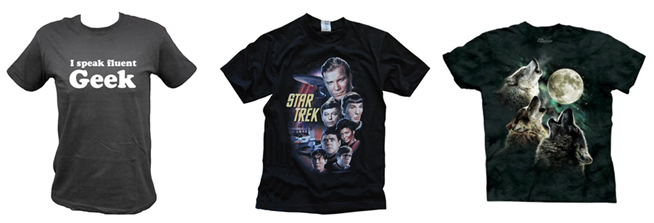
If so then chances are you’re a geek and Visual Studio may be your primary if not your exclusive tool.
Are you wearing something more like this?

If so then you may call Blend your home and ask a geekier friend to write the actual code for you. If you’re like me, you might wear many hats (and shirts) and be able to geek out in the code and the design tools.
Design, Execute, Interact
But right now I want to show you something that is exclusive to Blend. That is its ability to execute your application live as you design it and its ability to even give you interaction with the application and why you need that.
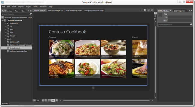
The figure above is what it looks like when you’re designing an application in Blend. The interesting tidbit of note is that those recipes you see in the design pallet are not declared in the HTML. They exist as JavaScript arrays in the data.js file and as images of food (yum) stored in the images folder.
Blend here is executing the application, running the JavaScript, and rendering the recipes accordingly on the screen. So just this is pretty awesome. Remember in Expression Blend days of old when we loaded sample data so we (designer role) could get an idea of what things looked like. Those are bygone days, my friend.
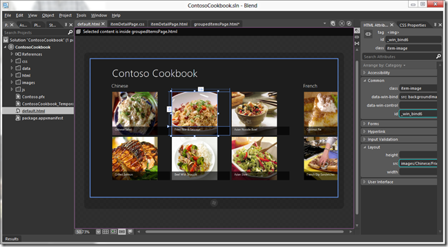
In this mode, we can actually grab one of the images (even though they’re being rendered live!) and resize it (see next figure) - effectively modifying the size of the image element in the item template utilized by the ListView control that forms this list.
But what about when you want to do some design on a different page. Say we want to resize the recipe image on its detail page as well. If we were actually executing this application, we would touch on the recipe to get to this page. But remember that we are actually executing this application. We just have to tell Blend that we want to interact with it. And to do that you hit the Interactive Mode icon…

…on the right side of the tab well. This hides all of Blend’s panes and puts you in a mode where input is passed on to the application (see next figure).
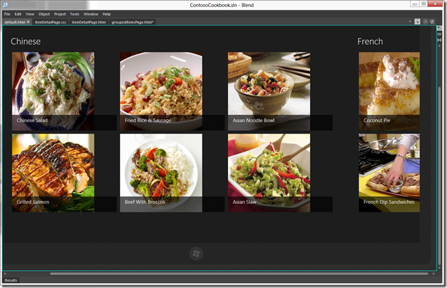
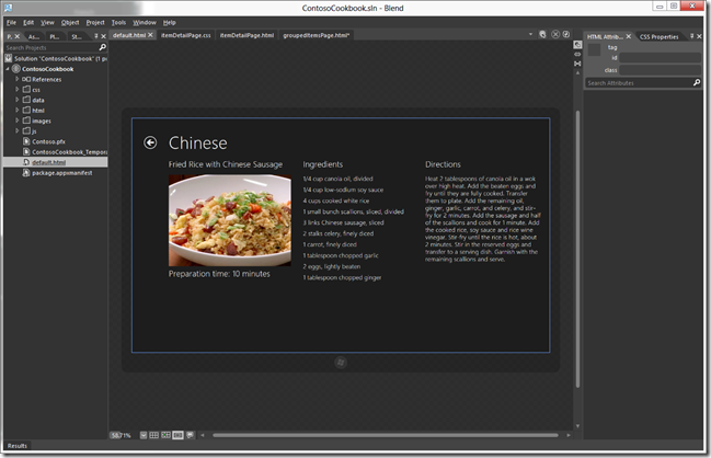
Now a click on a recipe takes you to the item’s detail page…
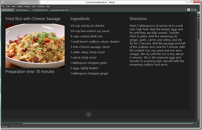
You can now click on the Interactive Mode icon again to turn it off…
…and now you’re ready to do some design on this page.
That’s all for now. Let the power and potential that is Blend sink deep. Now use it to create an awesome app.
Happy Blending!
Design Before You Develop
It has never been a good idea to jump right into development without putting time into the design of your project. It’s tempting to attribute your progress to the time when you’re actually typing the code into the computer, but application design like never before is more than fluff. It scopes and directs your efforts and saves you from real hours spent on divergent, throw-away work.
This is still true in Windows 8 development, but a lot of work has already been done to support application developers in creating Metro style applications. There’s a lot of design philosophy in the platform. The effort of which is to create an application ecosystem that has some consistency and thus some predictability and thus user joy.
Here’s a video I recorded that will walk you through the design philosophy – the 8 traits of Metro style design. Enjoy. Happy designing.