Posts tagged with "graphics"
Canva.com Colors
I host a page at /media that is a resource of stock assets - images, illustrations, video, fonts, etc.
I originally made this resource for myself because I was always forgetting what my favorite stock asset sites were. Over the years, though I’ve gotten a lot of traffic on this page proving that I’m not the only developer that dabbles in graphics and isn’t foolish enough to try to create everything from scratch. I don’t have the time, talent, or inspiration to consider that.
On that page, I ask readers to recommend more resources and recently somebody did.
The folks at Canva.com let me know about their free online color tool - canva.com/colors, and I was so impressed that I decided to blog about it as well.
When I start a new website, create a new brand, or even start putting together a photo album for my family, I want to pick a color pallet that has some chance of looking good. In the past, I’ve used sites like Adobe Color CC (formerly Kuler), but I’ve always found them to be overkill. Canva Colors instantly struct me as a simple and clean alternative. I was also impressed right off the bat at their inclusion of some design learning. That’s just what most of us developers need - to get a bit more design savvy.
I moved on from their /colors tool to check out the rest of their site and as a web developer, I’m impressed. For example, just take a look at their About page. That’s snazzy.
By the way, Canva asked me if I’d like to include a link to their tool on my /media page, but they didn’t ask me or pay me to blather on about how cool their stuff is. I’m just impressed.
So head over to canva.com and check it out for yourself.
Acquiring Images Without Committing Plagiarism
The easiest way to find the image you’re looking for is a Bing/Google image search.
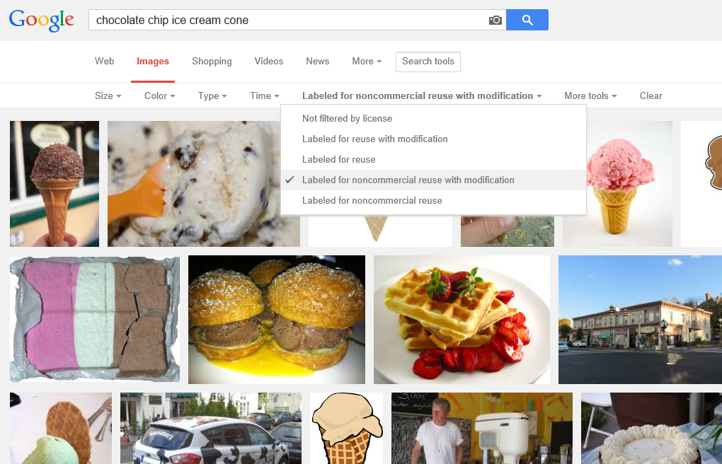
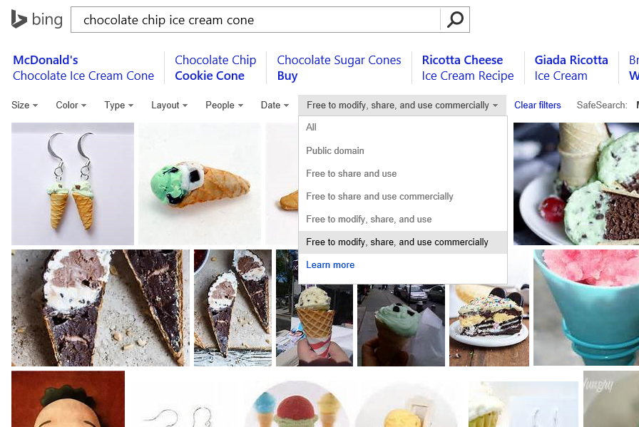
Did you know, though, that Bing and Google (and likely the other players) actually do their best to index the licenses associated with the images they crawl?
In a Google Images search, you perform a search and then hit Search Tools and then drop down the Usage Rights. As to why Google gives us astronaut Neapolitan and strawberry waffles… well, I can’t speak to that, but I’m sure those algorithms are really hard to write so we should have grace.

In a Bing Images search, you perform your search and then drop down the License list.

In either case, your search results are going to be severely limited, but you’re going to be able to sleep well at night knowing that you didn’t just rip an image off of someone’s site without a second thought only to reproduce it on your own and in the process breaking the law, ruining your name, and on and on.
I would imagine that this sort of search filter is highly dependent on the presence of some good metadata, so in order to be on the safe side, I still recommend you click through to the site where the image was found and do the leg work to figure out if it’s really in the public domain.
App Images
There’s an array of images that you need to create before you can call your app complete.
Images to represent your app are very important, because they’re often the first thing a potential user sees and the first opportunity to convince them your app will add value to their day.
The best resource I know on the subject is Choosing your app images on MSDN.
On that page, you’ll find a table that enumerates all of the images you need to create including…
- The store logo is displayed in the details section of the app listing page, it’s base (100% scale) size is 50x50 and it’s actually going to show over a 70x70 square so there will be a 10 pixel border around it. Your BackgroundColor (which you specify in the manifest) is used for the color of that border.
- The square 150x150 logo is often the default tile on the start screen, though it is possible to designate a different size for your default tile.
- The square 30x30 logo does not end up showing as a tile on the start screen. Instead, this image is used in various other places in Windows when many apps are displayed as very small icons. You can see it by swiping up from the start screen and showing all apps, and you can also see it when you Alt + Tab to switch apps.
- The **wide 310x150 logo **is a start screen tile and is good for apps that need a little more room for live tile content. If your app has a wide tile then your users will have a chance to choose wide from the start screen.
- The **square 310x310 logo **is a mongo tile on the start screen. I use this when I have a very prominent app that has live content that I look at very often such as news or financial data.
- The **square 70x70 logo **is the small tile on the start screen. I use this when I don’t care about any live content coming down and only want a means of launching an app. I’m the guy whose start screen looks like graph paper :)
- The **badge logo **is what people see next to the badge notification on their lock screen (if they’ve elected for your app to be on their lock screen).
- Finally, the **splash screen **is the relatively large image that shows for a brief period while your app is being launched. You want to be careful to make this a good experience for the user. We don’t mind waiting a little for an app to start up, but we like to know what our system is doing.
Remember that for all of these images, you should provide all of the various scales. That means that for the square 150x150 tile, you should actually create and specify (in your manifest) a 120x120 (80%), a 150x150 (100%), a 210x210 (140%), and a 270x270 (180%). If you skip this, you miss out on a huge opportunity to make your app look great on various screen resolutions. Basically, don’t skip this :)
Additionally, you must have screenshots of your app in order to successfully submit it to the Store, and you should have promotional images in case your app is found to be worthy of promotion.
By the way, the screenshots that you provide must be taken from your actual running app, but the first one is different. For the first screenshot, you have a chance to create a marketing screen that really gives your app a visual punch and makes people want to download it. Again, if your app is chosen for promotion, this first screenshot is going to be used along with a 150x150 logo.
CorelDRAW App Tile Template
In case you haven’t heard, Microsoft has an incentive [link removed] going on right now where any app you create, you can get $100 for. That’s not bad considering how easy it is to make an app. Well, not all apps are easy. Some apps take quite a substantial bit of time, but if you’re just trying to get a good app into the Windows Store quickly (like say for $100!) there are some tricks you should know. There’s a template at w8templates.codeplex.com, for instance, that you can customize with a few search terms and RSS feeds and in a matter of minutes, you’ve got a data and media rich app all about the topic of your choice.
I just made an app using this template. It’s called The Sailing App. One of the tasks you’ll have to complete if you go down this road is to create your own graphics for the app tiles, splash screen, etc. Well, I don’t know about you, but I’m a big fan of CorelDRAW, so I made a template and I’m posting it here for you. By the way, if you’d like your very own free copy of CorelDRAW X6 Essentials, just join a ZERO260 event [link removed]. We’re giving them away.
Here’s that template. Have fun!
The Counter Principles of Metro Style Design
Likely you’ve read the Metro style design principles, but you haven’t seen the counter principles yet (because I made them up). Here we go…
1. Show Shame in Mediocrity
To really show shame in mediocrity, just look at about 80% of the apps in any major app marketplace. These apps may get a users attention with a catchy title or a promise to solve some problem, but then they fail to add any value to anyones life. Even if they are not devoid of functional value they fail to provide any user joy.
- Ignore the little things
- Do something different in every little user interaction so you can keep them on their toes
- Embrace chaos
- Deviate slightly from the grid so the user knows something is wrong even though that can’t see it
2. Flow Like Peanut Butter
To be clear, peanut butter doesn’t flow. Even creamy peanut butter doesn’t flow. To meet this counter principle, perform actions synchronously, use while loops that peg the processor, and only use the UI thread.
- Add some offset between the user’s finger and the registered touch point
- No transitions or animations… all straight cuts
- Add boring graphics and boring interactions.
- Embrace lag and jitters
3. Be Faux Analog
It’s 2012, but give the user a solid 1994 experience by rendering an actual real-life scene and hope they’ll figure out which drawer their word processor is in. Even though there’s no actual need for a spiral binding, let’s add one. It’s nostalgic.
- Show a desk or a lobby or some other loose analogy to your navigation model
- Firmly draw your limits at real life paradigms and scenarios
- Expand on the success of Microsoft Bob©
4. Do Less With More
Pack that screen. You have millions of pixels at your disposal. You can use some for navigation, some for commanding, and if there’s room left over you can even include your user’s content.
- Assure that users can orient themselves to your views within 7.5 minutes
- Adhere to a strict 45 button limit per view
- Give users a sense of adventure as they discover your application
5. Die Alone
- Assume the user is only concerned with doing whatever it is that your app does.
- Assume they don’t have friends to share your content with.
- Assume they don’t need to find anything of your content
- Assume the user what’s to do one thing at a time… always… ever… only