When to Use ViewBoxes and FlexBoxes
HTML and CSS is great, but there’s at least one thing that has driven web designers mad for ages - layout. We used to use tables and it worked. We knew their weaknesses, but they worked. Then we were told that tables are for tabular data and div elements are for layout, but divs are wretched creatures. To set divs next to each other one had to float them, but then when finished floating had to be explicitly turned off - argh. Also, divs had no notion of filling vertical space or of controlling the vertical placement of anything within it.
So a myriad of web designers resorted to absolute positioning, browser hacks, jQuery UI positioning, or some other means just to get things to go where they ought.
Enter Windows 8.
Windows 8 allows us to design our Metro style apps using HTML and CSS. In doing so, however, it the CSS standards and Microsoft have given us some facilities to finally place things where we want them.
It’s not obvious how everything works though so let me give you a boost. If you start with a Fixed Layout Application (for the record, I think it should be called the Flexible Layout Application) project template you get the right stuff automatically, but here’s an explanation so you have the concept as well.
We’re dealing with two entities here: the WinJS.UI.ViewBox control and the -ms-flexbox css property value (for the display property).
WinJS.UI.ViewBox
The purpose of the ViewBox is stated in the documentation. It says that it “Scales a single child element to fill the available space without resizing it. This control reacts to changes in the size of the container as well as changes in size of the child element. For example, a media query may result in a change in aspect ratio.”
The first thing I had a hard time wrapping my head around was the overlap between a ViewBox and a FlexBox. Then I discovered that there really isn’t any. The ViewBox control is quite simple. It scales the content that it contains but maintains it’s aspect ratio.
It works like this…

Note that it does not work like this…

In other words, as it says in the documentation, it scales the contents, but it keeps their proportions.
And that’s really the end of it. The ViewBox serves this one purpose.
Flexbox
Now it’s time to talk about the flexbox. This is not a WinJS control, but rather an implementation of a CSS3 property. It’s not quite a standard property yet because all of the browsers are still implementing it with vendor specific properties and values, but it’s close. For Windows 8, we specify a display property with a value of -ms-flexbox to indicate flexbox layout.
The purpose and scope of the flexbox is a bit bigger than the ViewBox. Here’s what the W3C spec for the CSS Flexible Box Layout Module says “In the flexbox layout model, the children of a flexbox can be laid out in any direction, and can “flex” their sizes, either growing to fill unused space or shrinking to avoid overflowing the parent. Both horizontal and vertical alignment of the children can be easily manipulated. Nesting of these boxes (horizontal inside vertical, or vertical inside horizontal) can be used to build layouts in two dimensions.”
So, like the ViewBox, we still have the concept of the container’s content changing in size to fit the container, but this has more to do with a collection of child items.
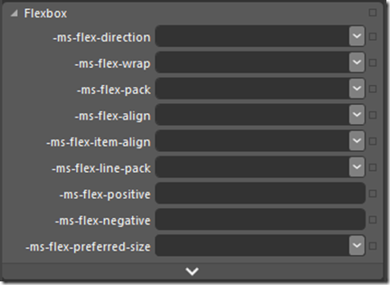
Additionally, the flexbox offers a lot of properties to specify how it’s children are laid out. A quick glance in Blend at the CSS properties on a div in the Flexbox category will enumerate them for you…

Notice first the -ms vendor specific prefix as I mentioned.
To give a thorough description of the possibilities with these properties, I’d be duplicating what’s already done quite nicely on the flexbox page on w3.org, so just go there and read the nitty, gritty detail.
Differences
The ViewBox is a WinJS control, whereas the flexbox is a CSS property.
The ViewBox always acts on a single child item, but the flexbox can act on multiple child items.
The ViewBox itself changes size to fit it’s container as a core feature. The flexbox can be told to scale to 100% either in width or height, but it doesn’t have to.
The ViewBox does not extend control over the alignment and scale modes of it’s contents, but always does the same thing - scales the child item without changing it’s proportion.
All Together Now
Now that you know how different these controls are, consider them together. If you put a flexbox div inside of a ViewBox, you get a really effective layout tool. Try this for your HTML…
<body> |
With this as the CSS…
.flexy { |
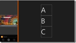
What you have now is a flexbox that fills its area well. Look at these simulator screenshots so you can see what this would look like…

[more images missing]
XAML is unarguably the most powerful layout engine I’ve ever seen, but I really don’t feel like there’s too much in HTML/CSS that we’re missing now with additions like this. It’s rather empowering.
Happy layouts!