OSCON 2014 in the Rearview Mirror
At OSCON this year, Olivier Bloch and I declare Portland to be the open source capital of the world, and while our declaration might not be official, it certainly makes sense.
The breadth of innovation represented in the exhibit hall is both impressive and inspiring.
In this special edition of CodeChat, I have a good chat with Olivier Bloch from Microsoft Open Technologies about the variety of ways that Microsoft collaborates with open source software and some exciting topics in the area of IoT. Enjoy.
Introducing CodeChat
I’m starting a new venture and I’m announcing it now.
It’s been on my mind for some time and I’m finally going to make it happen.
It’s called CodeChat and it’s a casual, weekly conversation about code and the myriad of periphery topics that may be of interest to developers. Chats will be targeted at 30 minutes, but who knows. They may be 15 minutes or 40.

The first episode will air on July 7, 2014 and new episodes will be released every Monday morning until the demise of the universe.
CodeChat will be broadcast via Channel 9 which will allow me to distribute it in various formats simultaneously. I, for one, listen to a lot of podcasts and never want to be limited to audio or video. If I’m driving or jogging, the video is pointless, but when I’m just sitting around it’s great to have a video feed for a more immersive experience.
I hope you’ll get some value out of the discussions I have with Microsoft employees, community developers, and whoever else I decide to bring on the show.
The Semantics of HTML and XAML
I had a question from a developer in my community and I decided to respond via a blog post.
I have taken liberty to distill and rephrase the question as follows…
HTML is less verbose than XAML, but it’s often times harder to figure out what’s going on with a bunch of div’s on the page. How do you determine by looking at your HTML what’s going on with the styling? Shouldn’t it be more like XAML - easy to read?
What we’re talking about here fundamentally is called semantics.
Let’s dig in.
Readable UI Code
We’re developers. We write code for a living. The designers of the coding languages we use have to strike a fine balance. The code has to be read by computers and humans, and I’m not sure if you’re aware, but the two are more different than they are alike.
These days, compiler technology has advanced to the point where we’re able to make almost any code understandable by computer, so we’re left with the bigger challenge - the human.
A developer should not just be able to read and write the code. He should enjoy it. He should feel as though, even if the language hardly resembles his spoken language, that it is still an expression and extension of his thoughts and the implementation of his logic.
Occasionally, we write user interface code and we target eye balls. With UI, the attempt to is show something that a user can quickly understand and interact with. Its importance can hardly be overstated. Actually, in light of world affairs, I can’t exactly call it critical, but in determining the degree to which users enjoy a platform or enjoy using your app, it certainly is.
Other times, the code we write simply targets results. That web service operation comes back with an answer. That’s all. As long as it comes up with the right answer, we couldn’t care less how it does it.
In this article, I’m going to focus on UI code.
HTML
The UI language of the web is HTML. It has been for a couple of decades. Talk about ubiquity! Pretty much every device in existence has the ready capability of interpreting HTML (most often, obviously, it’s the browser).
For apps, there’s not nearly so much ubiquity. The UI language of most devices is proprietary. Generally, they’re more powerful than earlier versions of HTML, but pretty much on par with HTML5.
XAML
Such is the case with XAML. XAML is the UI language of Windows platforms.
XAML looks somewhat like HTML with all kinds of anglies (<>) everywhere, and the analogy is a direct one. In both cases, what we’re trying to accomplish is to instantiate (or declare) an interface. We’re not trying to implement any business logic.
Two Reasons for the Readability
As I see it, there are two main reasons that XAML tends to be easier to read. The first is the language itself. The second is the tendency for developers to conjoin element instantiation with layout and styling. Let’s discuss both of these…
XAML is More Semantic
As I mentioned earlier, HTML is over 20 years old, while XAML is less than 10. Plus, HTML has evolved with the help of a vast community of individuals and organizations, while XAML has been directed by a single organization with input from developers.
Consequently, HTML has been a semantic disaster. The UI elements defined by HTML have evolved along with the overall function of HTML. HTML was originally designed to mark up documents and give them some presentation meaning - think bold text, block quotes, borders, etc. HTML is presently chartered with providing full-fledged application UI capabilities.
So, in HTML, you have often seen the same element (the div) used for many nested levels of generic containers.
Recently, HTML5 has added tags to improve its semantics, but few of them actually indicate the layout or style of elements in the document.
Separation of Instantiation and Styling
An now for the second major reason that that XAML tends to be easier to read than HTML.
When we define UI, we’re doing two things essentially - we’re creating UI elements and then we’re laying them out and styling them.
In HTML, the role of instantiating elements is usually separate from the role of laying them out and styling them. The HTML does the instantiating and the CSS does the layout and style.
A typical XAML document, on the other hand includes both roles. It’s certainly possible and usually recommend as good practice to separate styles, but more often they are all done in the same file.
An Example
Look at the HTML and XAML in the following simple example. Both do approximately the same thing. They render 3 boxes side by side across the page next to one another.
|
HTML XAML |
In this example, it’s easy to see the difference between the languages.
The HTML is using a div with div’s, and a div does not elude to its graphical intent. In other words, it does not convey layout, but only structure and containment.
From the HTML, we can tell that we have a container that has three child containers, and that’s all we can tell.
The XAML, on the other hand, conveys quite a bit of layout as well as structure. In it, we can tell that we’re going to have a horizontal arrangement of size 100 boxes.
As I mentioned already, a person can pull the styling out of a XAML document to create a separation. Likewise, one can add the styling in to an HTML file. It’s not as easy or elegant with XAML to create a divide, and it’s not as easy or elegant with HTML to join them. It’s a difference in the nature of the languages.
Implications
We’ve established something about the difference in nature between HTML and XAML, so where does that leave us?
I think that leaves us with two impressive UI languages that are each suited to assist with different scenarios and different developer preferences.
HTML is better at…
- creating a UI that works just about anywhere
- creating a responsive UI that adapts to various display conditions
- providing concise, generic UI syntax that can adapt and specifies no display characteristics explicitly
XAML is better at…
- bringing the next developer to look at your code up to speed quickly
- solid, pixel perfect, and predictable control over layout
- practically unlimited possibilities for importing custom doohickies, gadgets, and thingies
Conclusion
So, is XAML more semantic than HTML? Yes.
Why? Because that’s the way it’s been designed and the way it’s evolved.
Is it possible to express HTML as semantically as XAML? Not quite. It’s possible to embed styling into HTML and make it more verbose, but it is fundamentally less semantic.
Are HTML’s semantic deficiencies a bad thing? Maybe. XAML fans certainly get a lot of enjoyment ridiculing it, but it has its advantages - mainly in its ability to separate style and maintain a generic document structure.
Hope that helps. Thanks for listening.
App States and Activation Kinds
Process Lifetime Management (PLM) is also known as the Application Lifecycle, but don’t confuse it with Product Lifecycle Management (also PLM) or with the general Application Lifecycle Management (ALM).
By Microsoft’s conventional definitions and in the best of my understanding, Process Lifetime Management and Application Lifecycle are one and the same, are defined (for Windows 8) here, and are defined as such…
This topic describes the lifecycle of an app, from the time it is deployed through its removal. By suspending and resuming your app appropriately, you ensure that your customer has the best possible experience with your app.
The means by which an app developer considers and targets the lifecycle of an app is well documented on the above page and in a few other blogs I found with some easy searching, so let’s consider that outside the scope of this quick study.
I’d just like to define some terms and share a little utility I made to help you understand what’s happening and when. Emphasis on the word little please.
The application’s state is one of three logical values: Running, Not Running, or Suspended. That’s easy. And the values are easy to understand when you look at this diagram…
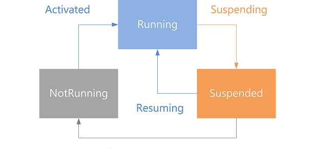
But the actual states that an app can be in are actually enumerated (in JavaScript) in the ApplicationExecutionState object as notRunning, running, suspended, terminated, and closedByUser.
When you’re writing code for your app - even in the onactivated function that lives by default in the default.js file of your project - the value of the app’s state isn’t all that helpful, since it will always be running.
But what you might be interested in is the applications state the last time the app was running - you know, before it got activated. And that’s available in the onactivated function under args.detail.previousExecutionState. You might need to know this to, for instance, determine that Windows had to terminate the app due to resource constraints.
The other value you’ll be interested in when your app gets activated is the activation kind. The activation kind is the means by which this app was launched. At first, you might wonder how an app can be launched besides you touching the app tile on the start screen. There are a myriad of ways though let me assure you. In Windows 8.1, there are 23.
In the simple case, your app was launched by the user, so the value of the args.detail.kind variable is simple launch (actually it’s the integer value of the Windows.ApplicationModel.Activation.ActivationKind enumeration), but the user may also have executed a protocol handler that is registered to your app (protocol), opened a file whose type is registered to your app (file), launched your app via Cortana (voiceCommand), or one of 19 more.
And now the little utility.
LifeCycleState is on github at github.com/codefoster/LifeCycleState.
Run it and it simply shows the previous app state and the means by which the app was launched. Something like…
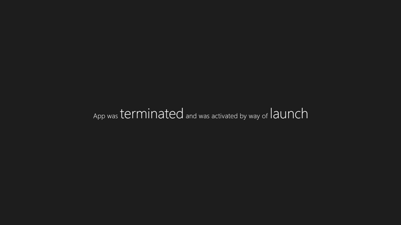
Hopefully it’s helpful for understanding the different states and activations kinds there are and when or how you trigger them. Run it through a few scenarios such as opening the app. Try switching to another and then back (activation does not occur). Try using various means of closing the app (ALT + F4, swipe from the top, swipe from the top and hold at the bottom of the screen until the tile flips, mouse click the X in the top right, etc.). Also, don’t forget about the Lifecycle Events that you can trigger using Visual Studio. Look for this button…

There you have it.
The Why and How of DreamSpark
Microsoft enjoys giving software away to students. It’s obviously in everyone’s best interest. Students get cutting edge technology and Microsoft gets young and hypercreative minds helping to shape the course of innovation for years to come.
If you are a student, signing up for DreamSpark is a no brainer. I can’t think of a reason not to. The DreamSpark website is pretty simple, but my colleage Bret Stateham created a slide show to make it just that much easier, or if you’d rather watch a very extensive video demonstration of this process as well as the process of getting a Windows Store developer account, check out Bret’s YouTube video. And if you want to watch a 4 minute video of me actually signing up.
Once you’re in the program, download some development software, then check out Microsoft Virtual Academy and get started writing curly braces. Writing code is a blast and may just help supplement your income while you work on that art history degree :)
How to Take a Nap
A what?!
“codefoster, I thought you were all about productivity and being effective and efficient in a development career… being a valuable and highly contributing part of a workgroup. So what’s this about taking naps?”
Yeah, that’s what I’m all about. I get inspired by the folks that get books (emphasis on the plural) out the door, blog like maniacs, have numerous libraries on GitHub, put together informative and inspiring presentations, and do all of that without a single sacrifice to the higher calling of loving their family well and still relaxing and playing and exploring. Let’s face it, there’s a lot of loving to do and a lot of world to explore. I want to be that guy. I call it effective.
So, I get jazzed about the idea of getting twice as much done in a given day. I obviously shed hours when I can, but I work hard to shed minutes too, because last time I checked, 60 of them add up to an hour. In fact, if I discover that a tool like ReSharper by JetBrains can save me seconds, I’ll plug that into my life too.
So back to the nap.

I think a person should be spent at the end of the day. Don’t desire to get through your life with as much ease as possible. If I compare my laziest and least productive days with my best - if I compare how I feel at the end, it’s quite easy to see. Our brains and bodies are meant to be used. If I use them up and am then very deliberate about recovery, I see a marked difference. It’s like the batteries I used to use on my sail boat. Deep cycle batteries hate being tapped 10% and then filled up. They much prefer having most of the life drained out of them and then going through a strong, full recharging cycle.
So, often times after spending time on my first priority - my family - in the evening, I’ll retire to my office for a late night working session. A few isolated hours of concentrated work usually see me landing my head on the pillow around 1-2:00 AM with an exhausted yet excellent feeling of accomplishment.
But the next day, I might need a power nap.
In my opinion, a power nap is the only way to go during the work week. Who has time for a full-blown 2 hour sleep session?! Those are for Sunday afternoon… maybe.
A power nap by my definition is 20 minutes long. I’m far from an expert on the topic, but based on some research and experience, 20 minutes is just enough time and not too much. Here are some things that I’ve found helpful…
- Make it happen. The hardest part is making the time. 20 minutes is not hard to carve out of the day, but there’s always something else on the mind or on the task list to keep you from starting. I consider it a major fail when I know I need the snooze and choose to work instead. There’s nothing I can do in 20 minutes time that is as productive as the nap.
- Time a boost. Have a short, single shot of coffee just before going to sleep. It will take some time to kick in and that will be about the time you’re getting up. This works well for me as long as I’m not trying to prop the day up with shot after shot of caffeine. A first or second cup of the day just before a power nap is effective. A fifth cup just before is masochistic.
- Think about black. It’s hard to block out all of the happenings of the day, that bug you haven’t figured out yet, that task you just thought of and need to writ edown. That’s hard to do. But you have to do it. Just keep reminding yourself that this nap is the most productive decision you can make… and make it. I like to think about black. Just a dark room and the blackness of it. It’s not an inspiring thought, and that’s the point.
- 25 min. Set your alarm for 25 minutes. You need a little time to off ramp and fall asleep. I suppose this might need to be adjusted for some folks, but don’t add too much time and give yourself room and permission to keep your mind spinning. You have to get practiced at turning it off.
- A distant alarm. Put your alarm across the room and make it loud enough to get you out of your slumber quickly. An abrupt transition from sleep land to work land is best.
- Illegalize snooze. If you snooze even once, you’re a goner. That’s why keeping your alarm close to you is dangerous. I am no longer tempted to snooze actually. I know all too well that however alluring it might, the snooze button wants to destory me.
That’s all I have for now.
I hope you’re effective and efficient. Happy napping.
Don't Make Your App Boil the Ocean!
I you haven’t dived into the app marketplace, what are you waiting for?
If Flappy Birds can bring in so much attention and cold, hard cash, who’s to say you can’t crank an app out in a weekend and be a contender.
I’ll give you one simple tip in this blog post. One tiny tidbit of information that just might spell the difference between you getting an app out the door and not.
I’m not going to advise that you take a certain course or watch a few hours of online video or go back to school or hire a marketer or a business manager. It’s much simpler than that and cheaper too.
Make a simple app.
Reduce the scope.
If you reduce the scope of your project to something simple you will be doing yourself and likely your potential users a favor. Your app doesn’t have to boil the ocean. It doesn’t have to do everything. Some apps do everything in the world, but they’re run by big teams and developed over long periods of time. They’re not usually done in free evenings and weekends. And despite this fact, they might not make as much money as some runaway success apps.
Don’t be a perfectionist.
If your app has a glitch, someone will find it. If you’ve provided support information (which you should), then someone will let you know. You’ll fix it. Your users will feel like they’re using a dynamic app from an attentive developer and they’ll be more apt to use your stuff. Nobody is expecting your app to be perfect and polished right out of the shoot - unless you’re Facebook or Vine or something.
Follow up.
Don’t fire and forget your app. Put it out there and then babysit it. Keep an eye on the downloads, the ratings, and the reviews. If nobody is talking then track some people down and ask them explicitly to try it and give you some feedback. Tell them you’re looking to improve it. If they have only good things to say and start using, then you’ve got a good product that you can market. If they don’t find it relevent or useful then shift to something else. If they find issues then fix them.
The nice thing about these apps as a form of modern, digital expression is that your artwork is alive and within reach. Unlike an oil painting it’s not out the door and out of reach. You get to iterate. It’s less like a bullet you fire and then pray hits its target, and more like a torpedo. Launching it is only the beginning. From there you get to track it, track your target, correct the course, and hopefully, eventually watch it go BOOM!
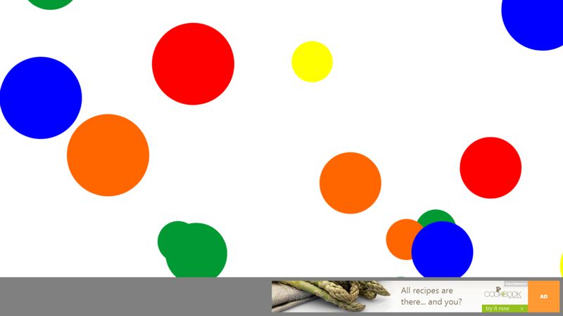
I just put an app in the Windows Store called KidSuite Pop. It’s about as simple as it gets, yet I know that there’s at least one user in the world that absolutely loves it. That’s because I made it specifically for him. My son is rather fond of spending free minutes popping virtual bubbles on the Surface while confidently calling out the colors - “RED” pop “BLUE” pop “YEDDOW!” pop
If this tyke finds it fun, I’m hoping a few other tiny fingers will open it and tiny eyes will ignore the ads while still earning me money for his college tuition.
KidSuite Pop in action…
8tracks for Windows 8
ME: Hi, Paul. Would you mind introducing yourself. Tell us where you work and what’s the most interesting thing you’re working on.

PT: My name is Paul Tidwell, I have been writing code as a hobby since I was 12. I currently work for Bungie, Inc where we are in the processes of bringing the world of “Destiny” to life. For fun, I am getting 8tracks ready for the Xbox 360.
ME: Okay, so what’s this 8tracks app you made? What’s the purpose of the app and was it your idea?
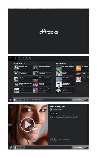
PT: 8tracks is a small company from San Francisco founded in 2006. It provides a streaming music service similar to how people think of Pandora or Spotify. 8tracks is different from those in at least one important way: its content is provided by its community of users. That is the users upload music from their own collection, organize it into a “mix” and then share it with the world. The clever folks at 8tracks figured out how to do this legally by making sure the artists are paid for their work and by following the rules set out in the Digital Millennium Copyright Act (DMCA).
I got involved with 8tracks when I was looking for a first project to do on Windows Phone. I had been using 8tracks (from their website) as a source of music and music discovery, when I happened to noticed they offered a public API for accessing and playing back their music. When I tried it out on Windows Phone, it worked beautifully and my first Windows Phone app “Mixtapes” was born. Mixtapes was a moderately successful Windows Phone app and got the attention of the folks at 8tracks.
In early fall of 2012, 8tracks approached me and asked if I would be interested in developing their official Windows 8 app. I agreed.
ME: Did you have help with 8tracks or did you work alone?
PT: I worked with the lead designer at 8tracks who provided wireframes and mockups of how the app should look at work and I put it all together. The folks at 8tracks also helped me test the app.
ME: How long did the project take, and did it take more or less time than you expected?
PT: The project got started in December 2012 and was approved in the store by March 2013, so about three months for the first release. I have released a couple of updates including a port to Windows 8.1.
ME: Can you tell us about what technologies you used? Did you write the app in C#? Did you use any significant libraries?
PT: I used Visual Studio 2012 Ultimate (although Express would have worked too), TFS online (visualstudio.com) which, by the way, is an amazing resource. The app is written using XAML and C#. I didn’t really use any major libraries except for a small wrapper around Google analytics making it accessible from C#.
ME: What were the biggest obstacles you had to overcome making this app?
PT: The biggest obstacle was my limited knowledge of XAML. At some point I ended up buying a big thick book on WPF which I read cover to cover. This helped me understand important concepts like Dependency Properties and Routed Events that I had been using by mimicking example code but never really understanding. This knowledge helped me debug issues and write better controls.
ME: What advice would you give an app developer starting out on his first app today?
PT: Make sure you understand your app lifecycle (suspend, terminate, resume, etc) early on. Don’t save it for last. Your project will be smoother if you consider and test these scenarios from the very start. The new async pattern that Windows 8 embraces is really beautiful, but it can also bite you when you least expect it. Users can, for example, navigate away from a page waiting for an async operation to complete, and when the operation resumes, surprising things (like crashes) can happen because the state of the app has changed.
ME: Thank you very much for sharing your experience with us today, Paul. On a personal note, I use 8tracks most every day. I do like the built in Xbox Music app for playing music from my own library, but when I am looking for some new music to match my mood, I go straight to 8tracks. Good luck, Paul, on your future coding endeavors.
Why Azure is Running the Sochi Olympics and Not AWS
Not so many people decided to travel to Sochi, Russia to attend the 2014 Winter Olympics. I’m not surprised. Who wants to go to Russia this time of year? Actually, I do, but not to Sochi. Especially when I can watch the Olympic events from any and every screen I own.
The streaming of this world event is backed by Microsoft’s Azure cloud servers - 10,000 of them cores to be exact. You might wonder why it’s Azure that’s backing this and not AWS.
I’m sure there are a number of reasons that I don’t have any visibility to, but one reason is that Azure is more than just a cloud containment system. That’s my term. Let me throw out another one. Azure is a cloud containment and intelligent content system. I love making up terms.
What I mean is that Azure does not, like AWS, stop at creating highly commoditized and ultra low-cost servers in the cloud. It does do that - in fact, Azure matches AWS’s price, so you can’t save money using AWS. But it doesn’t stop there. Azure offers a myriad of services on this platform.
Let me draw an analogy. AWS is like a deliver fleet of trucks. You hire them for the space and the engines that deliver your goods. Azure is a fleet of trucks with customized features - trucks with refrigerator units, trucks with tankers specially sanitized for carrying potable milk, trucks with concrete mixers, and trucks with that meet the Defense Departments security standards.
It’s perhaps a bit like this.
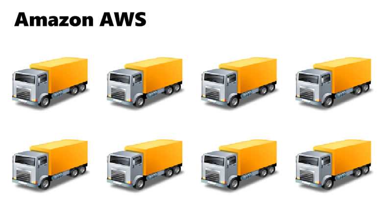
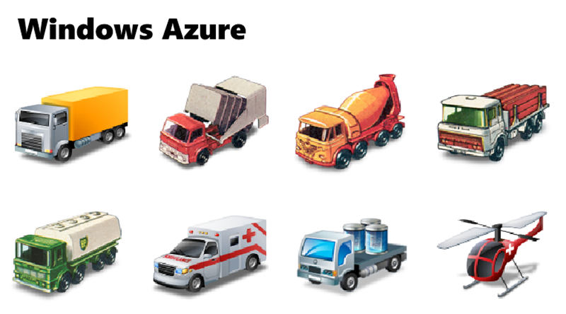
I’m not sure how the helicopter fits with the analogy except just to add a little bit of awesome.
Microsoft created Azure’s media services originally for the 2002 2012 Olympic Games in Salt Lake City London, and they put all of that work into the now highly (and economically) available Azure Media Services. That means that all of the platforms capability is available not only for the Olympic Games, but also for your company’s massive project or your personal app.
To be clear and fair, AWS is not actually devoid of PaaS offerings. It’s been ramping up on it’s PaaS offerings over the last two years through some innovations and some creative acquisitions. I think it’s clear to everyone in this space that the future is rich with opportunity for our tasks to be served easily and efficiently from cloud services, and we all look forward to the abolition of unnecessary workloads such as server maintenance without the sacrifice of performance or feature sets.
Head on over to windowsazure.com and sign up for a free trial and see how easy it is to create a Media Service or any other kind of truck you need today.
What's Microsoft Doing for Students?
Like the rest of the world, computer science is on a steep transformation curve!
If you’re like me and you’ve been doing this for a while, then think for a second about the technological delta across the first 75% of your life and that of the last 25%.
For me, the first 75% of my life was 1975 to 2003.
In 1975…
…gas was 44 cents a gallon, cars cost an average of $4k, and homes cost $40k. The Altair 8800 was born and Gates and Allen were writing BASIC on it. The Microsoft brand was born as a registered trademark, the big VHS vs Betamax battle was brewing, and the Cray-1 - the first commercially developed supercomputer - was available for the biggest computing tasks.
Jump ahead to 2003 and…
…gas is up to $1.83 and homes are up to $246k. Now, not only is 99% of the human genome mapped, but it seems like everyone has a personal computer and a personal cell phone. Processor speeds are fulfilling Moore’s Law and the Intel chips are everywhere. Everything’s bigger and faster than it was 28 years before, but the digital concepts and paradigms are largely unchanged… it’s basically just more of the same.
How about 2003 to today?
Now look at the delta between 2003 and today - 2013. Not only are things faster and smarter, but we don’t even do things the same way. Our data is in the cloud, and we can assume it will follow us to whatever device we happen to have in front of us. We know our technology knows our whereabouts, our heading, and every microscopic move we make. Everything is video recorded - everywhere. We’re printing things - actual things. And we’re seeing the introduction of autonomous robots that fly anywhere carrying the extent of our modern technology onboard and maybe even carrying our Christmas presents.
Generations above mine still marvel at the technology as it’s released. My generation does not. You can only surprise a person so many times before change becomes his norm. And THAT is exactly the experience of today’s student. Change… steep change… is their norm.
Not only do today’s youth expect change, but they expect themselves to be creators of change. They don’t have so many decades-old paradigms constraining their creative minds. When I work in a classroom full of students, the ideas flow far more freely than they do in professional developer circles.
What about the students?
So my question today is… what is Microsoft doing for students. The answer is… embracing and enabling.
My group - Developer Platform Evangelism - works extensively with students from secondary to post-secondary. We visit classrooms in state schools, private schools, community college, and vocational schools. Through DreamSpark, Microsoft gives its software - its bread and butter - away to the future developers. Not only is it a way to introduce them to our tools and platforms, but it introduces them to a field that can be quite intimidating when you’re yet on the outside.
The computer science field that tends to be intimidating to outsiders is demystified when you install the tools and create your first hello world project. And, like high school math which seems so advanced when you look ahead, every concept simply builds on the another until you find youself making apps that matter.
I went spelunking in an effort to figure out what other programs exist for the benefit of students and here’s what I turned up.
MICROSOFT STUDENT. The microsoft.com/student portal is a gateway to all student offerings. It’s a good place to start. A student can figure out how to download free software, join the Imagine Cup program, pursue certifications, and a lot more. Students can even find discounts at the Microsoft Store.
FACEBOOK. A student pursuit would not be complete without a Facebook page. Even though recent reports show fewer students embracing the ubiquitous social software, there’s still a lot of action on Microsoft Student’s Facebook page.
TWITTER. Twitter is an exciting way to keep in close touch with the development community. Students shouldn’t hesitate following @ms_student on Twitter to get timely information on what Microsoft Student is saying and doing that affects them.
TEALS. TEALS (Technology Education And Literacy in Schools) is not a Microsoft program, but there are a lot of Microsoft employees involved in the TEALS program, visiting classrooms, and introducing students to the technology world. We’re especially tuned in female students that may feel otherwise steered away from involvement in STEM careers.
IMAGINE CUP. Imagine Cup is a massive and massively exciting program. Actually, this one is happening as I write this, and this year is an exciting one for the fact that the grand finale is happening right here in Redmond, WA for the first time ever. I’m participating as a judge and have already been through a couple of rounds of student project reviews.
MICROSOFT FOR EDUCATORS. We believe that Microsoft’s hardware and software best serve students in the classroom. The software is managable for the school, intuitive and familiar for teachers and students, and allows the use of the mounds of legacy education software running in harmony with modern apps. If you’re on the other side of the education equation - the teaching side - you should visit the Microsoft in Education page. There you’ll find resources, tips, and even discounts for enabling your classroom with awesome Microsoft technology.
BING. Everyone knows about Bing. Not everyone is using it yet, but classrooms are one place it really shines. Being completely ad free and G-rated, the platform is not only safe, but super powerful. The advantages to using Bing over Google in schools are big and you can see them all at bing.com/schools, but the clincher for me is that you can get a free Surface every month for using Bing!
If you’re a student, teacher, or admin in the Pacific Northwest and you want to engage with me directly, please feel free to follow me on Twitter @codefoster and let me know how I can help.