Snap to Your Tiles
Let’s say you have a bunch of tiles in your Windows 8 app.

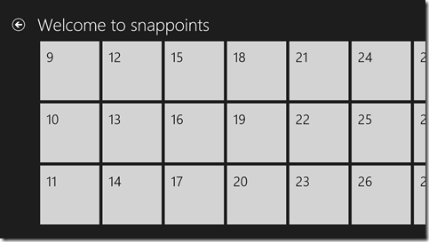
And the user grabs this list with their finger and pans some distance to the right. There’s a chance the list will end up landing in a position like this…

Notice that the tiles at left are cutoff. The list has panned some arbitrary distance and stopped where fate stopped it. I know it’s all scientific, but it’s fun to say that fate landed it here.
But what if you don’t want to put your app in fate’s fickle hands and would rather stop every time at a tile’s edge. That flick from my last example, then, should find you here…

…with the edge of tiles 9, 10, and 11 neatly lined up on your left margin.
Is that possible? Of course it is.
Is it easy? Yep. That too.
Once again, the custom CSS properties in Windows 8 come to the rescue. I’m going to talk about a couple of properties in the -ms-scroll* area. If you want a good list of the available properties, just type -ms-scroll in a CSS sheet and let IntelliSense be your guide.
We would implement this using snap points. Snap points are an IE concept. I don’t know if they’ve been suggested to the W3C for consideration in the CSS standard (I couldn’t find anything that indicated they have), but they should be because they’re super helpful.
If you have a container whose content exceeds the boundaries of the container, then scrolling is necessary to view all content, right? And when a user flicks with his finger, the contents scroll within the container and upon letting up his finger, the user watches his content scroll for a bit longer with some apparent inertia, right? Well, a snap point is a location in that content where it makes sense for that content to stop scrolling. You can define snap points in one of two ways: mandatory or proximity.
Defining a container to use mandatory snap points means that it will always stop at the nearest snap point. It will never stop somewhere in between. Defining it to use proximity snap points, however, means that if it ends up close enough to a snap point then it will find its way there, but if it’s not close enough then it will be fine with coming to rest between points.
Here’s the CSS you should add to achieve the above…
.snappoints #list .win-viewport { |
Let me break that down for you.
.snappoints is the name of my page, which in Windows 8 navigation apps automatically gets a class with your page’s name. So .snappoints essentially namespaces this CSS to this page.
#list is the ListView control on my HTML. I manually gave it the ID of list. BTW, I recently discovered that if you know you’re only going to have a single list on your page, it might be easier to forgo the naming of it and instead just refer to it with [data-win-control=WinJS.UI.ListView]. Nice, eh?
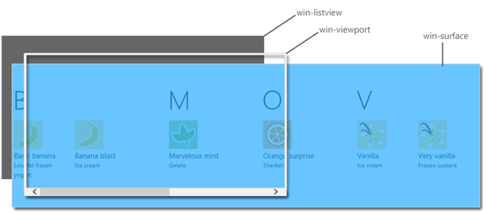
.win-viewport is the viewport of my ListView. If you work with the ListView much, and haven’t seen it already, you should definitely check out Styling the ListView and its itemsfrom the Dev Center. In that article, it breaks down the components of the ListView so you can have a shot at knowing how to style it. Here’s how it visually defines the win-viewport…

The first part of the property (mandatory) indicates that we are using mandatory snap points, so as I said before, we are assured of coming to rest on a snap point and never in between.
The second part of the property (snapInterval(0px,200px);) indicates that I want to start the content at the very beginning (0px) and I want a snap point every 200px. I have to know that my tiles are 200px wide to make this work. CSS is not actually recognizing a tile’s edge, just points every 200px.
I was a little bummed that I couldn’t find a way to indicate manually (with CSS properties on HTML elements I guess) where I want snap points to be and then just have the container recognize them, but this way works pretty well too.
That’s it. Happy snapping!