Posts tagged with "styles"
Microsoft's Vendor Specific CSS Prefixes
Much of my audience, I’ll presume, has at least some familiarity with CSS.
If you have none, then let me simply say that CSS is basically a big, flat list of style and layout properties that are grouped together into rules and determined to affect certain portions of an HTML document.
I like to draw the analogy to the classic word processor, because pretty much everyone has experience with a word processor. When you’re working on a letter to grandma and you want to emphasize that you don’t like nuts in your brownies, you might choose to bold that text, right? So you first select the important words and then you affect them with a bold command.
CSS works like that. You write selectors that identify certain parts of your UI and then you define properties and values that affect them.
Most of the available CSS properties are governed by a standards body - the W3C. They are a consortium of companies with a vested interest in web technologies that put their heads together and decide on the best way to do things. They decide things like “hey, let’s do away with the tag and use a tag instead because it’s more semantic”. All of the other smart guys in the room say “good idea!” and then they spend 18 months going through the paperwork to make the standard final. That’s a bit of exaggeration laced with cynicism perhaps, but it is frustrating sometimes that the W3C can’t turn the ship quicker. It’s a big ship. I’ll give them that.
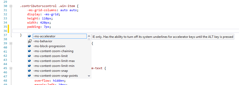
Once you’ve selected your target HTML elements with a well formed CSS selector, you go about choosing properties, and in Visual Studio that leaves you somewhere like this…

…that is, Intellisense gives you an enormous list of CSS properties. All of them. And it pretty much has to. There’s not really a way for the tooling to know which properties you might apply. More strongly typed UI frameworks define which properties can be applied to which UI elements, but in the world of HTML and CSS, you can apply anything to anything. It may not do anything or it may do something different, but you’re free to do it.
If you scroll to the top of that Intellisense list, you see this…

…that is, a bunch of properties that are prefixed with -ms-. That means that these are Microsoft specific properties. We actually call them vendor specific and the syntax (a dash, a vendor code, and another dash) is part of the standard, and it’s a good one in my opinion. It means that vendors will forever be free to do custom stuff and it will be readily apparent to everyone that it’s not necessarily part of the standard.
When you see a vendor specific prefix it means one of three things:
- the property is simply a feature or extension of a Microsoft product (usually Internet Explorer) and is not defined in the standard
- the property is part of a CSS spec that has not been run through all of its paperwork yet
- the property is part of a CSS spec that is final, but the feature is only partially implemented so far
I found it helpful to look through the many Microsoft vendor specific properties and see what they do. It gave me an idea of where IE is relative to the standards (it’s doing pretty good these days by the way) and also an idea of what I can do when I’m targeting an IE browser only (such as when I’m building a Windows app using JavaScript). I’d like to enumerate them for you, because they aren’t necessarily easy to find. My first search brought properties compatible with Windows Mobile 6.5. Oops!
Here’s the complete list as of today with links to documentation. Do keep in mind that the list is rather time-sensitive and very subject to change. Also, know that some of these are not required for later versions of Internet Explorer, but are still supported for backward compatibility.
- -ms-accelerator
- -ms-behavior
- -ms-block-progression
- -ms-content-zoom-chaining
- -ms-content-zooming
- -ms-content-zoom-limit
- -ms-content-zoom-limit-max
- -ms-content-zoom-limit-min
- -ms-content-zoom-snap
- -ms-content-zoom-snap-points
- -ms-content-zoom-snap-type
- -ms-content-zooming
- -ms-filter
- -ms-flow-from
- -ms-flow-into
- -ms-grid-column
- -ms-grid-column-align
- -ms-grid-columns
- -ms-grid-column-span
- -ms-grid-layer
- -ms-grid-row
- -ms-grid-row-align
- -ms-grid-rows
- -ms-grid-row-span
- -ms-high-contrast-adjust
- -ms-hyphenate-limit-chars
- -ms-hyphenate-limit-lines
- -ms-hyphenate-limit-zone
- -ms-hyphens
- -ms-ime-mode
- -ms-interpolation-mode
- -ms-layout-grid
- -ms-layout-grid-char
- -ms-layout-grid-line
- -ms-layout-grid-mode
- -ms-layout-grid-type
- -ms-line-break
- -ms-overflow-style
- -ms-perspective
- -ms-perspective-origin
- -ms-perspective-origin-x
- -ms-perspective-origin-y
- -ms-progress-appearance
- -ms-scrollbar-3dlight-color
- -ms-scrollbar-arrow-color
- -ms-scrollbar-base-color
- -ms-scrollbar-darkshadow-color
- -ms-scrollbar-face-color
- -ms-scrollbar-highlight-color
- -ms-scrollbar-shadow-color
- -ms-scrollbar-track-color
- -ms-scroll-chaining
- -ms-scroll-limit
- -ms-scroll-limit-x-max
- -ms-scroll-limit-x-min
- -ms-scroll-limit-y-max
- -ms-scroll-limit-y-min
- -ms-scroll-rails
- -ms-scroll-snap-points-x
- -ms-scroll-snap-points-y
- -ms-scroll-snap-type
- -ms-scroll-snap-x
- -ms-scroll-snap-y
- -ms-scroll-translation
- -ms-text-align-last
- -ms-text-autospace
- -ms-text-justify
- -ms-text-kashida-space
- -ms-text-overflow
- -ms-text-size-adjust
- -ms-text-underline-position
- -ms-touch-action
- -ms-touch-select
- -ms-transform
- -ms-transform-origin
- -ms-transform-origin-x
- -ms-transform-origin-y
- -ms-transform-origin-z
- -ms-user-select
- -ms-word-break
- -ms-word-wrap
- -ms-wrap-flow
- -ms-wrap-margin
- -ms-wrap-through
- -ms-writing-mode
- -ms-zoom
- -ms-zoom-animation
Box Sizing
Don’t miss the box-sizing property in CSS. It’s important. I’ll tell you why.
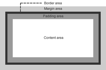
Let me start by showing you a diagram of the HTML box model.

Let’s talk about a div, for example. If you create a div and then use CSS to assign some margin, a border, and some padding as well as the content that you include within the div element, you would end up with something that looks like the image above. Most people with some HTML and CSS experience are very familiar with this.
When you set the size (width or height) of that div using CSS, the size values that you specify apply in an… um… interesting way. The size values apply to the content area. That’s a little bizarre, because in real life (the one we’re all familiar with) when we talk about the size of a box of stuff, we are talking about the size of the outside of the box.
This is a problem because if you want to set an element to the width of the screen and you use width:100%, even that 100% does not include the padding, border, and margin, so if you have any of those then your box will run off the edge of the screen.
You can change this behavior though with a simple CSS property. If you set box-sizing to border-box (instead of the default content-box), then the same value of 100% for your div’s width will now include the border and padding. It will still not include the margin, by the way.
Hope that helps.