UI/UX
Acquiring Images Without Committing Plagiarism
The easiest way to find the image you’re looking for is a Bing/Google image search.
Did you know, though, that Bing and Google (and likely the other players) actually do their best to index the licenses associated with the images they crawl?
In a Google Images search, you perform a search and then hit Search Tools and then drop down the Usage Rights. As to why Google gives us astronaut Neapolitan and strawberry waffles… well, I can’t speak to that, but I’m sure those algorithms are really hard to write so we should have grace.

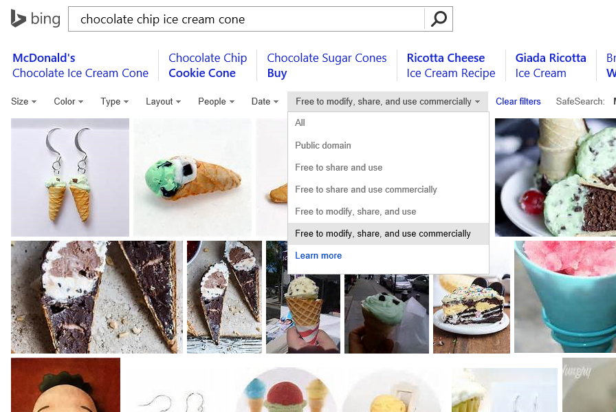
In a Bing Images search, you perform your search and then drop down the License list.

In either case, your search results are going to be severely limited, but you’re going to be able to sleep well at night knowing that you didn’t just rip an image off of someone’s site without a second thought only to reproduce it on your own and in the process breaking the law, ruining your name, and on and on.
I would imagine that this sort of search filter is highly dependent on the presence of some good metadata, so in order to be on the safe side, I still recommend you click through to the site where the image was found and do the leg work to figure out if it’s really in the public domain.
Extending that Splash Screen
I’m hard at work updating codeShow for Windows 8.1. I could have simply migrated my code from Windows 8 and tweaked it here and there, but in typical fashion, I decided to start from scratch. The open source codeShow project is intended as an instrument of learning and that’s exactly what I end up doing as I work on it… learning.
Since the start of codeShow, the number of demos has continued to grow and the amount of time it takes to load up all of those demos when the app is launched has been increasing. It’s actually quite a lot of file fetching and parsing that has to happen, so it’s perfectly reasonable that it would take some time.
So I started to get a little annoyed that the hub page was showing up blank and then taking a couple of seconds to bring in the data. So I set out to fix it.
I knew the answer was to create an extended splash screen, but I had not yet taken the time to learn how this is done.
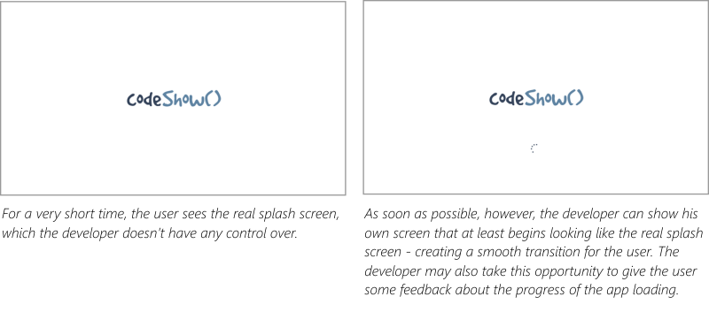
In case you’re not familiar, an extended splash screen is a technique for indicating to the user that some time is needed at the launch of the app. This is done by showing the app’s splash screen immediately after the app is loaded (so the user doesn’t even notice the transition), but adding progress indication of some kind. The real splash screen then only appears to the user for short time and then they begin to receive some feedback about how things are loading.

It’s ideal if you can get a user into your app right away, but if an essential element of your app (such as the demos in codeShow) are not available immediately, then the next best option is an extended splash screen.
The MSDN samples were helpful, but I felt a bit lost in the code. It seemed there was a lot of framework and superfluous code that may be necessary in a thorough study of a subject, but not necessarily for a simple and specific solution. So I set out to make the simplest extended splash screen solution that I could.
You can my entire solution in the codeShow project at codeshow.codeplex.com, and here it is…
First, I had to put a splash screen and progress indicator in my default.html file.
<div id="splash" class="hidden"> |
Then the positionSplashScreen function does most of the work. The function refers to the splash div by its id (notice that for the Trident engine that runs Windows 8 apps it’s not necessary to locate the element using getElementById). Then I query the args.detail.splashScreen to get it’s location and use that to set the location of my splash screen. Finally I set a margin for the progress indicator to get it where I want it.
function postitionSplashScreen(args) { |
And that’s almost all there is to it. If we stopped there, however, the splash screen would forever show and hide our beautiful hub page underneath.
So all we need to do is determine when all of the data that makes up the hub have finished loading and we can hide the splash screen. Here’s what that looks like…
Data.loaded |
The logic that I use to determine the Data.loaded variable (another Promise) is for another post entirely, but when it has been loaded, we simply add the “hidden” class to the class list of the splash screen and the whole thing disappears and reveals a completely loaded hub beneath.
That’s it for now. Hope it helps. Leave me a comment if you have any questions about this technique.
Cutting through the noise
As an application developer, you’re trying to communicate with your users in a sense. Not so much like an author is, though. An author can only communicate information, ideas, and the like, but an app developer can communicate behavior as well as information. You have the opportunity to make your users feel empowered as well as informed.
The app marketplace is wrought with noise, though. In an attempt to get their names out, developers are hurling junk into the marketplace and seeing if it will stick. Junk may stick, but not for long. Users need real value in order to download, use, and then even recommend and kindly review your app.
So how do you cut through the noise and get your message heard?
You do it by creating a unified message.
Huh?
A unified message is a clear message that only communicates one thing and does so very well. Very concisely.
Here’s the analogy I like to use.
Between your voice and your audience’s ear are air particles. Lots of them. Your attempt in communicating with your audience is to shake the air particles, so they cause vibrations in the ear drum of your hearer. Every one of the air particles is, however, doing its own shaking. Air particles above absolute zero are bouncing constantly, randomly, and violently off of each other and their container. This is the cause for air pressure and the reason your car is suspended a few inches off the ground.
So how does your message get through amid the noise? It does so because for each moment in time as you communicate, the air particles all have one thing in common. Each of them still fulfills the random and wild whims that heat demands, but all of them fulfill what your message determined.
And that’s what you must do with your app. Be certain that the function that your app performs is clear to the user, fulfill that function very well, and that’s all.
Remember that your goal is to delight the user. Have you seen the video of Alexander Gamme on YouTube. Alexander did a self-supported trek from the coast of Antarctica to the South Pole and back. Upon arriving at his first cache he was really hoping to find some food. I won’t spoil the rest.
I think that Mr. Gamme does a fine job of illustrating human delight. I don’t imagine I’ll ever create an app that is received with quite the same level of enthusiasm, but it’s a good bar to set.