App Images
There’s an array of images that you need to create before you can call your app complete.
Images to represent your app are very important, because they’re often the first thing a potential user sees and the first opportunity to convince them your app will add value to their day.
The best resource I know on the subject is Choosing your app images on MSDN.
On that page, you’ll find a table that enumerates all of the images you need to create including…
- The store logo is displayed in the details section of the app listing page, it’s base (100% scale) size is 50x50 and it’s actually going to show over a 70x70 square so there will be a 10 pixel border around it. Your BackgroundColor (which you specify in the manifest) is used for the color of that border.
- The square 150x150 logo is often the default tile on the start screen, though it is possible to designate a different size for your default tile.
- The square 30x30 logo does not end up showing as a tile on the start screen. Instead, this image is used in various other places in Windows when many apps are displayed as very small icons. You can see it by swiping up from the start screen and showing all apps, and you can also see it when you Alt + Tab to switch apps.
- The **wide 310x150 logo **is a start screen tile and is good for apps that need a little more room for live tile content. If your app has a wide tile then your users will have a chance to choose wide from the start screen.
- The **square 310x310 logo **is a mongo tile on the start screen. I use this when I have a very prominent app that has live content that I look at very often such as news or financial data.
- The **square 70x70 logo **is the small tile on the start screen. I use this when I don’t care about any live content coming down and only want a means of launching an app. I’m the guy whose start screen looks like graph paper :)
- The **badge logo **is what people see next to the badge notification on their lock screen (if they’ve elected for your app to be on their lock screen).
- Finally, the **splash screen **is the relatively large image that shows for a brief period while your app is being launched. You want to be careful to make this a good experience for the user. We don’t mind waiting a little for an app to start up, but we like to know what our system is doing.
Remember that for all of these images, you should provide all of the various scales. That means that for the square 150x150 tile, you should actually create and specify (in your manifest) a 120x120 (80%), a 150x150 (100%), a 210x210 (140%), and a 270x270 (180%). If you skip this, you miss out on a huge opportunity to make your app look great on various screen resolutions. Basically, don’t skip this :)
Additionally, you must have screenshots of your app in order to successfully submit it to the Store, and you should have promotional images in case your app is found to be worthy of promotion.
By the way, the screenshots that you provide must be taken from your actual running app, but the first one is different. For the first screenshot, you have a chance to create a marketing screen that really gives your app a visual punch and makes people want to download it. Again, if your app is chosen for promotion, this first screenshot is going to be used along with a 150x150 logo.
One Strong Case for Windows RT
Windows RT is that version of Windows that runs on low power ARM devices. I think for most people the pros and cons of this architecture are pretty clear already.

Usually the first upside argument is the significantly longer battery life it offers, and that’s certainly the case. Windows RT’s restricted architecture limits the processes that are running at any given point to only those modern apps that are designed to respect mobile users and their limited batteries. That’s a really great thing for users.
Besides the battery argument, however, I have another strong case for Windows RT that I’d like to share. By the way, I work at Microsoft, but I don’t have any influence on the teams that make these kinds of decisions, so I’ll just say that I hope that the Windows RT level or something like it sticks around. Here’s my case.
I have a friend that just installed a new shower for my wife and I. It’s a doozy too. Two shower heads and everything. Now we’re living in luxury.
This contractor friend of mine and his wife are… how to say nicely… far better with a tile saw than a computer. Computers aren’t their thing. At the same time, they run a small business and work with real estate, and so their job demands they spend a certain amount of time in front of a glowing screen.
We all know folks like these who spend 90% of their time in a browser, an email client, and the Office suite. And the other 10% of is spent waiting for the system to boot and launching the browser, email client, or Office suite.
These folks have a hard time getting work done anymore, because they’re overwhelmed with malware. Malware sucks, and there’s not really a good resolution. No matter what platform or browser is used, the consumer still wields the power to authorize the installation of malware. And if they don’t know any better, they will.
But malware is pretty much a moot point in the modern app ecosystem, and Windows RT devices are all but immune to it. The only code that can execute is built in or being executed out of an app package.
We’re dealing now with a whole new model for delivering code to people - it’s one where code is authorized and restricted. Code has to declare itself and its intent and it has to pass the test.
So, I recommend to my friend that they get a Windows RT device that performs the primary tasks (browser, email, and Office) brilliantly, but doesn’t offer any hope at all for the malware authors that would like to ruin their days.
This, in my opinion is a very strong case for this version of the OS.
I can put a Surface RT or some other Windows RT device in the hands of even my closest relatives and not expect support calls with complaints of malware. I’ll get support calls for other things I can be sure, but not for malware, and that is a big leap forward in my opinion.
Top 5 Things C# Developers Hate About JavaScript
We’re called coders. We’re called software developers. But despite what we’re called and despite our primary function of turning human logic and scenarios into ones and zeros, not everything we do in these roles comes down to a programming language. The soft skills, in fact, end up being massively importance. I could elaborate in a separate blog post (and just may) about the centrality of grammar skills, technical writing skills, communication skills, diplomacy skills, and so on. I’m tempted to call on Napolean Dynamite to elaborate on the importance of various skills, but none of his examples actually work toward my point, so I’ll refrain.
Nevertheless, a good portion of our roles does end up as code, and our choice of language ends up being a significant and quite personal matter.
My experience has been dominated by C# and JavaScript. I don’t really want to revisit the other languages. That’s what counselling is for. And I love both of these languages. My experience spanning the two has given me some perspective on those that tend toward either one camp or the other. Perhaps my observations on why C# developers might get a bit worked up about the prospect of having to spend some time on a JavaScript project will entertain or even inform. I wouldn’t count on it, but that’s always the goal.
LINQless
First and possibly foremost among the reasons is the fact that a move from C# to JavaScript finds a developer sharply aware of his lack of LINQ.
If you don’t know, LINQ (Language Integrated Queries) is this amazing set of extension methods that affect lists in C# and extend even to external collections of things or persistent data. After a relatively short onramp, LINQ developers find themselves expressing just what they want in terse and very readable code.
LINQ is a beautiful thing and the first time you type .First() on a JavaScript collection and language services tells you you’re crazy for expecting to just be able to just do that, you do feel a sudden urge to put resumes out.
Resolution
I’d be mean if I didn’t offer what I know as far as resolution to this pain, so I’ll try.
While I can’t say that JavaScript does in fact have LINQ and you only have to type a using statement at the top of your code file, I can say that there are a number of roundabouts that heal most of the pain.
First, many still don’t know that ECMAScript5 defines and JavaScript in pretty much every browser worth it’s salt and your time implements a set of array functions that map pretty well to the common array functions. The lambda syntax isn’t quite as elegant, but there’s ECMAScript6 and TypeScript to remedy that. Instead of .Select() you get .map(), Instead of .Where() you get .filter(), and you always get .forEach() even without casting to a List first.
Second, JavaScript’s amazing set of open source libraries comes to the rescue with a number of suggested solutions such as LINQ for JavaScript on Codeplex, Underscore.js, and likely about a thousand more.
Finally, there’s the fact that most of the LINQ functionality is actually drop dead simple and I for one end up implementing functions on my own just for that code warrior feeling it gives me.
The Inequality of Equality
C# folks come out of their skin when they see the === sign. They assume it’s a typo and pull over long before the end of the explanation for its existence.
This one actually bothers me quite a bit, because as I see it, it offers a small convenience but costs a lot of clarity. Seldom does the convenience of type coercion benefit me more than the hassle of spending the 3 or so brain cycles it takes to choose. I’ve been told to save the cycles and just use === every time, but I’m not sure I’m convinced.
Resolution
None. Just live with it.
Weaknesses of Weak Typing
When you write an app in C#, you have to explicitly include definitions for every little thing. If you need a Customer with facial hair, you also need a CustomerFacialHairTypeEnum and a CustomerFacialHairTypeEnum.Goatee value. Then a little way in, you end up having to write another class for a CustomerMapAttributeDifferentiatorFactoryGenerator or something like that. That’s what it feels like anyway when you write JavaScript for a week and then come back to a C# project.
But the result is veritable utopia of design-time tooling and near-iron-clad certainty that when your app builds, your app runs.
We don’t have this in JavaScript. In fact, JavaScript is practically defined by its lack of certainty, but if you give me a Customer I’ll give him a goatee in one short line. Then you ask me if my new object implements IFacialHairCustomer and I’ll just look blankly at you as if the answer is as unnecessary as the question.
Resolution
None necessary. No problem, no resolution.
Short Variables Names
JavaScript developers get used to such terse syntax and they just go crazy with it. You end up with…
var a = args.d.detail;
…and you end up with sleepless nights.
My personal rule on variable names in JavaScript is similar to my rule for variable names in C# actually. Use full, meaningful names, unless you’re inside a statement block brief enough to convey meaning better by way of its brevity.
In my opinion, the function…
customers.filter(function(c) { c.age > 21; })
loses more meaning than it gains when it’s expanded to…
customers.filter(function(customer) { customer.age > 21; })
Resolution
Stick to the same core philosophy with your JavaScript that surely you do with your C# - that is, think about the next guy that’s going to look at your code.
The Word Java
Finally, C# developers enjoy a few benefits of the language over Oracle’s Java, and the mere inclusion of the word Java in JavaScript is perhaps a deterrent.
As they say, however, Java is to JavaScript as Ham is to Hamburger, and the two have exactly 4 bytes in common and no more.
Resolution
Let go of nomenclature and get on with JavaScript
That’s all I’ll say on the matter. Thanks for listening.
10 Most Overused Tech Terms
Based on two laps around the exhibitor hall at OSCON and a couple of years working in the sometimes awkward space between marketing folks and developer folks, following is my list of the 10 most overused words in tech.
You’ll find these on a zillion websites, banners, and those spring up signs that people drag around in the airport. There’s probably a name for those, but I’m glad not to know what it is. If you know, don’t tell me.
It’s all an attempt to make an API or a service that has no material substance come to shape and life in the mind of a developer so that he’ll use it and love it and maybe make some contributions to the repo or pay some money for it.
And here they are…
- ninja. I have no idea how this expert in stealth, martial arts, and throwing stars came to represent the height of developer prowess, but it has… even though most developers wouldn’t be caught dead in black uni-suits or toe socks, and likely would be caught dead if they tried sneaking into the enemy’s lair under the cover of night.
- awesome. The term that attempts to capture that moment when a mortal lays eyes on a select sunset, a view of the milky way, or the power of God himself is reduced to describe the experience of successfully requesting a client record and retrieving his sales history.
- guru. One who knows everything about a religion becomes one who knows everything about his programming language.
- leverage. Sometimes the word use would work just fine, but for some reason we’re still compelled to leverage things.
- cloud. A list of clichés would not be complete without cloud. Never has a term risen so high so quickly. Hey, that sort of works! Do keep in mind that your cloud is actually on the ground. I’m just saying.
- stack. A choice of collaborating technologies building on top of one another. A stack. Got it. Yep, that describes it.
- bits. You’ve never seen a bit, but you talk about them all the time. Is that in the latest bits? Do you have access to the latest bits.
- mind blowing. Sometimes it does feel like that, but not often. I can recall on fewer fingers than has one hand the number of technologies that have felt like they blew my mind. And even then my mind remained literally unblown.
- real time. Even though most of the time it’s not true, it’s fun to say that your software runs in real time. The more honest claim near real time performance. What’s near? Within the hour?
- bacon. And making the list due entirely to the fact that I saw it used an entire 3 times in one exhibit hall… bacon. I love bacon for breakfast. Heck, I love bacon for lunch and dinner and dessert too. It feels like a cheap shot though to compare your API to bacon so I’ll love it. I’m still going to use your API though… since you said bacon. I do love bacon.
codeShow
codeShow is a app for learning to make apps. It’s very meta in that way. The whole project is an open source project with community contributions. Use it to learn the web platform and Windows app development.
You can download the app by visiting aka.ms/codeshowapp and you can find the source code at codeshow.codeplex.com.
Free Microsoft Oakley backpack
codefoster.com is entirely overhauled and with it my provider for blog commenting functionality.
I chose DISQUS and I’m pretty happy with it so far. It was very easy to plug in and gives me the basic commenting functionality that I’d like. I like the fact that many web users have used the system before and are already authenticated. I also like that comment threads can be tied to the page URL and are not tied into the content management software.
In an attempt to engage you, my readers, I’d like to offer an Oakley backpack like the one pictured below except it’s branded with the new Microsoft logo in gray.
To enter, either leave a comment below with your answer to the following question: What are the most important 3 items to carry in your day pack and have at the ready? or leave a comment on any other blog post on codefoster.com.
Unfortunately, I can only ship to the U.S., but if you’re overseas I’d still love to hear your answer.
I’ll pick a random winner this Friday the 25th and announce it in a comment and on Twitter.

Tapping Into Your Localized Resources Using JavaScript
Many developers (present parties included) are neglecting to take advantage of other cultures and are missing relatively easily earned revenue as a consequence.
Localizing your app by referencing resource strings is the first step and sets you up for easy translation to other languages. It’s simple enough to add your data-win-res in your HTML, but what about when you need to do the same thing from JavaScript?
There’s a quickstart on MSDN that will walk you all the way through the former, but if you run into a situation where you need to do the latter, you might find yourself in a pinch as there’s not nearly as much information online about it. It makes sense since it’s not an altogether common scenario.
The trick is to check out the Application Resources and Localization sample (also on MSDN) and look at scenario 11.
In it you’ll see that you can simply ask the ResourceManager for help. Let’s have a look in detail.
Create for yourself an empty Windows 8 blank app using JavaScript.
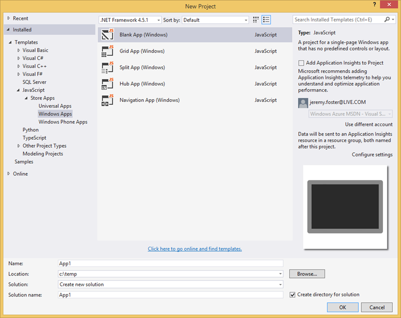
Now create a new folder called strings and in it a new folder with your culture name. Mine is en-US. If you don’t know the code for your culture name then you can look here. The table is very helpful if you speak English, but I wondered if MSDN has gone the extra mile and provided content in other languages.
A brief search turned up the  button at the bottom of the page, but switching it to
  only provides me with…

Meaning, unfortunately, that this content is not available in your language, so here’s English. Bummer.
…and later on…

Meaning, _was this page helpful? _Well, not actually if you only speak French, but c’est la vie.
And that right there is the nature of technical content on the web. Information changes at lightning speed and it’s a wonder any of us can keep up with our apps or our documentation in anything but our own language.
But I got us sidetracked and you likely know your culture code anyway.
You should now have a string folder and a culture folder and inside the culture folder you create a resource file using a right click | Add | New Item… > Resources File (.resjson). So you should have this…
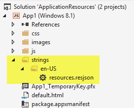
Open the resources.resjson file and you should see that it was prepopulated with…
{ |
Great. Now you have the resource string. The word greeting there is what you use as your resource string identifier, but it doesn’t get shown to the user. The user sees Hello World! because that’s the value of that string.
Now, as I mentioned, utilizing this from your HTML is quite straightforward. you just add an attribute to whatever element you want to suck it into. If you want it to populate a div, you would use…
<div data-win-res="{textContent: 'greeting'}"></div> |
In case you’re new to this, the data-win-res tag is so named for a few good reasons. The data- means it’s a valid HTML5 and will not trigger any syntax validators. The win- means it’s something provided by the WinJS library and makes it easier to distinguish from other libraries or from your own code. And the res obviously stands for resource, but you didn’t need me to tell you that.
Now comes the interesting part.
It may be that you are not laying this out so declaratively.
BTW, I can remember not knowing the difference between declarative code and a hole in a bucket, so I’m going to explain it here in case it helps.
There are two types of code (at least) as it pertains to UI. There’s declarative and imperative. Declarative code is the parts of your UI that exist because you explicitly wrote them into a UI description language like HTML, XAML, AXML, or whatever. Imperative code is the parts of your UI that come into being because you wrote code that told them to - usually based on some logic or action by the user.
If, for instance, you want to define a UI element that looks like a text box and prompts the user to enter their full name, you would likely be able to do that using declarative code. That likely means you’ll be writing HTML for it.
If, on the other hand, you need to get fancy with your UI and build it logically or if you need to ask the user something that you need to know before you can determine what kind of UI element to use, then you would likely be forced to use imperative code. It’s usually preferable to use declarative code when possible.
If, for instance, you need to figure out some information at runtime and use that to determine which string to use, then you need to load your resources imperatively. And I’m going to show you how.
Instead of tacking a data-win-res attribute on your div, simply give it an id attribute so you will be able to reference it from your JavaScript. Go ahead and do that in your default.html file replacing the existing <p>Content goes here</p>. Like this…
<div id="mydiv"></div> |
Now, if you created this project from the blank template, then you’ll find a js folder with a default.js file in it. Open that and add the following method…
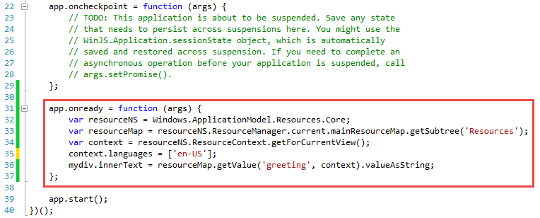
And that should work. Running the app (CTRL+F5) should result in a comforting Hello World in white text rendered on a black background.
Let me break down each of the five lines of that function, so you can see not only that it works but why.
Line 1: var resourceNS = Windows.ApplicationModel.Resources.Core;
This simply gives a shorter handle to the resources core which is built into the Windows application model. It’s a common practice to use this feature of JavaScript to shorten deeply embedded classes or even functions, and it does nothing more than keep your code shorter.
Line 2: var resourceMap = resourceNS.ResourceManager.current.mainResourceMap.getSubtree('Resources');
This is the first call to ResourceManager which handles the available resources in the current application. The getSubtree method is rather robust, but in this case it’s essentially allowing us to identify the file that our resources are in. In a large app, we may choose to separate our resources out topically for a better architecture.
Line 3: var context = resourceNS.ResourceContext.getForCurrentView();
The getForCurrentView method of the ResourceContext fetches the correct resource context for you. This is necessary because in Windows 8.1 resources can be customized for various scaling levels (which are determined by the screen resolution of the device your app is running on).
Line 4 (optional): context.languages = ['en-US'];
The fourth line is optional actually. If you don’t specify a language for the current context then your system’s current culture will be used. If you choose a language that you don’t have installed on the system then it will revert to whatever your system’s current culture is as well.
Line 5: mydiv.innerText = resourceMap.getValue('greeting', context).valueAsString;
Finally, you simply set the value of your UI element to the results of a call to the getValue method of your resource map.
That does it. Now, if you’re like me then you immediately start thinking about how you can wrap these 5 somewhat painful lines of code in a very elegant and semantic helper method to use anywhere within your app, and I’d say that’s a great idea.
Microsoft's Vendor Specific CSS Prefixes
Much of my audience, I’ll presume, has at least some familiarity with CSS.
If you have none, then let me simply say that CSS is basically a big, flat list of style and layout properties that are grouped together into rules and determined to affect certain portions of an HTML document.
I like to draw the analogy to the classic word processor, because pretty much everyone has experience with a word processor. When you’re working on a letter to grandma and you want to emphasize that you don’t like nuts in your brownies, you might choose to bold that text, right? So you first select the important words and then you affect them with a bold command.
CSS works like that. You write selectors that identify certain parts of your UI and then you define properties and values that affect them.
Most of the available CSS properties are governed by a standards body - the W3C. They are a consortium of companies with a vested interest in web technologies that put their heads together and decide on the best way to do things. They decide things like “hey, let’s do away with the tag and use a tag instead because it’s more semantic”. All of the other smart guys in the room say “good idea!” and then they spend 18 months going through the paperwork to make the standard final. That’s a bit of exaggeration laced with cynicism perhaps, but it is frustrating sometimes that the W3C can’t turn the ship quicker. It’s a big ship. I’ll give them that.
Once you’ve selected your target HTML elements with a well formed CSS selector, you go about choosing properties, and in Visual Studio that leaves you somewhere like this…

…that is, Intellisense gives you an enormous list of CSS properties. All of them. And it pretty much has to. There’s not really a way for the tooling to know which properties you might apply. More strongly typed UI frameworks define which properties can be applied to which UI elements, but in the world of HTML and CSS, you can apply anything to anything. It may not do anything or it may do something different, but you’re free to do it.
If you scroll to the top of that Intellisense list, you see this…
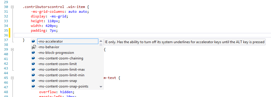
…that is, a bunch of properties that are prefixed with -ms-. That means that these are Microsoft specific properties. We actually call them vendor specific and the syntax (a dash, a vendor code, and another dash) is part of the standard, and it’s a good one in my opinion. It means that vendors will forever be free to do custom stuff and it will be readily apparent to everyone that it’s not necessarily part of the standard.
When you see a vendor specific prefix it means one of three things:
- the property is simply a feature or extension of a Microsoft product (usually Internet Explorer) and is not defined in the standard
- the property is part of a CSS spec that has not been run through all of its paperwork yet
- the property is part of a CSS spec that is final, but the feature is only partially implemented so far
I found it helpful to look through the many Microsoft vendor specific properties and see what they do. It gave me an idea of where IE is relative to the standards (it’s doing pretty good these days by the way) and also an idea of what I can do when I’m targeting an IE browser only (such as when I’m building a Windows app using JavaScript). I’d like to enumerate them for you, because they aren’t necessarily easy to find. My first search brought properties compatible with Windows Mobile 6.5. Oops!
Here’s the complete list as of today with links to documentation. Do keep in mind that the list is rather time-sensitive and very subject to change. Also, know that some of these are not required for later versions of Internet Explorer, but are still supported for backward compatibility.
- -ms-accelerator
- -ms-behavior
- -ms-block-progression
- -ms-content-zoom-chaining
- -ms-content-zooming
- -ms-content-zoom-limit
- -ms-content-zoom-limit-max
- -ms-content-zoom-limit-min
- -ms-content-zoom-snap
- -ms-content-zoom-snap-points
- -ms-content-zoom-snap-type
- -ms-content-zooming
- -ms-filter
- -ms-flow-from
- -ms-flow-into
- -ms-grid-column
- -ms-grid-column-align
- -ms-grid-columns
- -ms-grid-column-span
- -ms-grid-layer
- -ms-grid-row
- -ms-grid-row-align
- -ms-grid-rows
- -ms-grid-row-span
- -ms-high-contrast-adjust
- -ms-hyphenate-limit-chars
- -ms-hyphenate-limit-lines
- -ms-hyphenate-limit-zone
- -ms-hyphens
- -ms-ime-mode
- -ms-interpolation-mode
- -ms-layout-grid
- -ms-layout-grid-char
- -ms-layout-grid-line
- -ms-layout-grid-mode
- -ms-layout-grid-type
- -ms-line-break
- -ms-overflow-style
- -ms-perspective
- -ms-perspective-origin
- -ms-perspective-origin-x
- -ms-perspective-origin-y
- -ms-progress-appearance
- -ms-scrollbar-3dlight-color
- -ms-scrollbar-arrow-color
- -ms-scrollbar-base-color
- -ms-scrollbar-darkshadow-color
- -ms-scrollbar-face-color
- -ms-scrollbar-highlight-color
- -ms-scrollbar-shadow-color
- -ms-scrollbar-track-color
- -ms-scroll-chaining
- -ms-scroll-limit
- -ms-scroll-limit-x-max
- -ms-scroll-limit-x-min
- -ms-scroll-limit-y-max
- -ms-scroll-limit-y-min
- -ms-scroll-rails
- -ms-scroll-snap-points-x
- -ms-scroll-snap-points-y
- -ms-scroll-snap-type
- -ms-scroll-snap-x
- -ms-scroll-snap-y
- -ms-scroll-translation
- -ms-text-align-last
- -ms-text-autospace
- -ms-text-justify
- -ms-text-kashida-space
- -ms-text-overflow
- -ms-text-size-adjust
- -ms-text-underline-position
- -ms-touch-action
- -ms-touch-select
- -ms-transform
- -ms-transform-origin
- -ms-transform-origin-x
- -ms-transform-origin-y
- -ms-transform-origin-z
- -ms-user-select
- -ms-word-break
- -ms-word-wrap
- -ms-wrap-flow
- -ms-wrap-margin
- -ms-wrap-through
- -ms-writing-mode
- -ms-zoom
- -ms-zoom-animation
A Grand Voyage
I’m not far from setting sail in a 38’ boat for what promises to be an epic voyage by my standards. I have done plenty of sailing, but entirely within sight of land.
This last weekend, I took my family down to Westport, WA to have a look at the boat and meet some of the crew. All of the logistics are falling into place and one day in early August I’ll shove off, head offshore, and not stop until we reach San Diego. That’s about a 1200 mile trek. I won’t be tweeting or blogging during the voyage (except the scheduled stuff), but I will be taking plenty of GoPro footage which I’ll attempt to share.
Here’s to fair southerly winds!
That Was Good... This is Better
You’ll likely notice that codefoster.com looks a bit different. I put a shine on it, but I also put it up on blocks and did a complete engine swap.
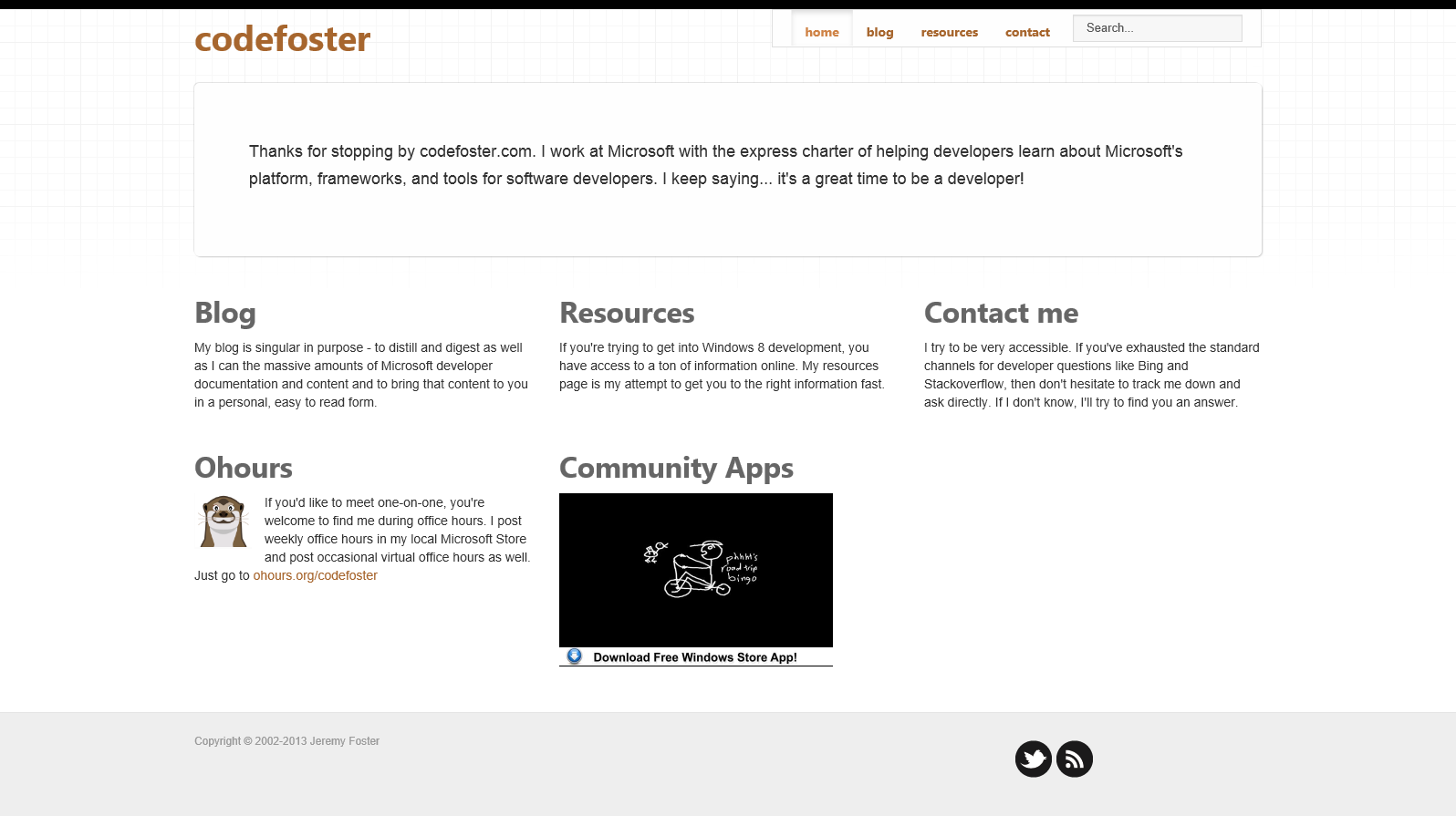
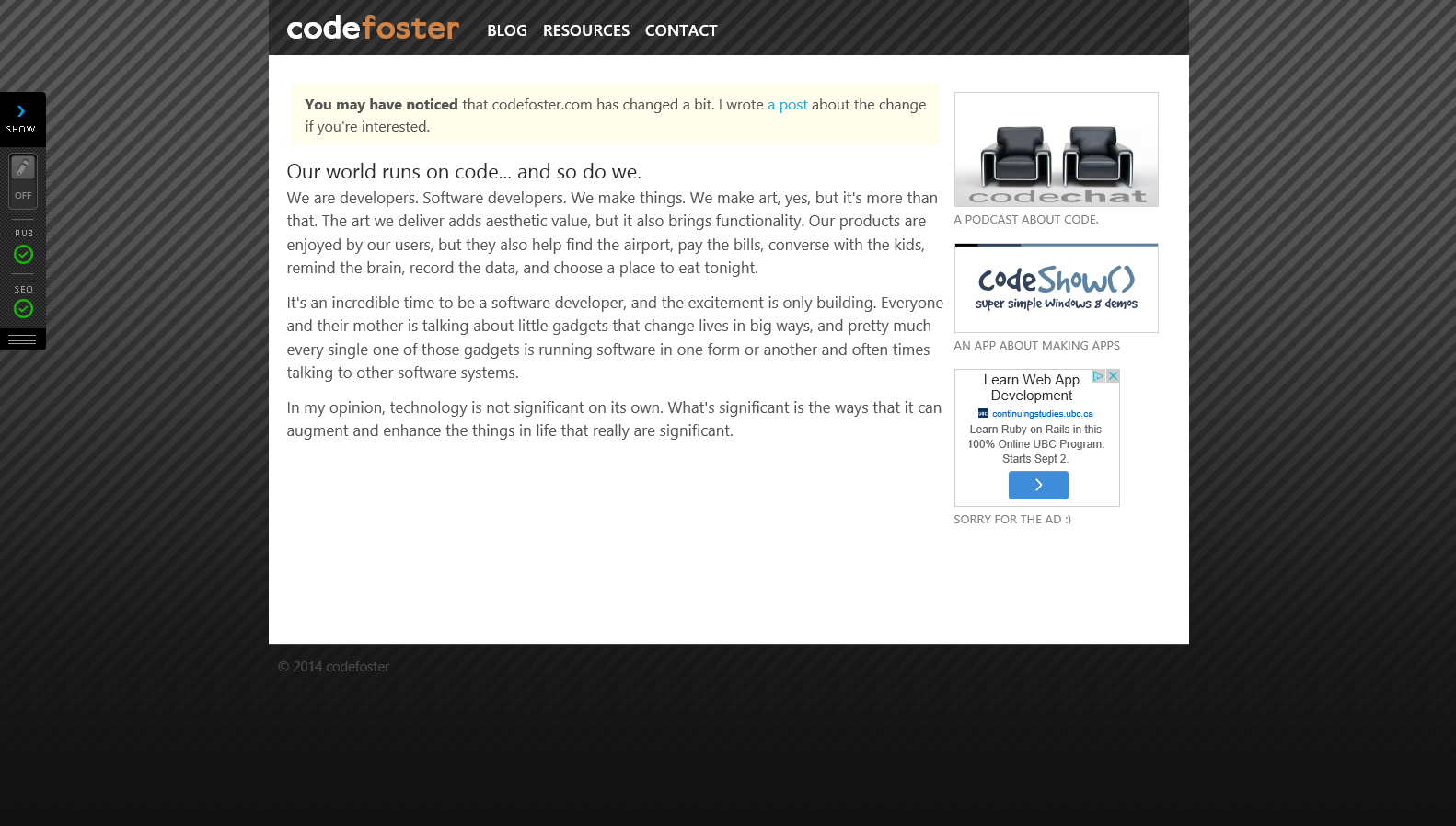
I don’t ask for much from my website besides elegance, ease, and expressibility. Whatever solution I implement, I want it to sort of fade into the background and let the real task of creating and consuming content stand out. Technology is cool, but not for its own sake. It is supposed to enhance what we do.
I started out using WordPress and was impressed with the fact that I could have a good looking blog up and running in approximately two and a half minutes. After a few posts, however, I started to feel like I was trapped in the platform and I didn’t like that feeling. It’s funny that even if it does the job just fine, I can still feel bound and begging to get out. Which I did.
I switched to BlogEngine.net and liked it just fine. It was a good step for me and it served my needs for some time, but it started to feel tired for my needs as well. I wondered if I was being the digital equivalent of a picky eater, but decided I didn’t care if I was and swapped it out too.
My next engine was Lemoon and I liked it just fine too. I changed hands and I didn’t like some of the admin portal UX, and finally have come to loathe TinyMCE. It makes me very, very sad.
And one day I was browsing through the CMS systems available in the Azure website gallery and found BetterCMS. It’s so easy to spin up a new Azure website that I decided to give it a shot.
And I love it. I have had to post a number of questions on the forums to get accustomed, but I’m feeling much more comfortable now thanks to their very quick turnaround with very helpful answers. There are a lot of things I like about the new system such as…
- a HTML editor based on codemirror (yay!)
- MVC/razor model
- crisp, clean, and simple (just what’s needed) admin portal
- ability to store files and images in Azure (or AWS had I chose) blog storage
- ability to Nuget deploy into an existing app
And there’s very little I don’t like. It doesn’t come with RSS/Atom syndication out of the box, but it didn’t take me long to write that. It also doesn’t support Windows Live Writer, but I stopped using that a long time ago in favor of OneNote. OneNote makes it simple to write my posts from any device and when it comes time to post it on my blog it’s easy peasy.
The best thing about BetterCMS, though, in my opinion is the level of control it gives you.
It works with two entities: pages and content. You define the page and then the admin interface let’s you add, edit, or rearrange content on it.
You get to create the pages by simply specifying a razor view in your project. That’s awesome. You can define content regions anywhere you want in the view and then BetterCMS will make those editable regions when you enter admin mode. That’s the holy grail of CMS systems as far as I’m concerned and this is the first time I’ve seen it in production.
I started writing a system that was actually quite similar (though not nearly as robust) as BetterCMS a long time ago. It was in the early days of ASP.NET. I called it Web Items and I made it because I was the webmaster at a decent sized company and was expected to handle the entire companies website - including content. I was quickly determined to get the task of creating content out of my inbox and into the hands of the content owners. If I’d only had BetterCMS then.
Now I have utter control over my site. That means that the little glitches that I’m sure you’ll find are on my. Only me. When you view it on an old version of Opera on your Android Crème Brule (was that an old version of Android) and it goes janky… that’s on me.
I’d like to own that for now though and I’d like to fix it. As long as you’re using a browser from this decade.
Thanks for reading codefoster.com and please let me know if you have any comments about the new system. And by all means, if you’re looking or a new CMS for yourself or your work, consider BetterCMS.
By the way, there are a couple of things that my old site was capable of that I’m still implementing for this one. One of those is search capability. For now, simply use your favorite search engine and precede your search with “codefoster” and you’re likely to find what you’re looking for.