Windowing in Windows 8.1
Windows (the OS) has always had windows - rectangular portals into an application that allow shrinking, expanding, moving, maximizing, minimizing, and whatever else. A window is a foundational element of many UI’s. It’s not right for every UI, but it’s great for many and is a part of many popular operating systems.
In Windows XP, I used a utility app called Resizer (I think that was the name) that allowed me to quickly relegate a window to a certain quadrant of the screen (upper right, for instance). It also showed the width and height in pixels of the selected window to allow for easier web development compatibility checking.
Windows 7, then, introduced some nifty windowing features obviating the need to install a third party app (for me anyway). In Windows 7, you could use WIN + LEFT/RIGHT to send a window to the left or right half of the screen and WIN + UP/DOWN to maximize, restore, and minimize it. I quickly developed a dependency on these shortcuts.
Desktop windows in Windows 8 still listen for these keyboard shortcuts, but the new Windows Store apps introduce a dramatically different windowing model altogether.
In 8.0, Windows Store apps are in snap mode, fill mode, or full mode and the WIN + . (period) shortcut toggles between them. This was pretty cool, but snap and fill windows modes were destined to live a short life. Windows 8.1 demolished them with a fluid windowing system that allows apps to be any size the user wants down to a minimum determined by the developer.
I want to show you how to use your keyboard to get some pretty cool control over this windowing in Windows 8.1. You can try this at home, but don’t try this with Windows 8.0 or you’ll be sorely disappointed.
First, let’s get some modern apps open. I’m going to open Bing Food & Drink, Alarms, and Windows Reading List. These apps are all Windows 8.1 apps that recognize and take advantage of the new windowing system.
Note as you’re playing with this that the classic desktop itself acts like a single app, and individual desktop apps do not participate in the new windowing behavior. So you’ll see the entire desktop as a single entity appear as if it’s a modern app.
So I’ll start by opening Bing Food & Drink from the Start Screen.
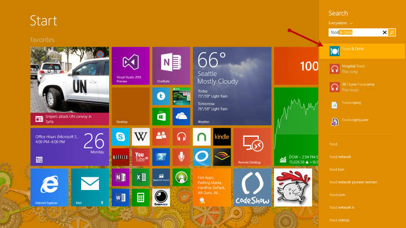
And that app opens full screen. I now have a single Windows Store app running in addition to a bunch of stuff running in desktop mode.
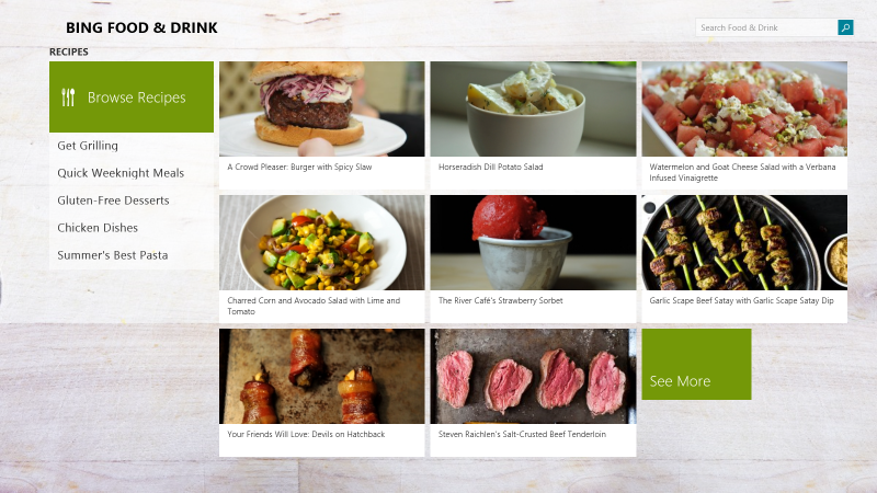
Now, while still in the Bing Food & Dining app, let me hit Start and launch the Alarms app the same way. It will also open full screen, replacing the Bing Food & Drink app.
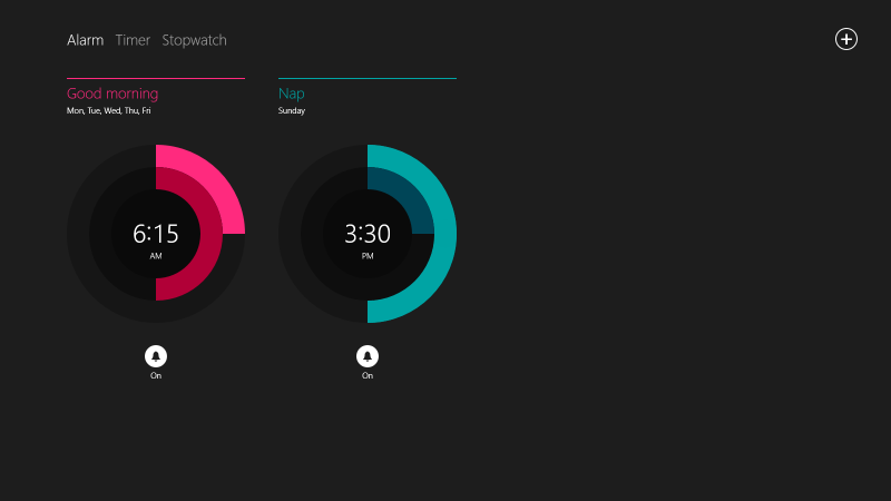
Perhaps you haven’t seen the new Alarms app in Windows 8.1. I think it’s really cool with some nice radial controls and lots of features.
Now let’s get our hands on the keyboard. Try just pressing WIN + RIGHT once. That will send the active Alarms app to the right half of the screen and leave the left half unoccupied. Now press WIN + TAB and you’ll see that the Bing Food & Drink apps will occupy the left side. That was two quick keystrokes to get ourselves into a great side-by-side workspace. Notice too that the slider control between the apps has a a subtle glyph rendered on the left side indicating that the Bing Food & Drink app is the active app.
WIN + LEFT/RIGHT sends the active app to the left/right
WIN + UP maximizes the selected app
WIN + DOWN closes the selected app (unlike desktop mode where the app is restored/minimized)
WIN + TAB switches through open Windows Store apps
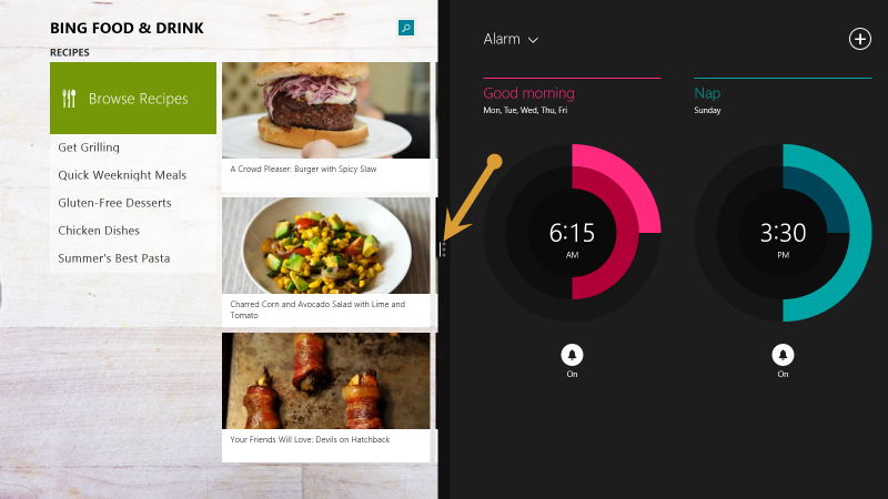
Now try tapping WIN + RIGHT again to swap the order of the windows. The Bing Food & Drink app is sent to the right effectively swapping it for the Alarms app. Notice that the Bing Food & Drink app is still the active app as designated by the glyph on the slider.
You can also use WIN + UP and WIN + DOWN to maximize or close the active app. Try that now with the Bing Food & Drink app.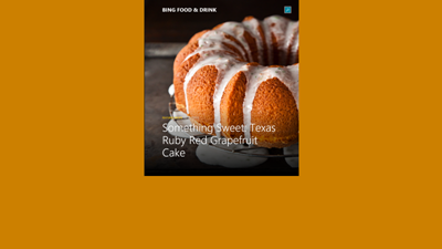
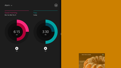
Let me show you another shortcut now. First, get your two apps back to split mode.
WIN + . (period) “grabs” the active app and used repeatedly toggles through all visible apps and the slider itself.
So with Alarms on the left and Bing Food & Drink on the right as the active app, press WIN + . quickly one time. Not much happens, right? The Bing Food & Drink app does a small animation indicating that it is being “grabbed”, but when you let go of the WIN key, it goes right back to where it was.
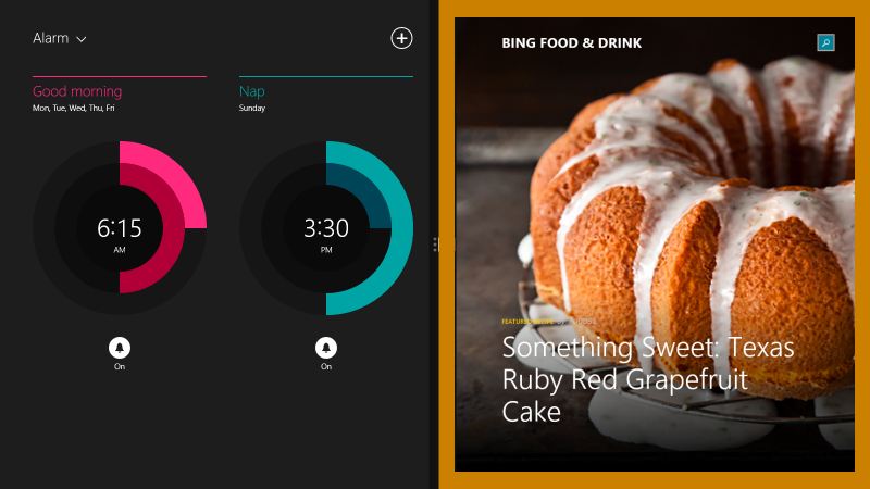
Now hold down WIN and press the period key repeatedly. You can see that you are changing which visible app is “grabbed” and when you let go, you find that you have activated another app (or the slider).
While holding the WIN key, repeatedly press the period key until you have activated the slider. Without letting up the WIN key, press the left and right arrow keys. You are able to incrementally change the position of the slider and thus the size of the adjacent apps to your hearts content. That’s pretty fun.
Also, try this. While holding the WIN key, repeatedly press the period key until you have “grabbed” an app. Without letting up the WIN key, try pressing the left, right, up, and down arrow keys. Left and right have the same effect as WIN + LEFT/RIGHT, up allows you to maximize the window size, and down allows you to close the app.
WIN + . (period), ARROW KEYS also allow for moving windows left and right, maximizing, and closing an app
Easy Caching in WinJS Apps
I set out the other day to help a developer add some cache functionality for his app.
The app is 1Vigor and there’s a version for swimmers, one for runners, and another for learning how to generate peak performance in whatever sport or fitness activity you’re doing (not quite ready for the Store). The 1Vigor apps pull content from the 1vigor.com website and provide some great articles for athletes. The authors of the articles are first rate and the amount of content available is impressive too.
The swimming and running apps are already in the store, but if you download them, you’ll discover that you’ll be required to maintain an internet connection while you fetch your next article to read, since no cache functionality exists. So if you’re on a submarine without wifi, you’re going to be out of luck. I’m not completely sure, but I don’t think that wifi availability on submarines is quite caught up with commercial airlines.
My first thought was that I was going to have to take a very manual approach to caching. I was prepared to enumerate each article and save a copy in local storage or something like that. As it turned out, it was a much easier task.
Here’s the only code required to accomplish the task at hand…
var results = WebData.articles.map(function (a) { |
And here’s what that does. It starts with the WebData.articles - an array containing objects with the metadata about the articles and including a URL (contentUrl) linking to the HTML of the article from 1vigor.com.
It maps that array to a WinJS.xhr call. If you’re not familiar with the .map() function, listen up. The .map() function works for all arrays (because it exists in the prototype for the Array object). When you map an array, you are changing all of its elements to something else.
Let’s say you have an array (A) of numbers and you want to create a new array (B) where all of the numbers from A are doubled. You could do that with…
var B = A.map(function(i) { return i*2; }); |
So, back to the first block of code… the value of the results variable is going to be an array of Promise objects.
You can wait for all of the promises in an array to complete by using WinJS.Promise.join(myArrayOfPromises).
So the articlesCached variable which I hang on the WebData object is going to be a promise that completes when all of the individual calls to the article content are complete.
Now, you might be wondering at this point what I do with the results of those HTTP requests. The answer is that I do nothing with them. I don’t need to. GET requests over HTTP are cached by default, so the next time the user launches an article and the system attempts to access its content using the .contentUrl, it essentially says “Hey, I’ve done this before. I’ll just use the results of that last network call instead of doing another one.”
And that’s all it took.
Not bad, eh?
Extending that Splash Screen
I’m hard at work updating codeShow for Windows 8.1. I could have simply migrated my code from Windows 8 and tweaked it here and there, but in typical fashion, I decided to start from scratch. The open source codeShow project is intended as an instrument of learning and that’s exactly what I end up doing as I work on it… learning.
Since the start of codeShow, the number of demos has continued to grow and the amount of time it takes to load up all of those demos when the app is launched has been increasing. It’s actually quite a lot of file fetching and parsing that has to happen, so it’s perfectly reasonable that it would take some time.
So I started to get a little annoyed that the hub page was showing up blank and then taking a couple of seconds to bring in the data. So I set out to fix it.
I knew the answer was to create an extended splash screen, but I had not yet taken the time to learn how this is done.
In case you’re not familiar, an extended splash screen is a technique for indicating to the user that some time is needed at the launch of the app. This is done by showing the app’s splash screen immediately after the app is loaded (so the user doesn’t even notice the transition), but adding progress indication of some kind. The real splash screen then only appears to the user for short time and then they begin to receive some feedback about how things are loading.
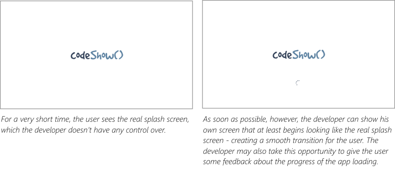
It’s ideal if you can get a user into your app right away, but if an essential element of your app (such as the demos in codeShow) are not available immediately, then the next best option is an extended splash screen.
The MSDN samples were helpful, but I felt a bit lost in the code. It seemed there was a lot of framework and superfluous code that may be necessary in a thorough study of a subject, but not necessarily for a simple and specific solution. So I set out to make the simplest extended splash screen solution that I could.
You can my entire solution in the codeShow project at codeshow.codeplex.com, and here it is…
First, I had to put a splash screen and progress indicator in my default.html file.
<div id="splash" class="hidden"> |
Then the positionSplashScreen function does most of the work. The function refers to the splash div by its id (notice that for the Trident engine that runs Windows 8 apps it’s not necessary to locate the element using getElementById). Then I query the args.detail.splashScreen to get it’s location and use that to set the location of my splash screen. Finally I set a margin for the progress indicator to get it where I want it.
function postitionSplashScreen(args) { |
And that’s almost all there is to it. If we stopped there, however, the splash screen would forever show and hide our beautiful hub page underneath.
So all we need to do is determine when all of the data that makes up the hub have finished loading and we can hide the splash screen. Here’s what that looks like…
Data.loaded |
The logic that I use to determine the Data.loaded variable (another Promise) is for another post entirely, but when it has been loaded, we simply add the “hidden” class to the class list of the splash screen and the whole thing disappears and reveals a completely loaded hub beneath.
That’s it for now. Hope it helps. Leave me a comment if you have any questions about this technique.
Did You Know About Microsoft HomeOS?
Because I didn’t. Not until recently.
HomeOS has apparently been out for a little while and recently received a hefty update to coincide with the Lab of Things project.
I wish I had time to install and try both of these projects and report my findings to you, but I’ll have to leave the sleuth work to you. I’m just reminded by this project about how many amazing things come out of the MSR group that push the boundaries of computer science and turn the crank of true geeks everywhere.
Let's Go MoDev!
Next week, I’m going to be joining a few folks from my team and a bunch of folks from Seattle for MoDev’s next conference right here in our sunny city.
MoDev is the conference to attend if you’re involved in development, design, or event marketing for the mobile tablet market, and really who isn’t these days? Even the auto body shop down the street needs a mobile app. Everybody needs a mobile app.
The conference is going to be graced by experts from the likes of Amazon, Samsung, Zillow, Rovio, and many more.
You can go here to register for the conference if you haven’t already.
Personally, I’ll be talking about creating native applications for Windows 8 using the web development platform. On most tablet platforms, you can find some way to eek out an app if you favor the web languages of HTML, CSS, and JavaScript, but in every case except for Windows 8, that app is going to be wrapped in a browser and confined to the inherent limitations of said browser. Tools like PhoneGap map a number of functions from JavaScript into the various platform specific nomenclature, but on Windows 8 your JavaScript is sitting directly on the kernel.
If you’re interested in learning more about this topic or any other the other talks at MoDevTablet, register now and I’ll see you there!
Register here
The All New codefoster.com
Woohoo! Welcome to the all new codefoster.com website.
I changed a lot about codefoster.com in this latest iteration, I’ve got most of my boxes unpacked, and I’m excited to be working out of the new space.
I switched CMS systems to one made out of Sweden, and we all know that the Swedish know how to make quality merch, right! The system is called Lemoon by Mindroute Software. It’s very simple, very powerful, and built entirely and extensibly on ASP.NET.
To coincide with the launch of the new site, I have some new business cards…
Now just sit back and wait for content that will blow your mind. Well, we’ll see about that.
Cutting through the noise
As an application developer, you’re trying to communicate with your users in a sense. Not so much like an author is, though. An author can only communicate information, ideas, and the like, but an app developer can communicate behavior as well as information. You have the opportunity to make your users feel empowered as well as informed.
The app marketplace is wrought with noise, though. In an attempt to get their names out, developers are hurling junk into the marketplace and seeing if it will stick. Junk may stick, but not for long. Users need real value in order to download, use, and then even recommend and kindly review your app.
So how do you cut through the noise and get your message heard?
You do it by creating a unified message.
Huh?
A unified message is a clear message that only communicates one thing and does so very well. Very concisely.
Here’s the analogy I like to use.
Between your voice and your audience’s ear are air particles. Lots of them. Your attempt in communicating with your audience is to shake the air particles, so they cause vibrations in the ear drum of your hearer. Every one of the air particles is, however, doing its own shaking. Air particles above absolute zero are bouncing constantly, randomly, and violently off of each other and their container. This is the cause for air pressure and the reason your car is suspended a few inches off the ground.
So how does your message get through amid the noise? It does so because for each moment in time as you communicate, the air particles all have one thing in common. Each of them still fulfills the random and wild whims that heat demands, but all of them fulfill what your message determined.
And that’s what you must do with your app. Be certain that the function that your app performs is clear to the user, fulfill that function very well, and that’s all.
Remember that your goal is to delight the user. Have you seen the video of Alexander Gamme on YouTube. Alexander did a self-supported trek from the coast of Antarctica to the South Pole and back. Upon arriving at his first cache he was really hoping to find some food. I won’t spoil the rest.
I think that Mr. Gamme does a fine job of illustrating human delight. I don’t imagine I’ll ever create an app that is received with quite the same level of enthusiasm, but it’s a good bar to set.
Prometric Exam Giveaway
I have three coupons for Prometric exams for Microsoft certification that I’d like to give away.
Each coupon offers 3 exams for the price of one, and is good for the MCSD track of exams.
To enter follow me on twitter (if you’re not already) and retweet this tweet. On July 12 I’ll select 3 random winners from all who qualify.
Terms include…
…all 3 exams must be taken by the same person
…expires Dec 31, 2013
…works for exams 480, 481, 482, 483, 484, 485, 486, 487, 496, 497, and 498
…doesn’t work with other offers
5 Ways to Be Effective
What effect do you have on the world?
Do you affect it consistently and positively? Do you affect it efficiently? Do you affect the world at large? How about your small world - your family and your work team? How about the customers that buy the widgets you make?
I know very few (and I don’t know them for long) that don’t have any desire to have an effect. It’s a core desire. It’s a healthy desire.
I’ve composed a list of just 5 (of the enumerable) ways that you might consider to increase your effect on the world.
Number 1. Minimize and refine your scope
Your scope is the definition and extent of what you are committed to doing.
It’s critical that you define your scope. If it’s not defined then you won’t know if you’re minimizing it. If you don’t minimize it then you won’t even be able to fulfill it. If you don’t fulfill it then you’ll be stressed out and those around you will be disappointed.
Defining and then minimizing your scope is going to take some deliberation on your part. If you haven’t spent some time thinking about it, then you won’t be ready for the moment when it comes - the moment where someone asks you to adopt an obligation. In fact, some people are so out of tune with their scope that they don’t even think before saying yes to commitments - they also don’t usually follow through with them. If you have given some good thought to it, however, you will be ready with an appropriate yes or no.
When you’re defining your scope, don’t think about just one facet of your life such as your job, your family, or your recreational activities, but rather consider the whole of it. Everything that you are obligated (whether by election or not) to do is not only going to take minutes or hours out of your day, but it’s going to weigh on your mind while you’re trying to sleep.
I’ll tell you how I do this practically. I use OneNote to maintain a list of the various roles I play - roles such as human, husband, father, employee, and church member. Within each role, I list the responsibilities it implies. I have a huge, two-column table of these roles and responsibilities that each fulfill the following sentence: As a {role}, I am responsible to {responsibility}.
Here’s a sampling…
- As a human, I am responsible to brush my teeth every morning and evening
- As a husband, I am responsible to take my wife on dates
- As a father, I am responsible to spend good time each day engaged with my son
- As an employee, I am responsible to complete monthly status reports
The list could get indefinitely large, so I try to keep it focused on things that actually take minutes and hours out of my day. This responsibility list is similar to a task list, except the responsibilities are more ongoing and are more proactive than reactive.
Once you have that list, be careful about letting anything be added to it. Saying no to someone when they ask you to take on something that’s outside of your scope is not nearly as rude as saying yes and then being overextended and either incapable of fulfilling the role at all or even being less than fully effective at it.
After creating this list for the first time, you may come to realize that you have too many responsibilities, and it might be time to have some conversations with people around you. Think about how you would feel if someone came to you and said “Hey, I’m trying to organize my life and time better and I don’t think I’ve done a great job with responsibility X to you. I would be realistic and opt out of the commitment instead of continuing to disappoint you.” In all likelihood, that would be well received and even respected. Don’t try saying that to your spouse though. :)
Number 2. One task list, one calendar, one file store
If you maintain task lists here and there, you’re asking for trouble. Just like a computer system has to do a little bit of busy work to switch from one thread to another, our brains have to do a little work to recollect where all we have things recorded and from which list to retrieve them.
A single task list accessible from your phone, your tablet, and your primary workstation (if that’s not your tablet :) is not too much to ask these days. Drop a new OneNote notebook in your SkyDrive and add it on all of your devices. Then create a single, top-level page in the notebook for your tasks. In my opinion, this is better than trying to use a task app because there are fewer controls and restrictions around task entry and maintenance. It’s also better than a paper system because it’s everywhere at once.
Multiple calendars is normally a very bad idea. These days, however, we can maintain multiple calendars and overlay them to get the one view we need to see our whole week. Each Sunday evening my wife and I sit on the couch and look at the next two weeks. My work calendar, my personal calendar, her calendar, and perhaps a couple more are all visible in one view. That’s important.
Also on the topic of calendars… be careful with your reminders. Too many reminders may encourage you to dismiss them and completely lose their intended effect. Only set reminders when needed and avoid the habit of mindlessly dismissing them. If they’re trivial enough to dismiss without a thought they are likely trivial enough to have omitted in the first place.
File stores are where I see a lot of people get disorganized. Do you have files on your laptop, your office PC, your media center PC, on a myriad of external hard drives here and there, some in the cloud, and then a Carbonite account that’s backing up some subset of all of that? Well, stop it. That’s confusing.
Instead, on each device, install the SkyDrive desktop app and configure your libraries so that all of your documents are saved to your SkyDrive. If you have to and if you can, pay for a bit of extra storage on SkyDrive.
If you’re like me, however, all of the data that makes up your digital life and past don’t fit in SkyDrive (unless you’re willing to pay for the 500GB option). So here’s the solution…
On one PC (perhaps your office PC at home or even a NAS drive if you’d prefer) store the whole shebang - the entire superset of files you own. Back that one PC up to Carbonite (or whatever online backup service you prefer). On that PC, keep the files that don’t need to be available on other PCs in the normal document storage locations (c:\users{profile name}\documents, c:\users{profile name}\pictures, etc) and the rest in the SkyDrive folders (c:\users{profile name}\SkyDrive\documents, etc.).
With this system, you can easily log in to that one PC and move a file from the SkyDrive location to the regular document store to effectively archive it and determine that it will no longer be copied to the cloud and synced to your other PCs.
Number 3. Collaborate
Don’t go it alone. You can be more personally effective if you incorporate diverse perspectives from other people. It sounds like the contents of a course you might take starting a new job, but it’s also true - diversity is an asset.
One thing you can do practically to co-labor with someone is to run your task list and calendar by them. Ask them to listen to you explain what it is you are trying to accomplish (generally speaking) and then show them your list and your calendar and ask them if it looks like it lines up. You’re sure to get some wonderful and useful perspective on what you’re spending your hours on.
When they’re done talking, add some of their considerations to the task list itself. For example…
- Consider implementing a consistent wake up time
- Consider finding a Meetup where I can find others that are doing similar things
- Consider cutting the one-on-one meetings out to spread my effectiveness
Notice, that they are perhaps all considerations at first. You can decide if and when you want to implement them as you have time.
In your collaboration, don’t neglect the face to face.
It’s tempting in this digital world to believe that we can do everything in front of a terminal. We can’t.
Sure we can order groceries and find freelance work and buy stocks and transfer money and sell houses and start businesses. We can do all of that with just screen and keyboard. But the really important things in life still happen in the context of relationships. Don’t forget to spend time on the phone or better yet over coffee getting real work done.
How many people do you know that spend all of their time in front of their heartless computer terminal and get incredibly good at things, but are all but incapable of applying their work to the real work because they aren’t in touch with the real world? Don’t be that guy.
Number 4. Keep your balance
A healthy investment portfolio has a little of this and a little of that. Concentration might be good for a swing trade when you see a trend that’s going to happen in a day or two, but if you want your portfolio to cross the oceans of time and weather all of the storms along the way, you’re better off diversifying it.
Likewise, if you spend all of your time doing one kind of software development, taking one kind of photograph, executing the same phase of a business deal, or adding the same adding the same door handle to the same door on the same factory floor, you’re going to type cast yourself. You’re also, if you’re anything like me, going to bore yourself to insanity. Learn something altogether new. I’m not just talking Visual Basic developers learning Erlang. I’m talking about Visual Basic developers learning Portuguese. I’m talking about librarians earning their Class A skydiving certificate. I’m talking about stay-at-home moms taking a welding class at the local community college.
In days of old (very old), man couldn’t afford to be a specialist. He had to be a hunter, a farmer, Mr. Fixit, dad, and everything else.
I am a big believer in a theory that I call general inspiration. By that I mean that an author can go to a symphony and be inspired in his book writing. Likewise, a flamenco guitarist can inspire me to draw. If this theory is true (which is likely considering I devised it :), then all of the ventures you take from whatever your definition of normal is are less likely to distract and more likely to enhance it.
Number 5. Clean
It sounds like a mere matter of preference, but I submit that if you clean and organize your home, your car, your workstation - if you clean and organize your life, you’ll be more effective.
Everything we do from dawn to dusk is about organization.
The guy that restores old cars - he is essentially organizing the parts to work and look good.
The guy that writes software - he is putting bits in a certain order so they are sensible and add value.
All of the tangible things around us want to default to their most base and chaotic state. We spend our 4 score on earth just trying to make sense of some of it. For some of our organizing, we get paid, but for much of it, we’re not. We are just designed to put things in right order.
So spend some time going through that stack of papers on your desk (that quite frankly, you’re never even going to look at anyway, right?).
Pull all the shirts out of the closet that are destined to collect dust, depart fashion, and finally visit Goodwill.
Consolidate all of your external hard drives and old DVD-ROM disks and finally make sense out of all of the data in your life. If it doesn’t belong in your life any more than hold down Shift when you hit Delete. If it does, then by all means, put it in the right place!
Make a list of all of the things you and your spouse have been meaning to talk about and carve out time to talk about them. Maintaining your marriage is infinitely more important than maintaining your Blueray collection.
By doing all of these things, you may seem to be stealing time from your primary function. You’ll likely find, however, invigorated and inspired to execute all the more effectively.
CorelDRAW App Tile Template
In case you haven’t heard, Microsoft has an incentive [link removed] going on right now where any app you create, you can get $100 for. That’s not bad considering how easy it is to make an app. Well, not all apps are easy. Some apps take quite a substantial bit of time, but if you’re just trying to get a good app into the Windows Store quickly (like say for $100!) there are some tricks you should know. There’s a template at w8templates.codeplex.com, for instance, that you can customize with a few search terms and RSS feeds and in a matter of minutes, you’ve got a data and media rich app all about the topic of your choice.
I just made an app using this template. It’s called The Sailing App. One of the tasks you’ll have to complete if you go down this road is to create your own graphics for the app tiles, splash screen, etc. Well, I don’t know about you, but I’m a big fan of CorelDRAW, so I made a template and I’m posting it here for you. By the way, if you’d like your very own free copy of CorelDRAW X6 Essentials, just join a ZERO260 event [link removed]. We’re giving them away.
Here’s that template. Have fun!