CSS for Windows 8
My CSS for Windows 8 App Development book is done… finished… finite! You can get an ebook or an old fashioned paper style book by visiting aka.ms/cssbook. I hope the book adds something to your CSS skills. The source code for the listings in the book is available at cssbookcode.codeplex.com. Enjoy!
Unintentionally Open Source?
I saw this tweet and decided to respond.
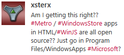
The technical answer is YES. You can access the source code for Windows Store apps written in HTML/JavaScript. But there are a few reasons that you should forego panic.
First, this is no surprise. App packaging and distribution has a ton of design and testing behind it. The designers knew exactly what was going to the client and exactly how much effort it takes to discover it. Developers are responsible for their own obfuscation strategy. If Microsoft created their own, it would just get pwned in a couple weeks and then it would be a senseless inclusion in the product. It’s better for obfuscation to be out of band with the Windows product and for it to be contributed by third parties.
Next, the way it works with HTML/JavaScript apps is actually similar to many other language stacks. JavaScript is clear text and translated script so it’s very easy to look for a .js file and read it. Managed languages such as .NET languages are only logistically more difficult to reverse engineer and capture the source from.
Next, the source code is available on the client, but the package is tamper proof. If a hacker finds it and changes one of the .js files so that the script now does something it wasn’t intended to do (such as validate that an in-app purchase has been paid for or that the app is not in trial mode), then Windows will not allow that package to execute.
Finally, the bottom line is that you should never trust code on a client. It doesn’t matter the language, the platform, or even the obfuscation technique. It can and eventually will be hacked. You should consider how sensitive your intellectual property is and protect accordingly. If you have very valuable business logic that would hurt you or your company if it’s taken then I wouldn’t even put that logic into the client app. I would put it in the cloud and make it available through service calls. That’s a better architecture for a lot of other reasons as well. If you are a hobby app developer and you wrote a silly app, I wouldn’t worry about it. It’s a very small portion of the population that’s going to try to take your code. The chances that your stolen code is going to turn into much added value for them is low and the chances that their efforts with it are going to hurt your business is even lower.
Another app in the Store
I’m on leave but I return to work next week. I took some of my off time to write another app. It’s a quick one that is tied to a specific piece of hardware, but I have said hardware and I use this app all the time now.
It’s a webcam viewer for the Foscam FI9820. I will expand it at some point to work with more cameras and do a lot more to it, but for now I have done with I always recommend my independent developer friends do and I kept the scope very low.
The app is called CamView and I use it daily now to spy on my as he sleeps. Here’s what it looks like…

Notice the full screen view of the webcam. I like this immersive experience, because I feel like I’m actually in room looking into the crib. I wanted to create a good snap experience too since watching someone sleep is not exactly going to be captivating and one might wish to multi-task. Here’s what I ended up with for the snapped view…
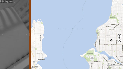
Instead of the camera’s view being restricted to a small square, it takes up the entire snap view.
Notice too the faint arrows on each edge of the screen. Those control the pan and tilt of the camera. Again, I like how direct the control is. Instead of a control panel to the side, they are right on the surface of the image.
If you happen to have this specific hardware, then you can link to CamView in the store with http://aka.ms/camviewapp.
I’m not sure what I’ll write next, but I’m ready for my next app. What are you working on and how’s it going?
codeSHOW is now in the Windows Store!
The codeSHOW app is now certified and available in the Windows 8 Store. If you’re wanting to learn development for Windows 8, use codeSHOW to browse a lot of demos and then see the code for them. There’s a lot more to be added and some kinks to work out, but I hope it adds value to your life today. Updates should happen on a relatively frequent basis. Leave a review and tell me what you think.
If you have Windows 8, you can go directly to http://aka.ms/codeshowapp to download it.
Reduced Discoverability in Windows 8
I just finished reading Jakob Nielsen’s article Windows 8 - Disappointing Usability for Both Novice and Power Users where the summary reads…
_Hidden features, reduced discoverability, cognitive overhead from dual environment, and reduced power from a single-window UI and low information density. Too bad. _
First of all, I think Jakob’s article is pretty well written and rather honest as well. I don’t think he’s trolling or begging for clicks. I do want to offer some extended thoughts on the matter, however.
Jakob’s second point is Windows 8’s reduced discoverability. I couldn’t agree more, but we can no longer work from an assumption that discoverability is king. We used to worship it and we ended up with a thousand commands on our design surface all conveniently a single click away. We had bloated navigation bars with submenus inside of submenus that all activated on hover (a gesture shackled to the mouse). In short, we had huge swathes of real estate dedicated to things the user might do and places they might go. No more. Now the user enjoys his content and brings up the charms bar when he wants to.
That simplicity comes at a cost though. As Jakob said, Windows 8 amounts to a reduction in discoverability. You may have seen the internet video of someone’s poor old dad left to discover Windows 8 on his own. He found his way to the desktop but couldn’t find his way back. All he had to do was move his mouse to any corner of the screen or hit the Windows key on his keyboard, but he didn’t know that. I think it’s safe to say he hadn’t discovered all the features yet. If you put a caveman in front of Windows 8, how long would it take him to figure out that he can swipe from an edge of the screen (unless he cheated and watched the introductory animation while setting up his profile).
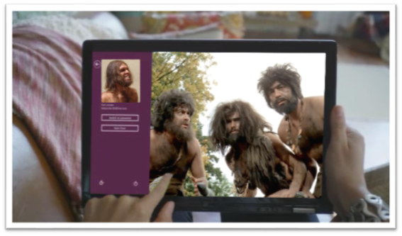
If you can surmount that hurdle (and a few more) then you’ll be well on your way to enjoying your UI and I hope you’ll appreciate that it’s not trying to put everything front and center. Just for fun, I’d like to make a list of things the caveman (or any of us actually) would not know without being told.
- Swipe in from the left to browse other Store apps
- Swipe in from the right to access charms
- Swipe from the top or bottom to access app bars
- Your preferences are in the Settings charm
- If you want to search your app, you need to go to the Search charm
- To print, you go to the Devices charm
- To select something you swipe down on it (or swipe right if you’re in a vertical scroll)
- You can just start typing on the start screen to find things
- Cut, Copy, and Paste are hiding behind a hold gesture
- (and there are likely more)
You know what’s way longer than that list? The growing list of things a computer can do, and they can’t all fit on the screen at once nor should they. I say leave the interactions for when the user is interested in interacting and requests them, otherwise just show him his content.
As for the remaining points in Jakob’s article.
There’s no question there are hidden features. When you open a photo and there’s nothing on your screen except your photo, you can bet there are hidden features. When your primary user interactions (e.g. app bars, charms bar) are off screen, you can be sure there are hidden features. Once again I want my features to be hidden. Until I want my features. If I have to learn where they are, so be it, but that happens once and doesn’t mean I want to look at them on the first page of my app for the rest of my life. I can’t agree with cognitive overhead from dual environment because I’ve never felt any brain pain over the fact that there’s a desktop back there. I love it in fact that I have access to all of the legacy features and functions. Reduced power from a single-window UI? Actually, it’s not a single-window UI. The desktop is still there and you can use your windows and resize them and everything still. And low information density? Yep, and I really appreciate it too!
The Escalator Ride
You want your app to be successful and to be successful, you must think about the user.
Windows 8 thinks about the user through and through. It puts the user in control of what shows up on their start screen, when the app bar and charms bar appear over their content, and what apps have the capability of doing on their machine.
When you’re working on your app, consider that the user is not always just launching your app and then closing it when they’re done. They may be using your app as one in a series of apps involved in a single usage scenario.
Consider this usage scenario…
Your app helps users make restaurant dinner reservations.
Your user may use your app on its own, but more likely your user…
- steps onto an escalator at the airport
- checks their trip management app to find their hotel’s location
- checks for restaurants in the hotel’s vicinity
- picks a restaurant based on user reviews
- makes a reservation at the restaurant (with your app!)
- sends the reservation confirmation to a colleague
- and then steps off the escalator
That user is a delighted user. He has not just used an app. He has accomplished something significant in very little time. All during the escalator ride, the complimentary and informative animations were important, all of the thought that went into the UX of each app was very important, and the app-to-app sharing was crucial.
Keep that in mind as you formulate your app idea, as you design your app, and as you implement the Windows 8 contracts.
Source Media
I decided to put together a reference post for when you’re looking for stock photos, clipart, audio, music, or video. I will update this post as I am made aware of new sources.
Photos
Getty Images seems to me to be the big player in stock images consuming some of the other providers such as Corbis, iStock, and FreeImages. Even in a few of the free services, you’ll see some iStock results that you can pay for if you want to.
| Name | Free/Pay | Notes |
|---|---|---|
| Bing Images | Free | Be careful for image licenses |
| Google Images | Free | Be careful for image licenses |
| Pexels | Free | My personal favorite |
| morgueFile | Free | |
| Free Foto | Free | |
| Pixabay | Free | |
| FreeImages | Free | A subsidiary of Getty |
| iStock | Pay | A subsidiary of Getty |
| Getty Images | Pay | |
| Unsplash | Free | |
| Pexels | Free | |
| Negative Space | Free | |
| Gratisography | Free | |
| Science Stock Photos | Free | |
| Stock Photo Secrets | Pay |
Illustrations
| Name | Free/Pay | Notes |
|---|---|---|
| OpenClipart | Free | |
| The Noun Project | Free | |
| IconFinder | Free/Pay | |
| Icons 8 | Free | |
| SyncFusion Metro Studio | Free | Requires registration |
| Open Game Art | Free | |
| 2D Game Art for Programmers | Free | |
| Modern UI Icons | Free | |
| Kenney | Free | Game art |
| Freepik | Free/Pay | |
| flaticon | Free/Pay | |
| vecteezy | Free/Pay |
Audio
| Name | Free/Pay | Notes |
|---|---|---|
| freesound.org | Free | |
| Incompetech | Free | |
| freeSFX | Free | |
| Shockwave Sound | Pay | |
| ccMixter | Free |
Video
| Name | Free/Pay | Notes |
|---|---|---|
| iStockVideo | Pay | |
| Pond 5 | Pay |
Fonts
| Name | Free/Pay | Notes |
|---|---|---|
| Font Awesome | Free | |
| 1001 Free Fonts | Free | |
| Google Fonts | Free | |
| We Love Icon Fonts | Free | |
| BlamBot | Pay | |
| Fonts.com | Pay |
Templates
| Name | Free/Pay | Notes |
|---|---|---|
| SlideShare | Pay | |
| Template Monster | Pay |
Other
| Name | Free/Pay | Notes |
|---|---|---|
| dfWiki | Free | |
| Windows Marketplace Icon Maker | Free | |
| Canva Colors | Free | |
| Adobe Color | Free |
Buy an app for the whole family
Imagine this scenario. You buy a game for $4.99 and you really like it, but your wife sees you playing it and wants it too. Your options are to a) hand your tablet to your wife (when you’re not playing it), b) log your wife into her tablet with your credentials (never the right choice and not even possible on other operating systems ;), or c) make sure you’re using Windows 8 because the Windows Store has a elegant solution for this scenario.
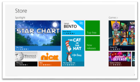
The policy for the Windows Store is that when you get an app (whether it’s free or $999) you can install it on up to 5 PCs. The interesting thing is that those don’t have to be your PCs. Here’s the scoop…
- Have your wife log in to her PC (as her!) and go to the Store
- Pull out the Charms bar (I still love that gesture!) and hit Settings | Your account
- Hit Change user and log in with your Microsoft account
- Install your app
- Go back to Settings | Your account and hit Change user again to get your credentials out
This is a tremendous advantage to the Windows Store, and it’s not even the only advantage Microsoft’s platform has over the competition. If you want to see the details of Licensing apps, you can read this blog post.
Enjoy!
Anatomy of a Push Notification
I can hardly stand not knowing how something works under the hood. More often than not, I’d rather have a working knowledge of a system than the convenience or function of the system itself. It’s why I chased degrees in Computer Electronics and Computer Engineering in the first place. I don’t know so much about all of the fancy things that engineers put into processors and primary system boards these days, but I’m relieved to have at least a fundamental understanding of a control bus, a machine clock, a MOSFET, an assembly program, and the higher level software abstractions. But I digress…
What I want to talk about right now is the anatomy of a push notification message. I was intimidated by the subject when I was first introduced to it, but I’ve climbed on top of the general concept now and feel confident enough to post on the matter.
I do have to say that I’m pretty excited about the convenience of Windows Azure Mobile Services (WAMS) abstractions over the process, but I don’t want to use it blindly without understanding what it’s doing under the hood. I’m going to start with a review of the process and players in a typical push notification. You can find this diagram and an overview of the process here.
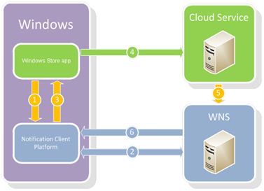
The green is you and the blue is Microsoft. You are writing an app and you are responsible for a cloud service to communicate with WNS.
In my typical attempt to make complex sound easy, I’m going to walk you through this process.
Steps 1-3. Your app asks Windows for a channel.
You ask Windows for a channel, Windows asks WNS (this happens transparent to you), and then Windows gives you a channel. This channel is just a string. Here’s a sample URI with an ellipse since it’s actually much longer.
https://bn1.notify.windows.com/?token=AgYAAABrcyAqFeh...wfOG5%2bD4TCeHU%3d
By the way, the channel that Windows gives you also includes an expiration time which may be helpful.
Step 4. Your app sends this URI to your cloud service
You can use whatever means you choose, but I would hope that you’d find a smart and secure way to do that. A potential attacker would have to get this URI and also your Package Security Identifier and Client Secret in order to start sending malicious app notifications, but still.
Step 5. Your cloud service asks WNS (Microsoft’s server) for an access token and then triggers a push
Here’s where the bulk of the “magic” happens. Your service does two HTTP calls. The first gets it an access token (which you’ll likely want to cache), and the second (and subsequent) initiates a push to your app. WNS knows where your app is because of the URI that you sent it.
Here are examples of those two raw HTTP messages…
First message
POST /accesstoken.srf HTTP/1.1 |
It’s just a simple POST to login.live.com/accesstoken.srf. The client_id is actually the Package Security Identifier (SID) that you get from your developer dashboard at http://dev.windows.com, and the client_secret is the Client Secret that you find in the same place.
The response to a successful access token request is something like…
HTTP/1.1 200 OK |
With that, your service has what it needs to submit notifications to be pushed to your app.
Second message
Your service has the access token and that’s all it needs to issue requests for WNS to push to your app.
Here’s a push message that changes the text on your tile…
POST **https://bn1.notify.windows.com/?token=AgYAAABrcyAqFeh...wfOG5%2bD4TCeHU%3d** HTTP/1.1 |
Notice a few things about this message…
- Just like the request for an access token, this is a secure post to https
- The message is sent to the channel URI
- You can find valid values for the Content-Type and X-WNS-Type headers here
- The Authorization header always has that word Bearer, a space, and then the access token received from the first call
Step 6. WNS sends the notification to your app
This step is all on WNS and Windows and you don’t have to do anything except for verify that the process worked.
And there you have it. You can find numerous services that wrap this process for you and make it easy, but now you know the guts of what’s going on under the hood. It’s not exactly something you want to try to explain to your mom, but it’s not exactly quantum physics either.
The Flexbox CSS Standard
_Question: what is Microsoft’s position on Flexbox and fallbacks for IE10 and legacy? _
While I’m not the official voice of Microsoft and am not the smartest Softie in Redmond when it comes to the web standards, I’ll attempt to answer this question anyway.
The official standard for the flexbox style in CSS is documented in exhaustive detail at W3C. The abstract of this implement is helpful stating that the flexbox is
_”…a CSS box model optimized for user interface design. In the flex layout model, the children of a flex container can be laid out in any direction, and can “flex” their sizes, either growing to fill unused space or shrinking to avoid overflowing the parent. Both horizontal and vertical alignment of the children can be easily manipulated. Nesting of these boxes (horizontal inside vertical, or vertical inside horizontal) can be used to build layouts in two dimensions.” _
I think the official answer is that Microsoft doesn’t have an official position on falling back from flexbox. The -ms-flexbox is an implementation by the Trident engine to the flexbox… end of story. You will, however, find some recommended strategies on the web, and the best I’ve run into so far is the use of inline-block for unsupporting browsers.
That said, I’m spending most of my time with Windows 8 apps these days am thus spared the pain (the ever building pain that has yet to reach a crescendo) of writing 12 lines of code to accommodate the various HTML/CSS engines. If I was doing web development for the masses, I think I would decide to avoid the use of flexboxes altogether to ease my pain. I’m not sure what’s worse - an old, hacky solution or multiple solutions to maintain (one of which is still old and hacky).