Windows
npm Erroring Out on Windows 10 Fast Ring Build 14367
Just in case someone else is running into the same thing, I’m running Windows 10 Insiders Build 14367 (on the fast ring), and I’m unable to use npm. When I do a simple npm -v I get this error…
C:\code>npm -v |
My workaround is simply to type bash and get into Ubuntu where I have node and npm. There’s not really any disadvantage to this either since it operates on the same directory structure. I’m loving this Bash on Ubuntu on Windows thing.
App Images
There’s an array of images that you need to create before you can call your app complete.
Images to represent your app are very important, because they’re often the first thing a potential user sees and the first opportunity to convince them your app will add value to their day.
The best resource I know on the subject is Choosing your app images on MSDN.
On that page, you’ll find a table that enumerates all of the images you need to create including…
- The store logo is displayed in the details section of the app listing page, it’s base (100% scale) size is 50x50 and it’s actually going to show over a 70x70 square so there will be a 10 pixel border around it. Your BackgroundColor (which you specify in the manifest) is used for the color of that border.
- The square 150x150 logo is often the default tile on the start screen, though it is possible to designate a different size for your default tile.
- The square 30x30 logo does not end up showing as a tile on the start screen. Instead, this image is used in various other places in Windows when many apps are displayed as very small icons. You can see it by swiping up from the start screen and showing all apps, and you can also see it when you Alt + Tab to switch apps.
- The **wide 310x150 logo **is a start screen tile and is good for apps that need a little more room for live tile content. If your app has a wide tile then your users will have a chance to choose wide from the start screen.
- The **square 310x310 logo **is a mongo tile on the start screen. I use this when I have a very prominent app that has live content that I look at very often such as news or financial data.
- The **square 70x70 logo **is the small tile on the start screen. I use this when I don’t care about any live content coming down and only want a means of launching an app. I’m the guy whose start screen looks like graph paper :)
- The **badge logo **is what people see next to the badge notification on their lock screen (if they’ve elected for your app to be on their lock screen).
- Finally, the **splash screen **is the relatively large image that shows for a brief period while your app is being launched. You want to be careful to make this a good experience for the user. We don’t mind waiting a little for an app to start up, but we like to know what our system is doing.
Remember that for all of these images, you should provide all of the various scales. That means that for the square 150x150 tile, you should actually create and specify (in your manifest) a 120x120 (80%), a 150x150 (100%), a 210x210 (140%), and a 270x270 (180%). If you skip this, you miss out on a huge opportunity to make your app look great on various screen resolutions. Basically, don’t skip this :)
Additionally, you must have screenshots of your app in order to successfully submit it to the Store, and you should have promotional images in case your app is found to be worthy of promotion.
By the way, the screenshots that you provide must be taken from your actual running app, but the first one is different. For the first screenshot, you have a chance to create a marketing screen that really gives your app a visual punch and makes people want to download it. Again, if your app is chosen for promotion, this first screenshot is going to be used along with a 150x150 logo.
One Strong Case for Windows RT
Windows RT is that version of Windows that runs on low power ARM devices. I think for most people the pros and cons of this architecture are pretty clear already.
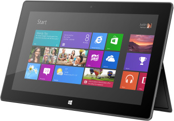
Usually the first upside argument is the significantly longer battery life it offers, and that’s certainly the case. Windows RT’s restricted architecture limits the processes that are running at any given point to only those modern apps that are designed to respect mobile users and their limited batteries. That’s a really great thing for users.
Besides the battery argument, however, I have another strong case for Windows RT that I’d like to share. By the way, I work at Microsoft, but I don’t have any influence on the teams that make these kinds of decisions, so I’ll just say that I hope that the Windows RT level or something like it sticks around. Here’s my case.
I have a friend that just installed a new shower for my wife and I. It’s a doozy too. Two shower heads and everything. Now we’re living in luxury.
This contractor friend of mine and his wife are… how to say nicely… far better with a tile saw than a computer. Computers aren’t their thing. At the same time, they run a small business and work with real estate, and so their job demands they spend a certain amount of time in front of a glowing screen.
We all know folks like these who spend 90% of their time in a browser, an email client, and the Office suite. And the other 10% of is spent waiting for the system to boot and launching the browser, email client, or Office suite.
These folks have a hard time getting work done anymore, because they’re overwhelmed with malware. Malware sucks, and there’s not really a good resolution. No matter what platform or browser is used, the consumer still wields the power to authorize the installation of malware. And if they don’t know any better, they will.
But malware is pretty much a moot point in the modern app ecosystem, and Windows RT devices are all but immune to it. The only code that can execute is built in or being executed out of an app package.
We’re dealing now with a whole new model for delivering code to people - it’s one where code is authorized and restricted. Code has to declare itself and its intent and it has to pass the test.
So, I recommend to my friend that they get a Windows RT device that performs the primary tasks (browser, email, and Office) brilliantly, but doesn’t offer any hope at all for the malware authors that would like to ruin their days.
This, in my opinion is a very strong case for this version of the OS.
I can put a Surface RT or some other Windows RT device in the hands of even my closest relatives and not expect support calls with complaints of malware. I’ll get support calls for other things I can be sure, but not for malware, and that is a big leap forward in my opinion.
Unintentionally Open Source?
I saw this tweet and decided to respond.
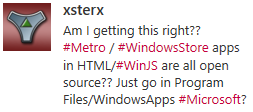
The technical answer is YES. You can access the source code for Windows Store apps written in HTML/JavaScript. But there are a few reasons that you should forego panic.
First, this is no surprise. App packaging and distribution has a ton of design and testing behind it. The designers knew exactly what was going to the client and exactly how much effort it takes to discover it. Developers are responsible for their own obfuscation strategy. If Microsoft created their own, it would just get pwned in a couple weeks and then it would be a senseless inclusion in the product. It’s better for obfuscation to be out of band with the Windows product and for it to be contributed by third parties.
Next, the way it works with HTML/JavaScript apps is actually similar to many other language stacks. JavaScript is clear text and translated script so it’s very easy to look for a .js file and read it. Managed languages such as .NET languages are only logistically more difficult to reverse engineer and capture the source from.
Next, the source code is available on the client, but the package is tamper proof. If a hacker finds it and changes one of the .js files so that the script now does something it wasn’t intended to do (such as validate that an in-app purchase has been paid for or that the app is not in trial mode), then Windows will not allow that package to execute.
Finally, the bottom line is that you should never trust code on a client. It doesn’t matter the language, the platform, or even the obfuscation technique. It can and eventually will be hacked. You should consider how sensitive your intellectual property is and protect accordingly. If you have very valuable business logic that would hurt you or your company if it’s taken then I wouldn’t even put that logic into the client app. I would put it in the cloud and make it available through service calls. That’s a better architecture for a lot of other reasons as well. If you are a hobby app developer and you wrote a silly app, I wouldn’t worry about it. It’s a very small portion of the population that’s going to try to take your code. The chances that your stolen code is going to turn into much added value for them is low and the chances that their efforts with it are going to hurt your business is even lower.
Reduced Discoverability in Windows 8
I just finished reading Jakob Nielsen’s article Windows 8 - Disappointing Usability for Both Novice and Power Users where the summary reads…
_Hidden features, reduced discoverability, cognitive overhead from dual environment, and reduced power from a single-window UI and low information density. Too bad. _
First of all, I think Jakob’s article is pretty well written and rather honest as well. I don’t think he’s trolling or begging for clicks. I do want to offer some extended thoughts on the matter, however.
Jakob’s second point is Windows 8’s reduced discoverability. I couldn’t agree more, but we can no longer work from an assumption that discoverability is king. We used to worship it and we ended up with a thousand commands on our design surface all conveniently a single click away. We had bloated navigation bars with submenus inside of submenus that all activated on hover (a gesture shackled to the mouse). In short, we had huge swathes of real estate dedicated to things the user might do and places they might go. No more. Now the user enjoys his content and brings up the charms bar when he wants to.
That simplicity comes at a cost though. As Jakob said, Windows 8 amounts to a reduction in discoverability. You may have seen the internet video of someone’s poor old dad left to discover Windows 8 on his own. He found his way to the desktop but couldn’t find his way back. All he had to do was move his mouse to any corner of the screen or hit the Windows key on his keyboard, but he didn’t know that. I think it’s safe to say he hadn’t discovered all the features yet. If you put a caveman in front of Windows 8, how long would it take him to figure out that he can swipe from an edge of the screen (unless he cheated and watched the introductory animation while setting up his profile).
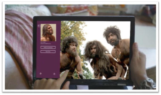
If you can surmount that hurdle (and a few more) then you’ll be well on your way to enjoying your UI and I hope you’ll appreciate that it’s not trying to put everything front and center. Just for fun, I’d like to make a list of things the caveman (or any of us actually) would not know without being told.
- Swipe in from the left to browse other Store apps
- Swipe in from the right to access charms
- Swipe from the top or bottom to access app bars
- Your preferences are in the Settings charm
- If you want to search your app, you need to go to the Search charm
- To print, you go to the Devices charm
- To select something you swipe down on it (or swipe right if you’re in a vertical scroll)
- You can just start typing on the start screen to find things
- Cut, Copy, and Paste are hiding behind a hold gesture
- (and there are likely more)
You know what’s way longer than that list? The growing list of things a computer can do, and they can’t all fit on the screen at once nor should they. I say leave the interactions for when the user is interested in interacting and requests them, otherwise just show him his content.
As for the remaining points in Jakob’s article.
There’s no question there are hidden features. When you open a photo and there’s nothing on your screen except your photo, you can bet there are hidden features. When your primary user interactions (e.g. app bars, charms bar) are off screen, you can be sure there are hidden features. Once again I want my features to be hidden. Until I want my features. If I have to learn where they are, so be it, but that happens once and doesn’t mean I want to look at them on the first page of my app for the rest of my life. I can’t agree with cognitive overhead from dual environment because I’ve never felt any brain pain over the fact that there’s a desktop back there. I love it in fact that I have access to all of the legacy features and functions. Reduced power from a single-window UI? Actually, it’s not a single-window UI. The desktop is still there and you can use your windows and resize them and everything still. And low information density? Yep, and I really appreciate it too!
Buy an app for the whole family
Imagine this scenario. You buy a game for $4.99 and you really like it, but your wife sees you playing it and wants it too. Your options are to a) hand your tablet to your wife (when you’re not playing it), b) log your wife into her tablet with your credentials (never the right choice and not even possible on other operating systems ;), or c) make sure you’re using Windows 8 because the Windows Store has a elegant solution for this scenario.
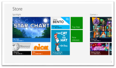
The policy for the Windows Store is that when you get an app (whether it’s free or $999) you can install it on up to 5 PCs. The interesting thing is that those don’t have to be your PCs. Here’s the scoop…
- Have your wife log in to her PC (as her!) and go to the Store
- Pull out the Charms bar (I still love that gesture!) and hit Settings | Your account
- Hit Change user and log in with your Microsoft account
- Install your app
- Go back to Settings | Your account and hit Change user again to get your credentials out
This is a tremendous advantage to the Windows Store, and it’s not even the only advantage Microsoft’s platform has over the competition. If you want to see the details of Licensing apps, you can read this blog post.
Enjoy!
Try Unsnap
Here’s a tidbit that is easy to miss if you’re not looking for it.
If your user has snapped your app, but then they take an action in your app that gives you reason to attempt to get back out of snap mode, you can do so by calling…
Windows.UI.ViewManagement.ApplicationView.tryUnsnap(); |
This method returns a value of true if it has successfully been unsnapped or false if it was not able to. It’s only going to unsnap for you if your app is in the foreground.
I’m using this method in my codeSHOW project. If the user snaps codeSHOW and then attempts to browse to one of the demos, then codeSHOW will unsnap itself to allow that demo to run full screen.
Hope that helps.
Important: the tryUnsnap() method will not work if it’s called from code that is not user initiated.
Thirty Nine Fourteen
That’s how many lines of CSS code make up the ui-light.css file that you get with WinJS.
What exactly are these nearly 4,000 lines of code doing for you? A lot of good stuff actually. And not only that, but there’s a lot that can be learned from spending some time looking at this file with a microscope. The techniques used in it are pretty advanced as far as CSS goes, and there are some classes, pseudo-classes, and pseudo-elements that you’ve likely not been introduced to yet.
All-in-all, the style sheet defines the look and feel of a Windows 8 app, all of its typography, all of the standard HTML controls, and all of the controls provided for you by WinJS such as ListView, slider, and many more.
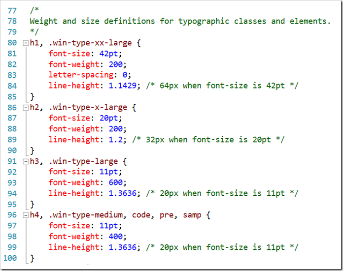
Here are a few of the highlights I want to call out…
- **header styles. **The font size and weight of the standard headers h1 through h6 are defined using the Windows 8 type ramp – 42pt, 20pt, 11pt, and 9pt. Also, along with each header is an accompanying class so that the font ramp can be applied to text elements without making them headers. For h1 there is win-type-xx-large, for h2 win-type-x-large, for h3 win-type-large, for h4 win-type-medium, for h5 win-type-small, and for h6 there’s win-type-xx-small.
- win-type-ellipsis is defined with the text-overflow: ellipsis property (and a couple of others) to allow text continuation
- HTML controls such as button, progress, input, select, and textarea are defaulted with minimum widths and heights so they work well in a touch environment.
- win-backbutton is defined as a class you can add to a button element to make it render like the round back button you see all over the place in Windows 8. The various states of the button such as hover or disabled are defined as well.
- snapped media query. When the user snaps an app, there’s a lot less space for everything, so the size of the entire type ramp is reduced as is the size of the win-backbutton, the size of the appbar and appbar buttons, and the padding and margins in various places.
- high contrast mode is supported throughout Windows 8 to improve visibility for people that need it. There is a media query expression for –ms-high-contrast that is captured in various media queries and defined to create more vivid contrasts and easier reading.
I’m impressed with the CSS file and all of the time and consideration it must have taken to not only get all of these definitions written, but also to get them in the right order and to take into account things like the CSS specificity. There’s very little in the file that feels remotely “hacky”. Still, I’m glad I wasn’t tasked with authoring it!
Getting Windows Device Info
I have plenty of experience in the C# space with accessing Windows API, but I’m still finding it rather novel and delightful to do the same thing in JavaScript. The fact that I can do something like…
Windows.Devices.Enumeration.DeviceInformation |
…is just slick. That’s all. There’s no interop’ing, no dll loading, no service calls. WinRT just delivers it to my front door and doesn’t even make me sign.
Recently, I went looking for how to enumerate the devices currently recognized by the system and found it to be quite nice and thought I’d share.
I started by creating a ListView and an item template in the HTML and imperatively binding that to a WinJS.Binding.List in my JavaScript file. In the interest of being DRY, I won’t walk through that process, but you can see the concept here.
With a ListView and a WinJS.Binding.List in place and with the two hooked together, we’re ready to just fetch our device information and push it into the List. I’ll just lay out all the JS code at once and then explain. Perhaps it will be self-explanatory.
Windows.Devices.Enumeration.DeviceInformation.findAllAsync().done(function (devices) { |
If you follow me much, you likely know that my code tends to be rather dense. I like using the horizontal space that God (and Visual Studio) gave me instead of wearing out my enter key and your scroll wheel. So there are a few things going on in this relatively short snippet.
First, I’m calling into Windows.Devices.Enumeration.DeviceInformation and calling findAllAsync(). That will asynchronously return all of the devices found on the system.
.done() is how we proceed with the results of an asynchronous call in case you haven’t seen that before, and we have a chance to capture the async payload (in this case a bunch of devices) by specifying a devices paramter.
Next, I’m calling a few array functions.
The filter function takes a lambda function and in this case I’m only concerned with devices that have a name and are enabled.
The distinct function is my own. If you want the code for that one, leave me a comment. It reduces the array to only those with unique entries, and it gives you an opportunity to specify what you mean by “unique$rdquo;. In this case, I’m saying that two devices are distinct if their name values are distinct.
Then I do a fancy forEach on the array. Notice how all of these array functions themselves return arrays making it convenient to chain functions together. The forEach function simply calls the provided function on each of the items in the list. No more (or far fewer at least) awkward for iterations. Yay!
In this forEach function, I’m doing another async call - this time to retrieve the Windows 8-style, super fancy glyph graphic to represent the device (hint: you can also call getThumbnailAsync() to get a boring, old-style, full color, supposedly realistic icon for each device.
When the call returns, I create an anonymous object shaped like the data that my template is expecting and push it into my WinJS.Binding.List. Just like that.
A little bit of CSS work later we have something that looks like this…
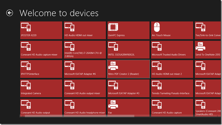
If you have any questions, just leave a comment and I’ll approve and respond as soon as I can.
Happy device enumerating!
How to Make Your Grid Pan Automatically
I got a question at an event a few weeks ago that sounded at first like it was going to implicate a rather complicated answer. In the end, it turned out to be not so bad.
The question was…
On the start screen when the user moves his mouse to the edge, the tiles pan automatically. How do I make the grid in my app work just like that?
And the answer - or rather an answer is here…
var timer = null; |
Let me unpack that for you.
When the user’s mouse is within the grid (that’s the .groupeditemslist), then check the event argument that our event function received and see what the location of the user’s mouse is on the screen (that’s screenX).
If it is withing 50 pixels of the right side of the page (that’s the document.body.scrollWidth) then set timer to a new interval that runs a simple function every 1 millisecond. The body of the function that runs is listView.scrollPosition += 30, which you have likely guessed scrolls (pans) to the right by 30 pixels. And the opposite should obviously happen if the user moves his mouse close to the left edge.
I wrote this rather quickly and have not tested it thoroughly. It appears to work well and does not have any significant performance impact (even though the interval is a single millisecond). That said - I would highly encourage you to tweak the numbers and see what works best for you. If you come up with a better combination, please leave a comment below.
I hope every is having as much fun with this Windows 8 development as I am!
Happy panning.