Gen Appathon Design Slides
If you attended the Gen Appathon in Redmond last week and attended the Windows 8 Design 101 breakout session lead by Valentina and Christina, you know that they promised slides, and here they are: http://www.slideshare.net/valeaseattle/windows-8-design-101
A big thanks to both Valentina and Christina for delivering excellent design content at a time when good design is more important than ever.
MCSD HTML5 Exam Offer
It’s was a big day in Building 33 as 100 or so people gathered to write Windows 8 apps, compete for prizes, and hopefully learn a little something along the way. One of the things attendees learned was that Microsoft Learning (MSL) is really rockin’ the Microsoft certifications lately. Paul Lee joined us at the hackathon to talk about the state of Microsoft certifications. They have tracks that based on software solutions and the technologies a developer would use to create them.
The one I’m excited about is the MCSD: Windows Store Apps - HTML5. Which you can earn if you take the 70-480, 70-481, and 70-482 exams. And actually, the first of those exams is free (for now) if you go to http://www.register.prometric.com to schedule your exam and use HTMLJMP as your promo code. If you want help studying for 70-480 and 70-481, you can take a look at the JumpStart videos that Michael Palermo and I recorded at http://aka.ms/jump480 and http://aka.ms/jump481.
Attached are the slides that Paul presented.
Box Sizing
Don’t miss the box-sizing property in CSS. It’s important. I’ll tell you why.
Let me start by showing you a diagram of the HTML box model.
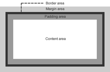
Let’s talk about a div, for example. If you create a div and then use CSS to assign some margin, a border, and some padding as well as the content that you include within the div element, you would end up with something that looks like the image above. Most people with some HTML and CSS experience are very familiar with this.
When you set the size (width or height) of that div using CSS, the size values that you specify apply in an… um… interesting way. The size values apply to the content area. That’s a little bizarre, because in real life (the one we’re all familiar with) when we talk about the size of a box of stuff, we are talking about the size of the outside of the box.
This is a problem because if you want to set an element to the width of the screen and you use width:100%, even that 100% does not include the padding, border, and margin, so if you have any of those then your box will run off the edge of the screen.
You can change this behavior though with a simple CSS property. If you set box-sizing to border-box (instead of the default content-box), then the same value of 100% for your div’s width will now include the border and padding. It will still not include the margin, by the way.
Hope that helps.
Try Unsnap
Here’s a tidbit that is easy to miss if you’re not looking for it.
If your user has snapped your app, but then they take an action in your app that gives you reason to attempt to get back out of snap mode, you can do so by calling…
Windows.UI.ViewManagement.ApplicationView.tryUnsnap(); |
This method returns a value of true if it has successfully been unsnapped or false if it was not able to. It’s only going to unsnap for you if your app is in the foreground.
I’m using this method in my codeSHOW project. If the user snaps codeSHOW and then attempts to browse to one of the demos, then codeSHOW will unsnap itself to allow that demo to run full screen.
Hope that helps.
Important: the tryUnsnap() method will not work if it’s called from code that is not user initiated.
The Book to Buy for Learning WinJS
I’ve learned a lot from Stephen Walther, so I’m excited that his book on Windows 8 Apps with HTML and JavaScript Unleashed is available for pre-order. Save 40% through the end of November. If you see a lot of Windows 8 and a lot of JavaScript down the road like I do, you’ll want to learn everything Stephen knows about it.
Giveaway - Gears of War 3 for Xbox 360
I have an extra, shrink wrapped copy of Gears of War 3 for Xbox that I’d like to give away to a random Twitter follower. Follow me on Twitter at http://www.twitter.com/codefoster and retweet this tweet to enter. I’ll request your mailing address if you win and send it to you snail mail style. I’ll draw a name on Friday, Nov 2 at noon.

Thirty Nine Fourteen
That’s how many lines of CSS code make up the ui-light.css file that you get with WinJS.
What exactly are these nearly 4,000 lines of code doing for you? A lot of good stuff actually. And not only that, but there’s a lot that can be learned from spending some time looking at this file with a microscope. The techniques used in it are pretty advanced as far as CSS goes, and there are some classes, pseudo-classes, and pseudo-elements that you’ve likely not been introduced to yet.
All-in-all, the style sheet defines the look and feel of a Windows 8 app, all of its typography, all of the standard HTML controls, and all of the controls provided for you by WinJS such as ListView, slider, and many more.
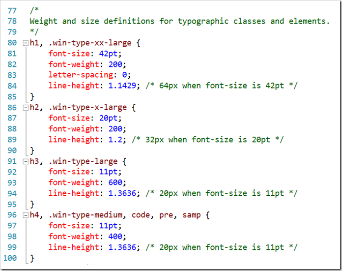
Here are a few of the highlights I want to call out…
- **header styles. **The font size and weight of the standard headers h1 through h6 are defined using the Windows 8 type ramp – 42pt, 20pt, 11pt, and 9pt. Also, along with each header is an accompanying class so that the font ramp can be applied to text elements without making them headers. For h1 there is win-type-xx-large, for h2 win-type-x-large, for h3 win-type-large, for h4 win-type-medium, for h5 win-type-small, and for h6 there’s win-type-xx-small.
- win-type-ellipsis is defined with the text-overflow: ellipsis property (and a couple of others) to allow text continuation
- HTML controls such as button, progress, input, select, and textarea are defaulted with minimum widths and heights so they work well in a touch environment.
- win-backbutton is defined as a class you can add to a button element to make it render like the round back button you see all over the place in Windows 8. The various states of the button such as hover or disabled are defined as well.
- snapped media query. When the user snaps an app, there’s a lot less space for everything, so the size of the entire type ramp is reduced as is the size of the win-backbutton, the size of the appbar and appbar buttons, and the padding and margins in various places.
- high contrast mode is supported throughout Windows 8 to improve visibility for people that need it. There is a media query expression for –ms-high-contrast that is captured in various media queries and defined to create more vivid contrasts and easier reading.
I’m impressed with the CSS file and all of the time and consideration it must have taken to not only get all of these definitions written, but also to get them in the right order and to take into account things like the CSS specificity. There’s very little in the file that feels remotely “hacky”. Still, I’m glad I wasn’t tasked with authoring it!
Well done, Telerik
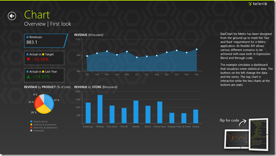
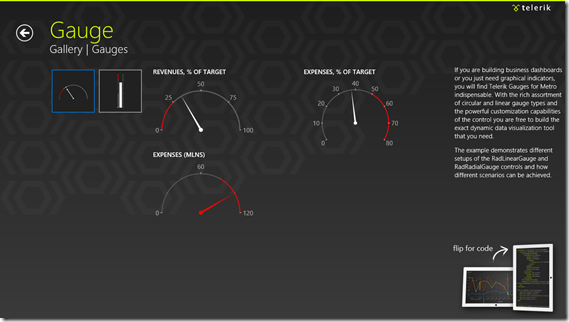
If you haven’t seen Telerik’s Windows 8 controls, you should check it out. Just go to telerik.com and install the trial and then open the demo app (there’s one for HTML/JS and one for XAML/C#) in Visual Studio and launch it.
Their presentation is awesome and the controls themselves are way cool. They’re simple and clean and have just the right amount of animation – enough to make them look alive but not so much they look brassy.
Super Simple Swipe Sections
Yesteryear we used tabs in UI. The problem with tabs and similar navigation aides is that they demand pixels to tell users about where they might go, whereas, good Windows 8 design tells users about where they are.
If you’re on a page that shows multiple entities or sections or parts or whatever, just hint to the user that there’s more off the page by giving yourself a left margin but cutting content off on the right.
I made a pretty simple way to do this for a Windows 8 app and you’re free to steal it.
Just add this to your default.css…
/*Swipers*/ |
Then add class='swiper' to the main section on your page (the one that has a role of main)…
<section aria-label="Main content" role="main" class="swiper"> |
..
You might want to give you main section the standard 120 pixel left margin like this…
.myPage section[role=main] { |
Then give it contents something like this…
<section aria-label="Main content" role="main" class="swiper"> |
Notice a few things…
- the swiper’s immediate children can be any type of element (*). I’m using divs in my example.
- the children will be 80% and have 80% snappoint intervals. This is so that the content from the next page will show up on screen and hint to the user to swipe and see more
- there is an extra at the end. This is necessary for being able to snap to the last section with a swipe gesture
- each section has a header (h2) and it will automatically have the correct 20 pixels under it
That’s it. I hope it comes in useful to you.
Event Handlers in a Windows 8 App
One of the nicest things about JavaScript is the way it considers function. Instead of being wholly owned subsidiaries of classes, functions are as portable as any other object, and their arguments are dynamic too. This makes for some elegant event handling.
In this screencast, I’ll attempt to give you a taste of how to wire up events in a Windows 8 app using JavaScript. It’s a pretty basic scope and I don’t enumerate the many events available on the many WinJS controls. I also don’t cover the event model around gestures or manipulations, but I hope to share more about those exciting areas later.