Posts tagged with "ui/ux"
Reduced Discoverability in Windows 8
I just finished reading Jakob Nielsen’s article Windows 8 - Disappointing Usability for Both Novice and Power Users where the summary reads…
_Hidden features, reduced discoverability, cognitive overhead from dual environment, and reduced power from a single-window UI and low information density. Too bad. _
First of all, I think Jakob’s article is pretty well written and rather honest as well. I don’t think he’s trolling or begging for clicks. I do want to offer some extended thoughts on the matter, however.
Jakob’s second point is Windows 8’s reduced discoverability. I couldn’t agree more, but we can no longer work from an assumption that discoverability is king. We used to worship it and we ended up with a thousand commands on our design surface all conveniently a single click away. We had bloated navigation bars with submenus inside of submenus that all activated on hover (a gesture shackled to the mouse). In short, we had huge swathes of real estate dedicated to things the user might do and places they might go. No more. Now the user enjoys his content and brings up the charms bar when he wants to.
That simplicity comes at a cost though. As Jakob said, Windows 8 amounts to a reduction in discoverability. You may have seen the internet video of someone’s poor old dad left to discover Windows 8 on his own. He found his way to the desktop but couldn’t find his way back. All he had to do was move his mouse to any corner of the screen or hit the Windows key on his keyboard, but he didn’t know that. I think it’s safe to say he hadn’t discovered all the features yet. If you put a caveman in front of Windows 8, how long would it take him to figure out that he can swipe from an edge of the screen (unless he cheated and watched the introductory animation while setting up his profile).
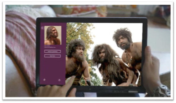
If you can surmount that hurdle (and a few more) then you’ll be well on your way to enjoying your UI and I hope you’ll appreciate that it’s not trying to put everything front and center. Just for fun, I’d like to make a list of things the caveman (or any of us actually) would not know without being told.
- Swipe in from the left to browse other Store apps
- Swipe in from the right to access charms
- Swipe from the top or bottom to access app bars
- Your preferences are in the Settings charm
- If you want to search your app, you need to go to the Search charm
- To print, you go to the Devices charm
- To select something you swipe down on it (or swipe right if you’re in a vertical scroll)
- You can just start typing on the start screen to find things
- Cut, Copy, and Paste are hiding behind a hold gesture
- (and there are likely more)
You know what’s way longer than that list? The growing list of things a computer can do, and they can’t all fit on the screen at once nor should they. I say leave the interactions for when the user is interested in interacting and requests them, otherwise just show him his content.
As for the remaining points in Jakob’s article.
There’s no question there are hidden features. When you open a photo and there’s nothing on your screen except your photo, you can bet there are hidden features. When your primary user interactions (e.g. app bars, charms bar) are off screen, you can be sure there are hidden features. Once again I want my features to be hidden. Until I want my features. If I have to learn where they are, so be it, but that happens once and doesn’t mean I want to look at them on the first page of my app for the rest of my life. I can’t agree with cognitive overhead from dual environment because I’ve never felt any brain pain over the fact that there’s a desktop back there. I love it in fact that I have access to all of the legacy features and functions. Reduced power from a single-window UI? Actually, it’s not a single-window UI. The desktop is still there and you can use your windows and resize them and everything still. And low information density? Yep, and I really appreciate it too!
Data Presentation
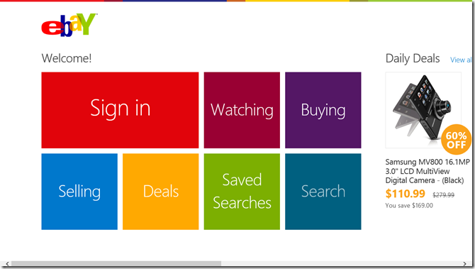
Sometimes it’s hard to know what control to use when you’re thinking about bringing your data feed into your Windows 8 app. You know you want to bring them in as tiles of some form or another. Maybe you want to do classic square tiles like eBay.
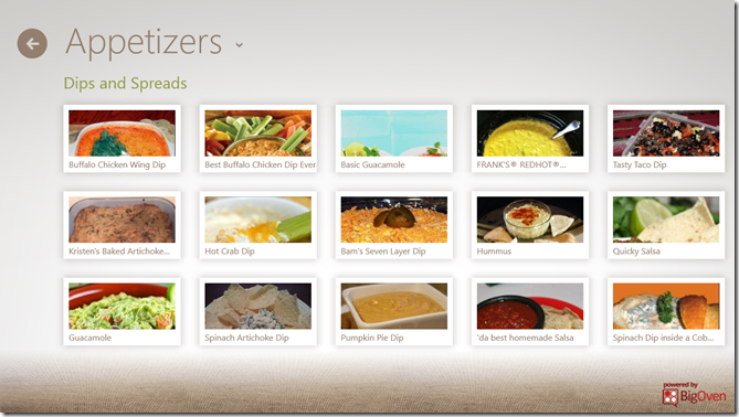
Hopefully, though, you want to add a little bit of flare and personality to yours. You could do something like the Cookbook app. Their primary data point is obviously a recipe and it looks to me like the designers of this app have put them in little Polaroids with shadows and everything.
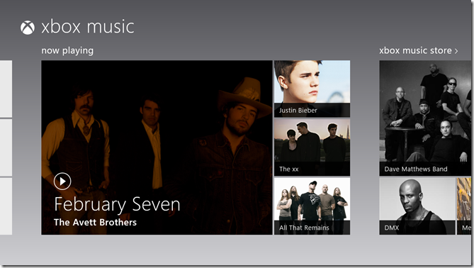
You could copy the music app that utilizes hero images – larger than average images that communicate a sense of feature or significance.
You could even get trés chic and model Cocktail Flow with their novel, beautiful tiles. They hardly look like tiles, but they still convey that essential Windows 8 design.
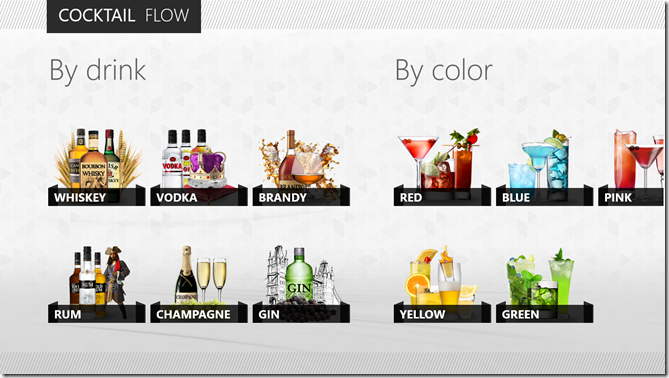
Inevitably, you’re going to have to make a choice about what control underlies this presentation of data, and eventually you’re going to have to implement it.
In this post, I’d like to do a little bit of a study into what control to choose when and why. As usual, I’ll be coming from an HTML/JS perspective, so if you’re wondering what your options are in XAML, Bing is your friend.
The first thing I want to point out is that not all lists of data are created equal. If you’re working on a section of your hub, you’re working with a very finite set of data. On the other hand, if your user has chosen to see something like your list of all recipes, then the list could have 10’s or 100’s of items in it. The two scenarios are candidates for vastly different solutions.
For the former, the hub section, I would employ a grid like what you see in the Music app screenshot above. You know that you have exactly four cells for images (for albums in this case) and you can determine which four albums you want to show and of them which deserves the ginormous featured cell on the left. The advantage to using a grid is that you have ultimate control over its layout. You don’t have to stick to symmetric lists of square. You can get funky with the layout and you can change it up too. You can create one layout for features a single item and another for featuring three. It’s all up to you (with the permission of your designer friend of course). The downside to using a grid is that you don’t get to bind it to an enumerable list of data. That’s not much of a problem, however, because again you’re only working with a handful or so of items. Also, grids don’t have any of the UX yum built in. They don’t automatically handle selection for instance, so if you want to allow the user to swipe select multiple entities in your grid, you’re going to have to figure out how to do that.
For the latter, the recipe list like you see in the Cookbook app screenshot above, I would employ a ListView. A ListView does have the UX yum built in. It automatically handles invocation, selection, and a lot more. It flows, it pans, it groups, and it wraps. It’s really great at what it’s made for.
In other scenarios, if you’re okay with giving up the yum that a ListView provides, you might want to opt for a FlexBox. Flexboxes give you better control than a ListView over how it’s members are laid out, and nothing complicated gets rendered out for each member of the flexbox. If you just inject a bunch of divs into your flexbox then that’s all it will contain.
To avoid a merely conceptual post on a developers’ blog, allow me to create a quick, custom grid and then populate it with some content.
First, the design. Let me whip out my digitizer pen and draw up a quick grid layout using CorelDRAW (woot!)…
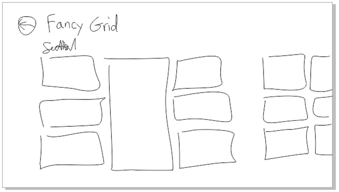
That’s the concept. Now for the implementation. I’m only going to layout the seven items in the first section.
First the HTML…
|
The only thing in that HTML that isn’t boilerplate is the div called grid and the seven div’s inside. There’s one for each of the tiles in our layout. And now on to the CSS which is not a terribly lot longer…
.fancygrid section[role=main] > * { |
Great. No JavaScript. As it should be. This is just a matter of layout, so it’s a collaborative effort between HTML (our structure) and CSS (our layout and style). The HTML in this case is dead simple. It’s just a div with seven div’s inside. Our CSS is like that kid in your chemistry lab in high school that did all the work for your whole lab group while you played Nintendo. Slacker.
So let me explain. The first style rule that refers to the main section is just something I do make sure everything in that main section takes on the 120px left margin that characterizes Windows 8 apps. The next rule applies to the grid. You may know by now, but the .fancygrid that preceeds #grid is just there to namespace this rule to this page. The next rule applies to all seven of the child div’s of the #grid div. The child combinator (the >) in this case is likely important. If you end up putting content inside of these cells and that content contains any div elements at all, this rule would apply to them if you used a space (the descendent combinator) instead of that greater than sign. So for all seven cells we want to draw a white border and give 5px of space. Why 5px? Because the Windows 8 design principles call for 10px between items and so that would be 5px around each item. Then I’m using the :nth-of-type() pseudo-class to refer to each div according to its position and add the correct -ms-grid properties to put it where it belongs. Notice how the 4th div has a span of 3.
And here’s the result…
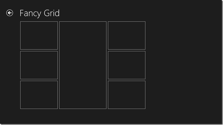
Now, if you’re like me, you see this done once and it looks fine and dandy, but your mind races to imagine the value of something like this in a library primed for reuse. It would be super easy to dynamically add div’s and a couple of CSS properties each according to the template selection chosen by the developer. I believe I’ll get started on that now. Or perhaps soon. By all means, please beat me to it.
Hope this has been helpful. Now get to work!
Metro Design by Blink Interactive
Last Friday my user group (“The Ocho”) met and heard a special presentation on Metro Design thanks to Blink Interactive.
Valentina and Christina are UW students and interns at Blink and gave us a ton of information about user centric design and then the history and concepts behind Metro design.
I promised that I’d post their slide deck for those that want to take a look, so here it is.
If you were there with us, thanks for joining. If you weren’t, then look up our next meeting at http://www.meetup.com/theocho. Maybe we’ll see you there.
When to Use ViewBoxes and FlexBoxes
HTML and CSS is great, but there’s at least one thing that has driven web designers mad for ages - layout. We used to use tables and it worked. We knew their weaknesses, but they worked. Then we were told that tables are for tabular data and div elements are for layout, but divs are wretched creatures. To set divs next to each other one had to float them, but then when finished floating had to be explicitly turned off - argh. Also, divs had no notion of filling vertical space or of controlling the vertical placement of anything within it.
So a myriad of web designers resorted to absolute positioning, browser hacks, jQuery UI positioning, or some other means just to get things to go where they ought.
Enter Windows 8.
Windows 8 allows us to design our Metro style apps using HTML and CSS. In doing so, however, it the CSS standards and Microsoft have given us some facilities to finally place things where we want them.
It’s not obvious how everything works though so let me give you a boost. If you start with a Fixed Layout Application (for the record, I think it should be called the Flexible Layout Application) project template you get the right stuff automatically, but here’s an explanation so you have the concept as well.
We’re dealing with two entities here: the WinJS.UI.ViewBox control and the -ms-flexbox css property value (for the display property).
WinJS.UI.ViewBox
The purpose of the ViewBox is stated in the documentation. It says that it “Scales a single child element to fill the available space without resizing it. This control reacts to changes in the size of the container as well as changes in size of the child element. For example, a media query may result in a change in aspect ratio.”
The first thing I had a hard time wrapping my head around was the overlap between a ViewBox and a FlexBox. Then I discovered that there really isn’t any. The ViewBox control is quite simple. It scales the content that it contains but maintains it’s aspect ratio.
It works like this…

Note that it does not work like this…

In other words, as it says in the documentation, it scales the contents, but it keeps their proportions.
And that’s really the end of it. The ViewBox serves this one purpose.
Flexbox
Now it’s time to talk about the flexbox. This is not a WinJS control, but rather an implementation of a CSS3 property. It’s not quite a standard property yet because all of the browsers are still implementing it with vendor specific properties and values, but it’s close. For Windows 8, we specify a display property with a value of -ms-flexbox to indicate flexbox layout.
The purpose and scope of the flexbox is a bit bigger than the ViewBox. Here’s what the W3C spec for the CSS Flexible Box Layout Module says “In the flexbox layout model, the children of a flexbox can be laid out in any direction, and can “flex” their sizes, either growing to fill unused space or shrinking to avoid overflowing the parent. Both horizontal and vertical alignment of the children can be easily manipulated. Nesting of these boxes (horizontal inside vertical, or vertical inside horizontal) can be used to build layouts in two dimensions.”
So, like the ViewBox, we still have the concept of the container’s content changing in size to fit the container, but this has more to do with a collection of child items.
Additionally, the flexbox offers a lot of properties to specify how it’s children are laid out. A quick glance in Blend at the CSS properties on a div in the Flexbox category will enumerate them for you…
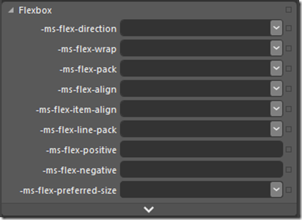
Notice first the -ms vendor specific prefix as I mentioned.
To give a thorough description of the possibilities with these properties, I’d be duplicating what’s already done quite nicely on the flexbox page on w3.org, so just go there and read the nitty, gritty detail.
Differences
The ViewBox is a WinJS control, whereas the flexbox is a CSS property.
The ViewBox always acts on a single child item, but the flexbox can act on multiple child items.
The ViewBox itself changes size to fit it’s container as a core feature. The flexbox can be told to scale to 100% either in width or height, but it doesn’t have to.
The ViewBox does not extend control over the alignment and scale modes of it’s contents, but always does the same thing - scales the child item without changing it’s proportion.
All Together Now
Now that you know how different these controls are, consider them together. If you put a flexbox div inside of a ViewBox, you get a really effective layout tool. Try this for your HTML…
<body> |
With this as the CSS…
.flexy { |
What you have now is a flexbox that fills its area well. Look at these simulator screenshots so you can see what this would look like…
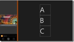
[more images missing]
XAML is unarguably the most powerful layout engine I’ve ever seen, but I really don’t feel like there’s too much in HTML/CSS that we’re missing now with additions like this. It’s rather empowering.
Happy layouts!
Art Matters
I’m in a Microsoft building today that I’ve not been in before. There are a lot of them since I’m a relatively new employee. This one houses a lot of the work that goes into the Windows Phone 7 operating system, and that’s pretty cool.
I arrived early for my conference and decided to spend some time meandering. A 3rd floor native told me I should visit the Windows Phone design studio on the 2nd. The design studio looks like a bunch of art supplies, flowers, and rainbows blew up. It’s very cool actually.
I’m a propeller head for sure, so it’s important to me that a system functions correctly, but I want never to forget that art matters. It matters because it’s human like your users. When I picked out my SCUBA gear, for instance, its ability to sustain my existence while I’m under water was certainly high on my priority list, but it was also an assumption for the most part. SCUBA gear wouldn’t likely make it to the consumer shelf if it wasn’t well tested. So I essentially set that aside and look for gear that I enjoy looking at - gear that makes me feel like a Navy Seal Ninja.
Know that your users are making the same assumptions that your application is going to function as it’s intended, and they are going to choose it, keep it, and pay for it based on its art. Is it beautiful? Is it smooth like butter? Is it inspirational.
The Counter Principles of Metro Style Design
Likely you’ve read the Metro style design principles, but you haven’t seen the counter principles yet (because I made them up). Here we go…
1. Show Shame in Mediocrity
To really show shame in mediocrity, just look at about 80% of the apps in any major app marketplace. These apps may get a users attention with a catchy title or a promise to solve some problem, but then they fail to add any value to anyones life. Even if they are not devoid of functional value they fail to provide any user joy.
- Ignore the little things
- Do something different in every little user interaction so you can keep them on their toes
- Embrace chaos
- Deviate slightly from the grid so the user knows something is wrong even though that can’t see it
2. Flow Like Peanut Butter
To be clear, peanut butter doesn’t flow. Even creamy peanut butter doesn’t flow. To meet this counter principle, perform actions synchronously, use while loops that peg the processor, and only use the UI thread.
- Add some offset between the user’s finger and the registered touch point
- No transitions or animations… all straight cuts
- Add boring graphics and boring interactions.
- Embrace lag and jitters
3. Be Faux Analog
It’s 2012, but give the user a solid 1994 experience by rendering an actual real-life scene and hope they’ll figure out which drawer their word processor is in. Even though there’s no actual need for a spiral binding, let’s add one. It’s nostalgic.
- Show a desk or a lobby or some other loose analogy to your navigation model
- Firmly draw your limits at real life paradigms and scenarios
- Expand on the success of Microsoft Bob©
4. Do Less With More
Pack that screen. You have millions of pixels at your disposal. You can use some for navigation, some for commanding, and if there’s room left over you can even include your user’s content.
- Assure that users can orient themselves to your views within 7.5 minutes
- Adhere to a strict 45 button limit per view
- Give users a sense of adventure as they discover your application
5. Die Alone
- Assume the user is only concerned with doing whatever it is that your app does.
- Assume they don’t have friends to share your content with.
- Assume they don’t need to find anything of your content
- Assume the user what’s to do one thing at a time… always… ever… only
Good Design for App Bar Button Placement
I’ve watched a few developers port their existing apps over to Windows 8.
The first thing they do is drop all of their UI into their new app and run it to see it work. It’s nice to see things work, but Windows 8 is more than just a new API for accessing modern computer hardware. It’s a completely new design for user experience as well. So after you drop all of your buttons into your new app and see it work, you should migrate most of those buttons to the app bar.
The app bar, for the uninitiated, is the bar that slides up from the bottom of the screen whenever the user swipes up from off screen (and sometimes it appears all on its own). That app bar is nice. It avoids bothering the user by appearing only when the user requests it.
Here are some questions that developers raise when they’re learning to design and develop for Windows 8…
- Why can’t I put my buttons on the screen like I always have?
- Okay, fine, but which buttons should I put in the app bar and which should remain on the canvas?
- Do I put the buttons on the left, the right, or what?
- What if they don’t all fit?
- How do I control when buttons appear?
I’ll take these one at a time…
Why can’t I put my buttons on the screen like I always have?
It’s because it’s 2012 now! The modern trend has been to cram as much information into a user’s screen as possible, but we’ve had enough! When I see so may things I cease to see anything. It’s time to take a step back, take a deep breath, and think about what the user is actually doing right now and dedicate every pixel on the screen to it, immersing the user.
Look at the website versus the Metro versions of the Times of India…

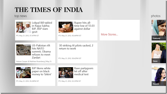
Most of the space in the website version is taken up with navigation commands (hyperlinks), which is a good example of an app telling you about “where you might go” instead of telling you where you are and letting the user navigate with the content.
Okay, fine, but which buttons should I put in the app bar and which should remain on the canvas?
First off, most of the buttons should be in the app bar. It won’t take long for a user to learn that that’s where the interactions are and start to swipe that bar up automatically. Since the app bar is hidden at first (usually), many wonder if their command won’t be apparent enough to the user. Keep in mind, however, that when a user draws up the app bar, they are specifically searching for a command. It takes away the need for discoverability and arguably makes your command more apparent - not less.
Some buttons should be on the canvas though. You would decide to put a button on the canvas when it’s part of the workflow a user is traversing. A case could be made that the workflow itself is the content at that point. If I’m adding products to my cart and checking out, I’m not here to browse content anymore. I’m engaged in the purchasing workflow. If you’re a retailer making a Windows 8 app, I would recommend that you diligently immerse the user in your products and their supporting media to make them love the browsing experience. Then when they decide to checkout, transition them to a slightly more utilitarian mode with canvas buttons and progress feedback.
Do I put the buttons on the left, the right, or what?
In general, the right side is for global commands, and the left side is for contextual commands. There are exceptions, however.
**Global commands **are those that apply to the entity represented by the current page. If you’re on the friend page, then add to favorites is a global command because it applies to the friend.
**Contextual commands **are those that apply to the entity or entities the user has selected. If you’re on the my friends page, then add to favorite is going to require that you swipe select one or more friends and would then be a contextual command.
One exception to this is when you don’t have any (and aren’t going to have any) contextual commands because you have nothing for the user to select. In this case, the entire app bar can be dedicated to global commands and the left and right sides should be used to separate the most disparate functions. You could, for instance, put your filtering commands on the left and your sort commands on the right.
What if they don’t all fit?
If you have more commands then you have app bar, then go vertical by combining commands into menus. For instance, if this is what you have on your app bar…

…then combine all of your filters into one menu and your sorts into another. That would bring 9 buttons down to only 4!
How do I control when buttons appear?
If you’re using HTML/JavaScript for your app, the recommended way to add app bar buttons and control when they appear is to declare them all on the default.html file and then in the .js file for each page just control their visibility. This avoids having to manipulate the DOM each time a page is loaded. There are easy functions for doing this such as…
appbar.showOnlyCommands(["add-template-item","delete-global"]); |
If you’re using XAML/C# then (from what Jerry Nixon tells me), you will actually create the app bar buttons on the page where they’ll appear.
Finally, don’t forget to account for snap view. When your app is snapped, you only have room for 5 app bar command buttons. If you have more then they will wrap up to a second row and it will look funny and your users will laugh at you. And that’s not the response you’re likely looking for.
Happy commanding!